Monday, 7 November 2016

20 Types of Lead Generation Content to Put Behind Your Landing Pages

landing.png

What does being in a "content rut" mean to you?

Perhaps the words remind you of writer's block, when you couldn't think of fresh topic ideas. (We've all been there.) Or maybe it makes you think of those days, weeks, or even -- horror of horrors -- months when your content seems to be falling kind of flat.

There's one other thing it might make you imagine -- the kind of content rut with the same types of content getting created over and over again, instead of mixing it up. Build and promote landing pages that generate more leads with the help of this free optimization guide.

A big part of building a strong content strategy is experimenting with new types of content. Your audience may love your podcasts, but that doesn't mean that's the only thing you should create. Fresh content types can expand your reach and attract more, and possibly even better leads.

To help you shake up your content balance, here are 20 things you can put behind a landing page to help you collect new leads -- and ways you can optimize your landing page for each type.

20 Types of Lead Generation Content to Put Behind Your Landing Pages

1) Ebooks

Ebooks are a popular type of offer used to generate leads, educate customers and prospects, and gain credibility in your industry. But they can take time to become a reality, so be sure to choose a topic that will help a prospect go from downloading your ebook to having a productive conversation with a member of your sales team.

Here's a good example from LiveCareer. The company created a piece of content that aligns with its brand -- a job search handbook -- and built a landing page around it. Plus, it's sharable. The social sharing icons below the form make it easy for users to tell their friends and colleagues about the content.

Demo Screenshot

For more detailed tips, click here to learn how to create ebooks from start to finish.

2) Courses

Your audience may also be excited to fill out a form in exchange for a video course or tutorial. It's up to you whether to produce, shoot, and edit the video in-house or hire a professional. You can hold the course live, or post a recording. Either way, ask participants to share their email address in exchange for the tutorial, so you can send them an email with the video recording that they can access forever.

Lynda, LinkedIn's learning platform, does that well with its course previews. Users are able to watch the first minute of a lesson and when that preview is over, a prompt appears to start a free trial.

Course Screenshot

3) Trials

Trials aren't just limited to things like courses. Sometimes, your prospects will want to try out your product or service before deciding whether they're a good fit. That's a good thing -- you want to grow a base of customers that are convinced and loyal, and that can take a little more work than trying to sell your stuff to everyone who will listen.

That's why it can be helpful to provide a free trial of your product or service with no risk, no obligation, and no credit card required -- the only thing the prospect needs to do is fill out a form.

Here's how Geneious used a form for a free trial of its research software for biologists. Notice how the form is followed by images of the program and FAQ, in case the user scrolls before committing to the form.

Course Screenshot

4) Demos

If visitors are ready to learn more about your product or service, make it easy for them to schedule a demo with your team. You can place demo calls-to-action on key pages of your website, including your home page.

These are particularly valuable on sections of your site that explain the different highlights and features of your product or service. Once the user is intrigued, make it seamless to schedule a demo. Here's a look at HubSpot's demo landing page:

Demo Screenshot

5) Contests

People love contests. They can teach you a lot about your audience while engaging them, growing your reach, driving traffic to your website, and -- drum roll, please -- generating leads. You can run contests on your website, or on pretty much any social media platform, including Facebook, Twitter, Pinterest, and Instagram. They can be as simple as you'd like:

...or as complicated as you'd like. Notice how Brytor Designs uses its lobster gauge giveaway -- I mean, who doesn't need one of those? -- to pull off a double whammy of lead generation. To enter the contest, the user has to both follow the brand on Instagram and fill out a form. But Brytor made it easy. When I clicked the Instagram icon on the page, it took me directly to the brand's profile in a new tab, so that I could easily go back to the landing page and fill out the form.

Contest Screenshot

Want to learn more about running a successful social media contest? Check out our guide here.

6) Cheat Sheets

Cheat sheets are a type of short, concise offer that someone might bookmark for future reference. Think of them as comprehensive guides to terms, commands, symbols, or other things. They should be formatted for quick reference, which means clear headers and not too much detail. And the more visual, the better.

Here's one way that Nusii pulled that off with the landing page for its proposal cheatsheet. It's colorful and visual, with the imagery suggesting that the downloadable itself will be equally easy to follow. The only thing we'd change here? Consider removing navigation from your landing page -- you can add it back in on your thank you page. Be sure to limit the text and visuals to the valuable content you're providing.

Cheat Sheet screenshot

7) Checklists

Checklists are another type of short offer that you could put behind a landing page, which readers can print out or download to their desktops. Include clear headers, a colorful design, and keep copy brief.

Notice how there's no navigation on Bonafide's landing page below, which gives the visitor less of an opportunity to navigate away from the form (and the content). The text explains why the user should download the checklist, and personalizes the benefits to make the brand relatable.

checklist-screenshot

8) Email Series

An email series is a multi-part series of emails sent to an individual who specifically opted in to receive them. It's different from an email subscription -- it has a finite number of emails sent.

These programs are especially popular around the holidays, when many brands do "12 days of"-themed promotions. Microsoft, for example, executes one each year. And notice how even though I was a bit early for this year's holiday email series, Microsoft still used the landing page to encourage me to shop its current sales, or look at last year's prizes.

email series Screenshot

Another example is HGTV's Urban Oasis, in which a lucky winner receives a completely refurbished home. Users are allowed to submit one entry per day, and can opt in to receive daily email reminders to enter until the contest is over.

email series Screenshot

9) Email Subscriptions

Business blogging not only drives more traffic to your website, it also can become a major source for lead generation down the road. But how do you convert blog readers into leads?

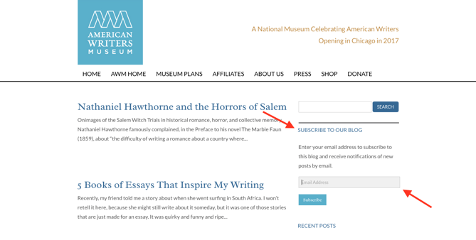
First, turn them into dedicated subscribers by simply asking for their email address in exchange for sending them new blog posts daily, weekly, or monthly. Make it easy for them to subscribe by including a one-step form on your blog, like the American Writers Museum does with its blog here:
Email subscription

Learn more about converting visitors to subscribers here.

10) Guides

Guides come in many shapes and sizes. There are "ultimate guides," which are long, in-depth, and usually include detailed explanations, screenshots, and step-by-step instructions. Then, there are "simple guides," which are shorter and much more concise. There are also tactical guides, pocket guides, introductory guides and advanced guides. The list goes on.

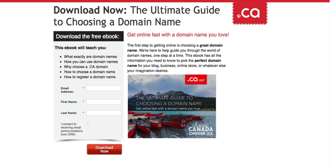
What's the common denominator? They're all tutorials of some sort, and many of them include step-by-step instructions. Below, the Canadian Internet Registration Authority uses a landing page for its "Ultimate Guide to Choosing a Domain Name." It's simple, well-branded, and concisely explains what the user is getting out of this download.
Guides screenshot

11) Kits

Kits are pieces of content grouped together into one offer. They're great for repurposing existing content by aggregating multiple offers on similar topics into a cohesive collection. For example, HubSpot offers an Inbound Marketing Kit that includes an interactive presentation, a report that includes original data and research, and glossary.

But this content also works well with things like media kits. Not only are you providing a user with more information and media about your company, but you're also offering it in exchange for contact information. See how Her Campus Media does that below. It helps the brand follow up with potential advertisers, which is especially valuable in digital publishing.

Guides screenshot

12) Original Data & Research

Data and metrics are have become especially valuable as many fields become more data-intensive. If your team has the bandwidth, original and data-heavy industry reports can build authority and trust with your audience. The trade-off is that curating them takes a lot of time, resources, and expertise.

One of the least expensive ways to curate original data and research is to conduct a survey among your subscribers, leads, customers, and industry professionals. Then, share the results in the form of a downloadable report, study, or infographic. For example, the data in our annual State of Inbound report is taken from a survey of over 4,500 marketing and sales professionals. We asked the questions, and the answers provided us with great insights that our audience is interested in learning about.

Data and research screenshot

Annual reports are similar to original data and research, though they usually focus on information pertaining to a specific organization, rather an industry at-large. And while these reports are often written with the intended audience of shareholders, they can actually be helpful resources for a number of users, like potential non-profit donors or members of the press.

13) Podcasts

Podcasts can build an audience and establish your brand as a source of expertise, while also showing off your company's personality. They put a voice to your brand, so to speak. And creating one can even be relatively low-budget -- all you need is a decent microphone and a smart -- but fun -- host who can keep your audience listening in each time a new one is released.

When it comes to using a podcast for lead generation, one of the best ways to do that is to ask your listeners to subscribe to updates about it. Subscribing to a podcast alone is already easy to do through apps that don't ask for contact information, like iTunes and Stitcher. But by offering a "latest news" subscription, you can keep your audience up to date on related information like industry trends and sneak previews of future episodes. Here's how we do that with HubSpot's The Growth Show podcast:

Podcasts screenshot

Learn how to build a successful podcast here.

14) SlideShare Presentations

Because SlideShares, like blog posts, are great for traffic, some marketers choose to share them without hiding them behind a form. But that doesn't mean you can't offer a download of your SlideShare in exchange for some information. If your SlideShare is good enough, it can be a low-effort way to convert readers into leads.

Here's an example for a particularly nice design from Collision Latitude. Notice how there are bullet points to outline exactly what knowledge the user will gain from this download -- as well as those handy social sharing icons.

Slideshare screenshot

15) Templates

Templates are great offers because they provide readers with a backbone for creating original things on their own. Templates often take different forms -- calendars, worksheets, and other outlines can all benefit different audiences in the form of a template.

For example, one of our most popular offers is our "15 Free Infographic Templates in PowerPoint," which we promoted with blog posts that teach our readers how to create great infographics in more detail. Check it out:

Templates screenshot

16) Events

Holding a happy hour at your office, a meet-and-greet at a local eatery, or a conference in a major city? Whatever your event, ask attendees for their information so you can send or email their tickets ahead of time and have an ID badge waiting for them upon arrival.

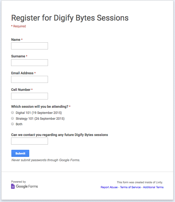
Here's how LIVE Magazine SA did that with registration for one of its free events. Notice how the brand used a Google Forms -- a free and easy way to collect registration data without navigation or other distractions. Just make sure to direct your visitor to a thank you page where he or she can start navigating your site again.
Events screenshot

This way, you can follow up with attendees to let them know about similar occasions, ways to connect with people they may have met at the event, and where to download content they may have come across there. You can even add calls to action in follow-up communications that invite users to follow you on social media or subscribe to other types of content.

17) Tools

Interactive tools can be difficult and time-consuming to create, but if they're truly helpful for your audience, the payoff is often worth it.

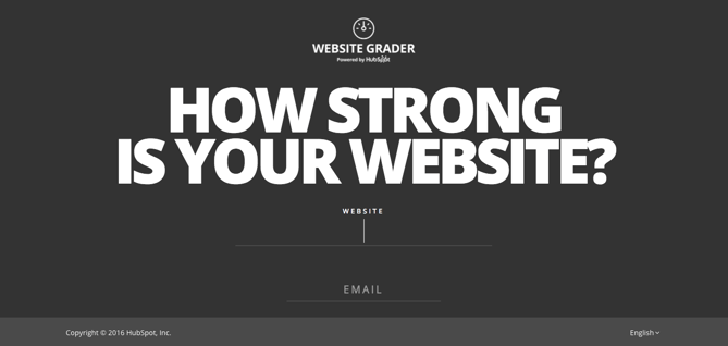
Take HubSpot's Marketing Grader, for example. The landing page form below is simple and only requires a website URL and email address. The feedback that the marketer gets from this tool is worth a lot compared to the amount of information we ask for. That makes it a compelling exchange.
Tools screenshot

18) Free apps

Who says a free product doesn't earn business? They're actually a great opportunity for lead generation. Try giving out free versions of your product or service -- it can be lighter or have fewer features than the full-blown version -- with no risk, no obligation, and no credit card required. The only thing they need to do is fill out a form.

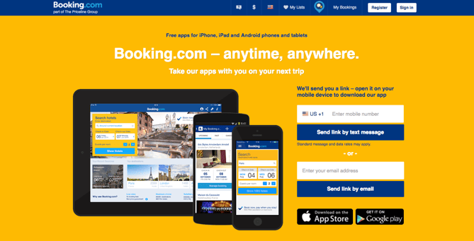
Check out how booking.com does this below. The brand could just post links directing individuals to the App Store or Google Play. Instead, it also provides the option to receive a link to download the free app via email or text. For the sake of convenience, some users are willing to provide that information, so think about how you can provide that ease of use in exchange for information from your audience.
Apps screenshot

19) Webinars

The webinar is a useful content format for introducing prospects to thought leadership around your industry, and it establishes you as an expert in the discussion. A successful webinar takes a lot of work -- especially with regard to planning and promoting it -- but with the right strategy, it can be a great way to generate high quality leads.

Here's one that Sprout Social did about Instagram with a special guest. The registration page is fairly simple in design, but still has enough information about the webinar leaders to pique the interest of prospective attendees.

Webinar screenshot

To learn more about planning your own webinar, check out this post.

20) Whitepapers

Ebooks are informal, fun, design-heavy pieces of in-depth content. Whitepapers are more academic and persuasive reports. They're structured to present a problem, then provide a solution to it. People download them because they are authoritative, detailed, and informative. And since every audience could use a good hold on their respective industry details, whitepapers can be quite valuable to them.

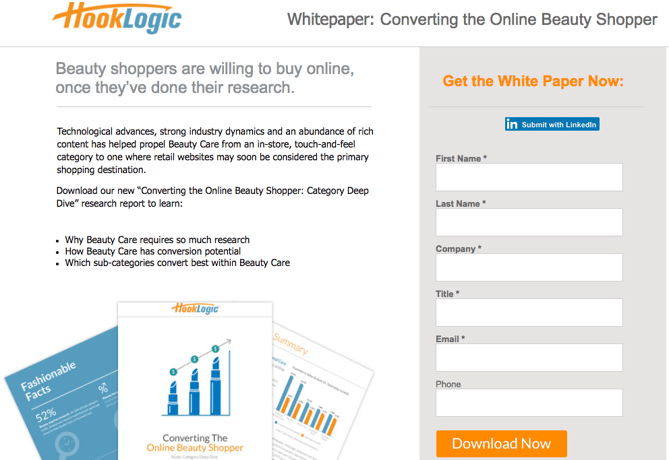
The cool thing about whitepapers is that they can be created around almost any industry. Here's one that HookLogic created for the buying behavior around beauty products. Notice that the landing page allows users auto-fill the form using information from LinkedIn. Letting visitors auto-populate this data makes it easier for them to get to your content quicker, encouraging them to complete the form.
Whitepapers screenshot

Make a Smooth Landing

From ebooks, to apps, to templates, each type of content you put behind a landing page has a specific job. By experimenting with different types of offers, you can observe which ones resonate with your audience and convert the most leads. Of course, you can always do more of what works, but never get too comfortable -- keep you audience alert and intrigued with new topics and formats that are groundbreaking, but relevant.

What other types of offers have you put behind a landing page form? Share with us in the comments below.

Editor's Note: This post was originally published in October 2014 and has been updated for freshness, accuracy, and comprehensiveness.

free ebook: optimizing landing pages

how to design landing pages for conversion


from HubSpot Marketing Blog http://blog.hubspot.com/marketing/lead-gen-content-ideas
Via http://blog.hubspot.com/marketing/lead-gen-content-ideas

19 Brands with a Cult Following (And What You Can Learn From Them)

brand following.png

Ever wonder how Dollar Shave Club turned razor subscriptions into a billion dollar exit? Or how LaCroix’s fans strong-armed their beloved bubbly’s way to the top of the sparkling water food chain? The answer is simple. They inspire impressive devotion from their large fan bases.

That’s especially true among Millennials -- 62% of them tend to stick with one brand, compared to 54% of the population at-large. How does a brand garner that kind of advocacy? I found myself asking the same question, so I compiled a list of 19 brands with faithful followings, along with the marketing tactics that might contribute to their cult status. Download our essential guide to branding here for even more tips on branding your company. 

Note: It’s easy to look at the behemoth brands below and feel a little overwhelmed. From one marketer to another, stop, breathe deeply, and give yourself a break. The strategies these brands employ don’t require billions of dollars or global teams. They’re simple enough that even a lone marketer can incorporate them into their next campaign -- that’s why we love them.

19 Brands with a Cult Following (and What You Can Learn From Them)

1) Southwest Airlines

Southwest.png

Source: Brand New

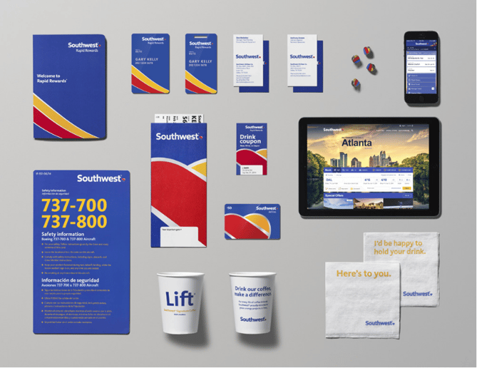
When I say Southwest, you probably think of cheap fares, funny flight attendants, and drink coupons. If you also think of great branding, there’s a reason for that. In September 2014, Southwest unveiled a branding refresh that earned positive media attention and made marketers swoon.

Southwest rolled out a PR campaign for its rebrand, explaining the reasoning and research behind the airline’s new look. It included videos that maintained the company’s playful brand voice while touting the new message, “Without a heart, it’s just a machine.” Southwest proved that sharing its new identity was as much a part of the rebrand as the redesigned packages of peanuts.

Branding Best Practice: Own Your Rebrand

Your rebrand may not be at the scale of a major airline, but it’s still a big undertaking, so don’t hide the results. And remember, it works in a number of sectors -- at least half of nonprofits, for example, say that a rebrand has increased their revenue.

Use your rebrand as a way to create buzz within your industry. Make it clear why you felt a rebrand was necessary, how you considered your audience, and what the positive results will be. Think of it as another way to reinforce your new image and foster adoption of your refreshed identity.

2) LaCroix

LaCroix.png

Source: LaCroix

Do you know someone who’s obsessed with LaCroix? Hypothetically, you might be addicted to the fizzy water yourself (raises hand slowly). Sales for the bubbly drink have more than doubled over the past two years, but chances are, you won’t see a ton of LaCroix TV ads.

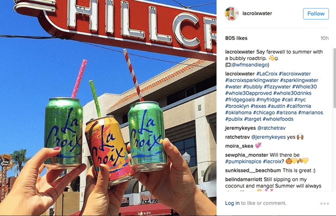
Instead, LaCroix has executed some impressive social media campaigns, specifically with Instagram. In 2015, the brand grew its Instagram followers from 4,000 to 30,000 in just eight months. Today, it has almost 60,000 followers.

But how? First, LaCroix engages with anyone who tags the brand, no matter their number of followers. If you’re lucky, you might even receive a free case of Pamplemousse for posting a photo. Second, LaCroix is quick to adopt relevant trending hashtags like #Whole30approved (to promote its partnership with Whole30 nutrition) and branded ones like #LiveLaCroix. Third, Instagram micro-influencers are smartly targeted with free products and other perks in exchange for featuring LaCroix in lifestyle images shared with their large following.

Branding Best Practice: Discover Where Your Audience Hangs Out

Find out who your target audience is and where they’re hanging out. LaCroix knew that 55% of online 18-29-year-olds are active on Instagram and doubled down on efforts there. By promoting user-generated photos and rewarding influencers, LaCroix went from sitting on dusty grocery store shelves to becoming a drink of choice for Millennials.

3) In-N-Out

In-In-Out.png

Source: In-N-Out

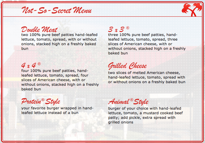
Let’s not even get started on the In-N-Out vs. Five Guys and Shake Shack debate. That’s a blog for a different day (and, probably, a different website). But if you’ve been to California, you might have made at least one stop for a Double-Double Animal Style -- one of In-N-Out’s more notable menu items. And, the chain maintains its fervent following by knowing that meals like that are part of its brand, even being a bit protective of it.

The brand is comprised of burgers, fries, and shakes, as it has been for 68 years, insulating it from fad-food missteps. And while it’s tough to find an In-N-Out beyond the west coast, the brand extends much further. In September 2016, a pop-up shop came to London, selling out of burgers in an hour. “These events also help to protect the In-N-Out Burger brand,” the company said in a statement, “in important regions like England and Southeast Asia.”

Branding Best Practice: Protect Your Brands

It’s been said that your brand is more important than the product or service you sell. Building a brand strategy, getting buy-in from your team, and sticking to the plan are important parts of ensuring that your marketing efforts reinforce your brand standards.

4) Trader Joe’s

TraderJoes.png

Source: Trader Joe's

Trader Joe’s products draw levels of adoration that would make something like pumpkin spice jealous. (I mean, hello, cookie butter.)

So what’s the secret sauce in the brand’s marketing efforts? Well, the funny thing is, it doesn’t really have any. Trader Joe’s doesn’t have an official Facebook, Twitter, or Instagram account, nor will you see television ads. What it does offer are great products that the brand is openly passionate about.

But they have discovered one thing that works. The Trader Joe’s Fearless Flyer newsletter is one of the brand’s dedicated marketing channels -- and people seem to love it. With a selection of featured items and an astonishing amount of copy, the Flyer waxes eloquent on Trader Joe’s hotdogs, apple cider, and more.

Branding Best Practice: Be Strategic About the Channels You Engage In

What the success of Trader Joe’s doesn’t mean: you should shut down all marketing channels and “let your product speak for itself.” Unless you start selling products like cookie butter by the gallon, that strategy probably isn’t right for you. But it does mean that stepping back and taking an unbiased look at which unconventional channels could work for you. What’s your brand’s “Fearless Flyer”? Figure out what makes your brand different, and capitalize on it with something unexpected.

5) Saturday Night Live

SNL.gif

Source: Giphy

Saturday Night Live (SNL) first aired in 1975. And while a 41-year run is prone to its share of tough seasons and dry spells, this sketch variety has remained strong and relevant.

While a talented cast might be the backbone of the show, it’s the weekly guest hosts and musical talent that keep each episode topical and trending. That impressive lineup allows SNL to leverage current events (e.g., when Ronda Rousey hosted after her impressive six-win UFC streak). It also allows the show to test out different hosts and bring back fan favorites, like Justin Timberlake.

Branding Best Practice: Incorporate Guest Contributions Into Your Content Strategy

While having a strong, core content team is important, guest contributions are a great way to keep your brand relevant and credible. But remember -- these guests have to be aligned with your brand. Think of it as a co-marketing agreement. These partnerships have to be strategic and both parties have to benefit from it. Check out our tips on how co-marketing works in branding here.

6) IKEA

IKEA-8.png

Source: Home Designing

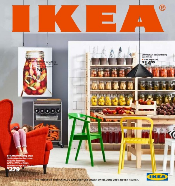
IKEA has a simple vision: “to create a better everyday life for the many people.” And while some patrons might give credit to the in-store meatballs -- the brand is rumored to sell three million each day -- IKEA turns to research to learn what its consumers really want.

But there’s no reliance on customer surveys and downloaded data. Instead, design experts are actually sent into people’s homes to learn what’s important to them and what their pain points are. That information is funneled into content that’s relevant to customers, ranging from the brand’s over 50-year-old catalogue, to the award-winning web series “Easy to Assemble,” which ran for four seasons.

Branding Best Practice: Do More Than Audience Surveys

Understanding your audience goes deeper than sending out a survey. That’s said to be especially true of Millennials, who are more interested in conversing with a brand (see LaCroix’s Instagram example above) than spending time on a questionnaire. Finding out what motivates and challenges your consumers is arguably the most important part of a marketer’s job, which also means you have to allocate your marketing time and resources accordingly. Focus on the conversation -- engagement through social media and other conversation-centric platforms can help bring your user personas to life.

7) Dollar Shave Club

DollarShaveClub.png

Source: Brandfolder

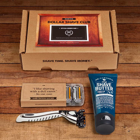
Razors are not exactly an exciting topic. In fact, they’re probably a topic that most of us avoid discussing -- because, gross. But when Dollar Shave Club (DSC) burst onto the startup scene in 2012 with a launch video that people are still talking about, it made shaving worth talking about.

The deep care for the brand is often evident, like in one interview with Brandfolder: “From our packaging to our digital presence, the DSC brand identity informs everything we do.” That devotion to the brand shines through every piece of marketing content produced. From witty emails, to carefully branded packaging that makes you stop and read your razor wrappers, DSC’s brand is carefully and craftily infused into everything they do.

Branding Best Practice: Organize Your Brand Assets

How do you incorporate your brand identity into each piece of marketing you own? With brand consistency. While your brand might have several moving parts, they have to be cohesive -- in fact, 90% of consumers expect this kind of consistency across all channels, especially when shopping for a product or service. Not sure where your brand inconsistencies might be hiding? Check out this list.

And once you have achieved that consistency, consider using digital asset management: the technology that makes any of your digital branding collateral -- logos, images, and standards, to name a few -- easily accessible to your team (and ready to implement).

8) Apple

Apple-7.png

Source: Apple

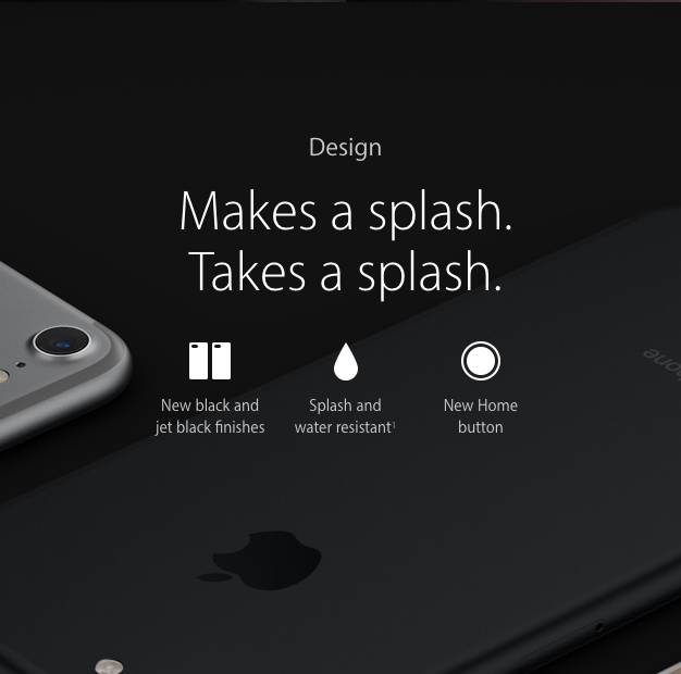
Year after year, new Apple product announcements get people talking -- whether it’s industry chatter or consumer debate. So how does the tech giant manage to generate buzz about yet another new iPhone, even now?

For one thing, the launch messages tend to be simple and consumer-focused. For example, the iPhone 7 landing page reads that this version “dramatically improves the most important aspects of the iPhone experience.” See that? Experience. Before I even read the list of features that follows, I’m already thinking about which aspects of my iPhone are most important to me, and how much better they’ll be on this new device.

Branding Best Practice: Keep it Simple

Choose the benefits that matter to your customer and build a marketing strategy around them. And don’t forget to keep that marketing message simple and unapologetic -- focusing on too much at once can lead to brand confusion, which might be why 69% of consumers are more likely to recommend a brand based on its simplicity.

Focusing on benefits in a no-frills way can also imply confidence. For example, Apple was noticeably unapologetic about removing the headphone jack from the iPhone 7. Instead, the official announcement proclaimed, “Oh yeah … and the headphone jack from over 100 years ago has been removed (shocker) for the more versatile Lightning port.”

9) Starbucks

Starbucks-3.png

Source: TechGenie

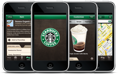
Mobile has seen some interesting developments as of late. 51% percent of digital media is consumed via mobile (versus 42% on desktop), and voice search is on the rise. It makes sense for marketers to be focused on mobile, and Starbucks is no exception.

When Starbucks introduced the “Order & Pay” feature of its app in 2014, it saw adoption rates between 4-10% in stores. The brand capitalized and built on that, creating an in-app experience that remembers and recalls your favorite orders, suggests pairings, and guesses where you’d like to pick up your order.

Branding Best Practice: Invest in Mobile Marketing

If you’re not investing time and resources into your mobile marketing strategy, you might want to get started, especially when it comes to building an app for your brand -- 56% of digital time is spent using them.

But if an app is out of reach or not relevant for to your brand (after all, just look at the Trader Joe’s example), how else can you elevate your mobile strategy? Start by making sure your site is mobile-friendly, and look into push notifications or other unique offerings that your organization can use to its advantage.

10) Zappos

Zappos.png

Source: ReferralCandy

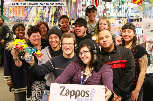
Zappos has built its brand around customer service -- a brand that CEO Tony Hsieh has defended and protected over the years, even famously saying, “Zappos is a customer service company that just happens to sell shoes.” At any other company, it might be considered inefficient for a customer service rep to engage in an almost 11-hour phone call with a customer, but at Zappos, that kind of dedication is encouraged.

But it doesn’t stop there. From sending flowers to a bereaving customer, to overnighting free shoes to a best man whose footwear hadn’t made the flight to the wedding, Zappos leads with a customer service story and keeps their fans coming back from more.

Branding Best Practice: Delight Your Customers

In a marketplace where consumers have hundreds and even thousands of choices at their mobile-savvy fingertips, you need to set yourself apart. And sometimes, all your consumer needs to make a decision between you and three other competitors is exceptional service -- especially since U.S. businesses collectively lose about $41 billion dollars each year because of bad customer service. (I suppose sending flowers can’t hurt, either.)

11) TED

As marketers, we have our favorite TED talks. Maybe yours is Simon Sinek explaining the golden circle, or my personal favorite, Susan Cain speaking on the power of introverts. Regardless, TED talks have become a go-to resource for quick, insightful information across almost any topic.

In a time when consumer attention spans are shorter than those of goldfish, TED does what might seem impossible to some marketers. The brand holds five million YouTube subscribers captive for talks that average 20 minutes in length. There’s no flashy light show or catchy theme song -- just solid storytelling that’s largely spread by word of mouth.

Branding Best Practice: Focus on Quality Content

Put time, effort, and money into creating quality content. While you might be able to grab someone’s attention for eight seconds with a catchy headline, valuable content is what will transform that one-time view into a regular reader, and hopefully, a customer. Plus, quality content is imperative to SEO -- without it, your rankings can take a serious hit.

12) Lululemon

Lululemon-1.png

Source: Lululemon

Lululemon is one of the hottest fitness brands in the market today. Ask someone why she spent just short of $100 for a pair of yoga pants, and you might get a lecture on the superior quality of Lululemon’s products. That’s the kind of brand loyalty sought after by every marketer on the planet, and it starts with Lululemon ambassadors.

While consumer word-of-mouth is one form of brand loyalty, Lululemon fosters a more formal type of ambassador in yoga teachers and fitness trainers who have been selected to represent the brand’s values and lifestyle. They lead classes at storefronts on weekends, share photos of themselves wearing the brand, and provide aspirational advertising.

Branding Best Practice: Experiment with Influencer Marketing

Brand ambassadors are a form of influencer marketing -- which, according to Twitter, is responsible for 49% of user purchases. Look at who the movers and shakers are in your industry, and learn how you can partner with them through guest contributions, using, or writing about your product.

13) SoulCycle

SoulCycle.png

Source: SoulCycle

Telling a colleague that you’re headed to the gym can elicit a number of responses. You might hear, “good for you,” or receive a grimace face that says, “I feel your pain.”

But SoulCycle, similarly to Lululemon, has found a way to rebrand your workout. One visit to its website or Instagram profile is all it takes to find mantras about pushing your body to its limits with your #SoulMates and #SoulSquad. By sending the message that exercise is a community-bound opportunity, SoulCycle makes it seem like less of a chore, and more like an exclusive club.

Branding Best Practice: Market to Your Consumer’s Emotional Side

How can you make your product or service sexier? Consider how you can tap into your client’s emotions, and touch on the things that are important to them. In fact, a study that measured consumers’ brain activity in response to ads found that higher activity indicated a 23% increase in sales volume. And considering that 60% of consumers who feel a “high brand connection” are more likely to make a purchase -- even at a higher price point -- it quite literally pays to understand their potential feelings toward your brand.

14) Life is Good

LifeIsGood.png

Source: Life is Good

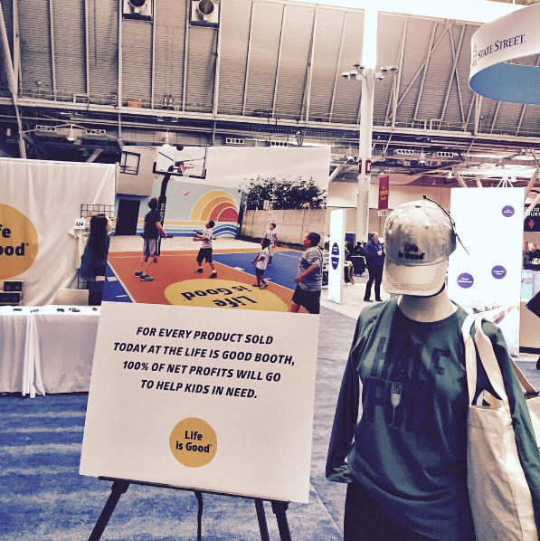
Life is Good was founded in 1994. Within 11 years, the brand was boasting $50 million in sales -- having never run a single ad -- and $100 million by 2015.

What was the strategy behind that rapid growth and success? Say sibling co-founders John and Bert Jacobs, it was simple -- “rely on the good vibes and social power of their community to spread the word,” according to Inc.

Instead of traditional marketing, Life is Good pours its advertising dollars into different events for its charity, Life is Good Playmakers. In addition to impressive sales, these efforts have resulted in an avid fan following and even partnerships with celebrity musicians.

Branding Best Practice: Think Outside the Advertising Box

Consider new, less traditional forms of advertising -- especially since 84% of Millennials, for example, don’t even like advertising. By sponsoring local events or supporting a charity that aligns with your company’s mission, you could generate more than just good PR. You could also gain fans who respect and appreciate your work. Plus, 80% of consumers believe that corporations can (and should) work to benefit their communities -- a win-win for both brands and the people they serve.

15) Moleskine

Moleskine.png

Source: The Next Web

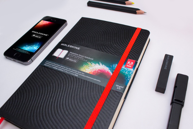
Moleskine is not just a notebook. It’s “a free platform for creativity,” Maria Sebregondi, Moleskin’s head of brand equity once said. What’s more, it’s found a way to make paper cool and relevant in the digital age.

The notebook brand expertly balances its heritage past -- touting Hemingway and Picasso among its early brand advocates -- with the digital present, launching a smart notebook and companion app. This balance of yesterday and today helps maintain the brand’s relevance -- and appear to consumers who love the latest tech, but still have nostalgia for paper.

Branding Best Practice: Allow Your Brand to Evolve

Every brand should evolve. Our shortened attention spans aren’t limited to the content we consume -- they apply to the products we adopt, as well. It is possible to maintain your brand’s legacy while also letting your marketing evolve, but it requires being flexible and open to your product changing.

16) Chaco

Chacos.png

Source: Chaco

Chaco is a lifestyle and outdoor footwear brand with an active following. Just look at its Instagram profile -- it’s packed with user-generated photos of fans hiking, adventuring, and camping in these colorful sandals. And that’s key -- such bold visuals increase people's willingness to read a piece of content by 80%.

The branding also travels well, hitting up music festivals and gear shops around the country in what Chaco refers to as “Z the World Tour.” The tour allows the brand to interact with consumers in-person, advocate for the product, and raise awareness directly.

Branding Best Practice: Don’t be Afraid to Put a Face with Your Brand

Consider taking your marketing on the road. Sales teams often suggest closing deals through in-person meetings and, sometimes, marketing can follow the same strategy. Want to recruit brand advocates? Let them experience your brand in a tangible way.

17) CrossFit

CrossFit.png

Source: CrossFit

CrossFit, a workout regimen created by CEO Greg Glassman, is today a billion-dollar business with what some describe as a cult-like following. So what’s in the CrossFit Kool-Aid everyone’s drinking? Great marketing, of course.

Similar to SoulCycle, CrossFit taps into the desire for community. CrossFit’s website wastes no time nodding to that idea with photos of and journal entries from its “elite” pool of members. The brand could have called them “testimonials,” but CrossFit’s careful use of language ensures that its messaging reads more like a movement, and less like a product. Another example of this strategic word choice: describing itself as a phenomenon that’s “harnessing [a] natural camaraderie.

Branding Best Practice: Inspire Ownership in Your Brand

How can you give your audience more ownership in your brand? Simple language tweaks like calling your audience a “community” instead of “members” can go a long way in building brand advocates. That goes back to the idea of shared values that we mentioned earlier -- 64% of consumers cite that as the main reason for even having a relationship with a brand.

18) GoPro

GoPro makes handheld video cameras that are high quality and easy to use. The return has been huge -- in 2011, less than a decade after being founded, the brand saw a 112% increase in net income after spending only $50,515 on marketing. In 2013, marketing costs went up by $41,000 and income by $28 million.

Maybe that has something to do with the company’s expertise in putting user-generated content to work for their brand. By simply encouraging its audience to use the #GoPro hashtag when posting images captured by its camera, GoPro succeeded in building strong brand loyalty and a powerful content machine. At least, that’s how I see a company with 6,000 user-branded videos uploaded to YouTube every day.

Branding Best Practice: User-Generated Content is King

How is your audience using your product or service? That information might already be out there and on social media -- it just doesn’t have a branded hashtag yet. Once you get that information, ask users to tag your brand or submit content for you to post on your own networks. Some companies, like West Elm, are hopping on this trend by almost exclusively featuring user-generated content on their social media feeds — a smart strategy that can conserve your marketing budget.

19) Philz Coffee

philz_logo_cream.png

Source: MINT

Philz is a California coffee chain with a rabid following and well-cared for social media channels. In 2014, when content marketer and Philz devotee Caitlin Roberson tweeted her displeasure at the brand’s then-generic Twitter responses, Philz tweeted back their apologies. Today, you’ll find genuine and customized responses to followers on each of the coffee house’s social media channels -- especially on Twitter.

For a business that built its brand on delicious coffee and a small shop vibe, that’s an important part of the marketing strategy. Could the social media team get by just fine by continuing to post generic responses to their followers? Probably. But going the extra few steps leaves their fans with anything but a bitter taste -- in fact, a personalized customer service experience on Twitter, for example, leaves people 83% more satisfied.

Branding Best Practice: Talk to Your Customers Like They’re Real People

Make sure you’re interacting with your consumers in a genuine and rewarding way. Yes, it takes time to thoughtfully respond to customers through on social media and customer support channels, which are sometimes one in the same. But the benefit to both your brand and your consumers, however, will be well worth the extra brainpower -- since Roberson’s noted interaction with Philz, the brand’s Twitter following has nearly doubled.

If You Build It...

Take time to really understand what motivates and moves your audience, and create a content and brand marketing plan accordingly. Stay confident and genuine in your message. Then, share it with your audience in a relatable way. You might just find yourself with advocates who believe in your brand as much as you do.

How are you building your brand’s following? Let us know in the comments.

free guide to branding your company


from HubSpot Marketing Blog http://blog.hubspot.com/marketing/brands-with-cult-following
Via http://blog.hubspot.com/marketing/brands-with-cult-following

15 of the Coolest Agency Offices We've Ever Seen

cool agency offices

If you're spending over 40 hours a week in a single location, shouldn't you at least be comfortable?

Our offices are often our homes away from home, and a good office environment can help employees stay engaged, productive, and happy throughout the day. In fact, a 2003 study from the California Energy Commission found that just giving employees access to a window in the office had a significant impact on their work performance.

If just providing a window can make a difference, imagine what intentionally designing an office space with employee comfort in mind can do. Subscribe to HubSpot's Agency newsletter today.

To showcase how marketing and advertising agencies around the world are accommodating their teams, we've compiled a list of 15 amazing offices. Ranging from minimal and clean to downright kaleidoscopic, these agency work environments are sure to inspire some office feng shui (even if that just means getting a new desk plant).

15 Examples of Cool Agency Offices

1) Leo Burnett Moscow

In early 2016, global advertising agency Leo Burnett found an unexpected place to house their new Moscow digs: a former Bolshevik confectionery factory. They converted the historic factory -- originally opened in 1885 -- into a sleek, modern space for their Russian team.

"We envision our office space as а modern art gallery," the folks at Leo Burnett wrote in a blog announcement. "We wanted to keep everything simple. Every design element is integrated naturally into the space."

The new space is anchored by an enormous sculpture of Leo Burnett's iconic glasses -- an homage to their founder and namesake, the late Leo Burnett.

Image Credit: Leo Burnett

2) Mono Minneapolis

When Minneapolis-based advertising and marketing agency Mono grew too large for their old office, they converted a 20,320 square foot urban space into a stunning open-concept location for their entire team.

The new Mono office balances industrial elements with cozy, collaborative spaces, such as a design library and kitchen.

Image Credit: Office Snapshots

3) 22squared Tampa

22squared wanted their new office space to be reflective of Tampa, so they made a point of using as many Tampa-based services and supplies as possible during the design process.

"It was crucial that this was a Tampa-led, Tampa-inspired space," 22squared's chief administrative officer Mike Grindell said to Adweek. "All of 22squared’s design partners were local Tampa companies, other than national suppliers like Knoll."

The end result is a beautiful space with lots of natural light and comforting, casual elements like hammocks, bean bags, and womb chairs.

Image Credit: Adweek

4) 360i London

Collaboration is key for creativity, and 360i's London location was strategically designed to encourage cross-departmental interactions and the exchange of new ideas.

The agency's 11,000 square foot space is set up without permanent desks for employees. Instead, team members are free to roam between the office's modular work spaces, which include noise-cancelling felt booths and a community kitchen.

"It might sound obvious, but it makes our staff so much more mobile than before," James Townsend, 360i London's CEO, said to Digiday. "When you’re anchored to a desk, often you feel you can’t get up."

Image Credit: Digiday

5) TBWA Los Angeles

This is about as far from a traditional office space as you can get. TBWA\Chiat\Day's Los Angeles home is decked out in otherworldly details, such as a massive gargoyle sculpture, a 1,000 gallon fish tank on wheels, and a bar made entirely of surfboards.

The eclectic space isn't just fun to look at -- it also suits a wide variety of working styles. Employees can work everywhere from recycled shipping containers to an expansive atrium nicknamed "Central Park."

The agency converted this former pharmaceutical manufacturing plant into an unconventional daydream with help from Clive Wilkinson Architects.

Image Credit: Where We Design

6) Bubble Prague

Bubble, a content agency, might be on the smaller side, but their Prague office makes a major statement. The open, 3,552 square foot space used to be a printing press before it was converted into Bubble's offices in 2016.

They retained many of the original area's industrial touches, such as exposed beams, recycled wood, and massive double-pane windows that allow for free-flowing natural light. Chalkboards suspended from the ceiling offer employees daily inspirational mantras. 

Image Credit: Office Snapshots

7) M&C Saatchi Mobile New York

M&C Saatchi Mobile's New York office may look spare compared to some of the other offices on this list, but it was designed with "brutal simplicity" in mind.

"It’s not about cluttering the space with more things but keeping it simple, and that's reflected in our culture too," Eric Mugnier, the senior vice president of M&C Saatchi Mobile North America told Digiday.

The 8,000 square foot open office space includes minimal furniture, neutral colors, and exposed brick walls.

Image Credit: The New York Egotist

8) TM Advertising Dallas

This Dallas-based agency needed a fresh, flexible work environment for their growing workforce, and the architects at Gensler and HKS Architects, Inc. certainly delivered.

The bright, sprawling, 46,000 square-foot space is lit mostly by natural light, and features open, collaborative spaces conducive to employees who are always on the go. Pops of unexpected color on staircases and furniture contribute to the office's aura of "casual, creative professionalism".

Image Credit: Work Design Magazine

9) BICOM Communications Montreal

When this Canadian PR agency needed a new look for their office, they turned to Montreal-based designer Jean de Lessard.

The unique space is populated with house-shaped work pods that provide employees with a wide variety of different work environments. The houses, according to de Lessard's website, "were customized according to their specific function, and randomly positioned to break the monotony and encourage spontaneous interaction."

Image Credit: Creative Bloq

10) Zion & Zion Arizona

Zion & Zion's office creatively balances industrial elements like concrete floors and unfinished wood with playful touches, such as a chalkboard wall, florescent pink panels, and vivid, minimal decor.

"This was an amazing opportunity to collaborate with a diverse creative team to design an innovative and energetic space," said Rachel Usher, the lead designer on the project.

Image Credit: Zion & Zion

11) RPA California

RPA's Santa Monica, California office is chock full of quirky details intended to inspire their creative staff, including a hanging cloud sculpture that lights up whenever an RPA client is trending on social media.

"We're a creative agency, so we looked at the redesign of our space as an opportunity to provide inspiration -- even in often overlooked areas like hallways and meeting room walls," RPA's COO Pete Imwalle said to Adweek. "Our favorite parts are the small details that you sometimes don't even notice right away."

Image Credit: Adweek

12) CP+B London

This stunning office in the heart of London was designed to accommodate CP+B's busy creative team, with plenty of space for communal work, a mezzanine cafe, and quiet lounges complete with cozy, whimsical furniture.

The cavernous King's Cross location underwent a major redesign in 2014 by the talented workspace designers at Trifle Creative. They replaced the flooring, designed a new seating system, and refurnished the space to better suit the agency's needs.

Image Credit: Office Snapshots

13) FoxP2 Johannesburg

A departure from the bright and minimal aesthetic becoming common among agencies, FoxP2's Johannesburg office takes full advantage of the building's spatial limitations and quirks. Narrow rooms were converted into areas for library-style desks and vintage lockers for employees to store their belongings. Ceilings were left with their original piping and outfitted with exposed-bulb fixtures.

The core design inspiration behind the space was Thomas Edison's research and development laboratory.

Image Credit: Office Snapshots

14) Merkle / Periscopix London

Merkle / Periscopix wanted to create an environmentally friendly space that also impressed visitors, clients, and prospective employees. The new entryway features reclaimed timber paneling, poured concrete floors, and places for potted plants. The unfinished wood is incorporated throughout the office's many communal spaces to continue the environmental motif.

Image Credit: Office Snapshots

15) Dentsu Aegis Network Shanghai

Walking into global communications group Dentsu Aegis Network's Shanghai office is like stepping into a kaleidoscope. Every inch of the space is covered in bright, inviting color, from the boldly patterned floors to the vibrant hanging light fixtures.

To prevent the color from appearing gaudy, designers added plenty of neutral elements into the mix, including polished wood floors and walls covered in high oxygen-omitting plants.

Image Credit: Office Snapshots

What elements do you think are important in an agency office? Share with us in the comments.

social-networks-ads


from HubSpot Marketing Blog http://blog.hubspot.com/marketing/cool-agency-offices
Via http://blog.hubspot.com/marketing/cool-agency-offices