Design agencies have developed a major sweet tooth for packaging.
The once humble chocolate bar has become the latest canvas for creatives to experiment with unexpected concepts and show off their design chops.
Since packaging actually has a real impact on how we perceive taste, these 15 examples of chocolate brands must be absolutely delicious. Check them all out below:
15 of the Best Chocolate Packaging Designs
1) Chocolate-Paint
Japanese designer Nendo took inspiration from childhood to craft these edible paint tubes for Seibu Department Store. The chocolate tubes are each filled with a unique flavored syrup and come packaged in a box styled after oil paint sets. And don't worry about messy fingers -- Nendo added minimal paper labels you can hold onto while you indulge.
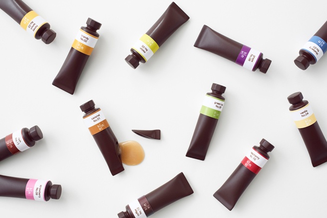
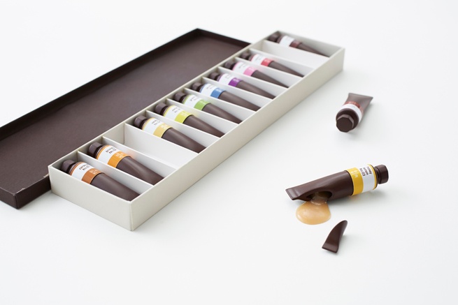
Image Credit: Nendo
2) Fat Pig Chocolate
This organic chocolate brand has roots in design -- it's owned and operated by New York-based ad agency The Brooklyn Brothers, whose founders decided to give the chocolate business a chance as a way to better understand their clients' business needs (although a love of chocolate was also involved).
Their package design entices chocolate-lovers to "pig out" with the following copy on the back of each bar: "Get your snout in this. Shove every single square in your face right now. And do it quick. Or some other fat pig might ask you for a piece. Oink, oink!"
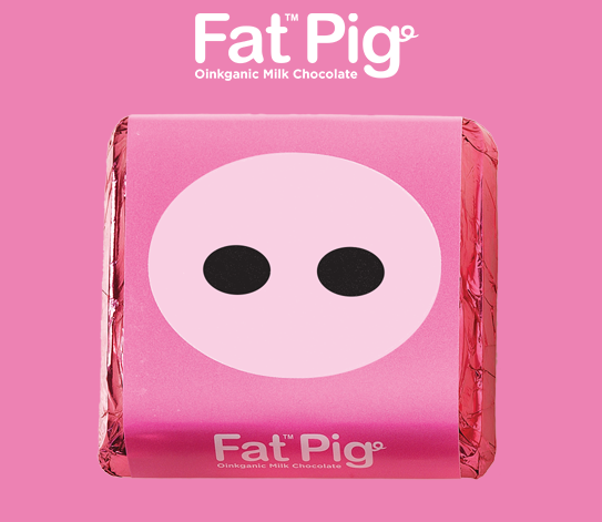
Image Credit: Fat Pig Chocolate
3) LYRA
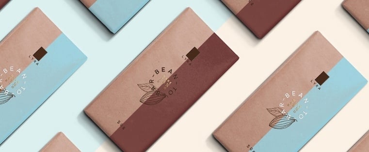
When this Slovakian bean-to-bar chocolate company launched a premium line of bars, they enlisted the help of designer Michal Slovák to create a design that was as "simple, playful and extraordinary" as the chocolate itself.
To emphasize the brand's local charm in it's native country, a paper-bag style base was used for the wrapper. Both varieties have a two-toned label -- a warm brown for the dark chocolate and a robin's egg blue for the milk chocolate. Celebrating the bar's star ingredient, the design features a simple illustration of a cocoa pod. Small gold lettering in the center adds a hint of sophistication.
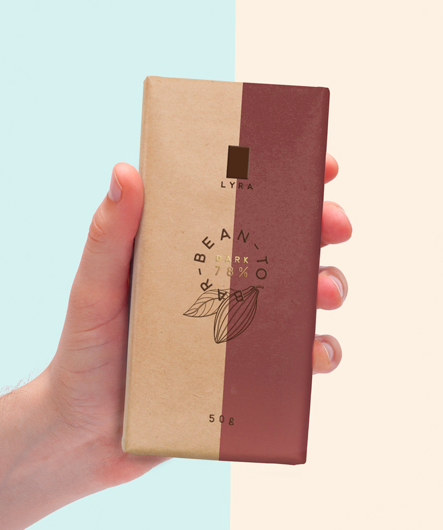
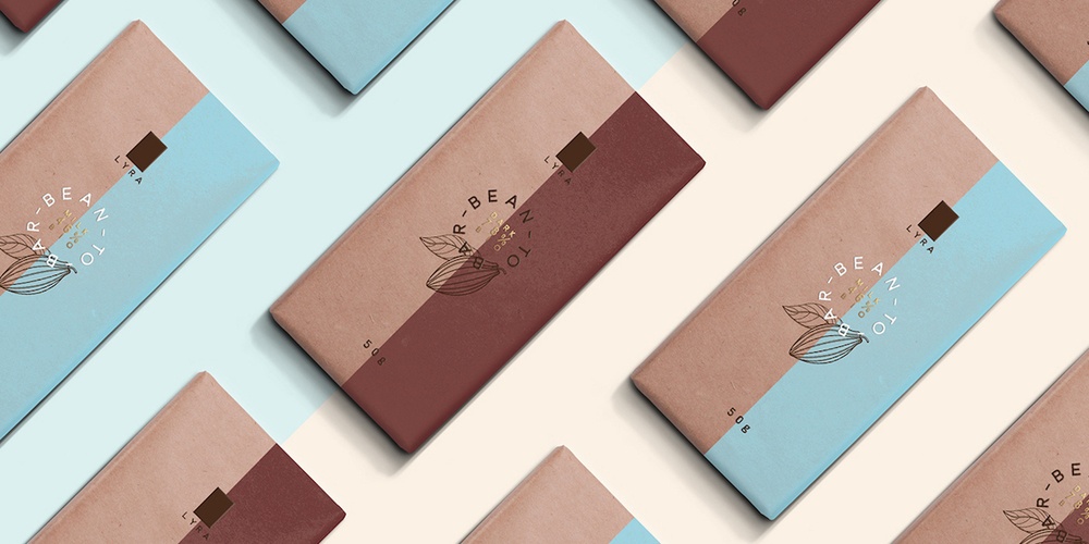
Image Credit: Michal Slovák
4) Fruene
Chocolate seems like a sweet way to honor the brave female pioneers of the world's northernmost inhabited area -- Svalbard, Norway. Norwegian graphic design firm Tank Design Tromsø worked closely with the Svalbard Museum and the Longyearbyen cafe (which happens to be the world's northernmost chocolate producer) to create these unique chocolate bar designs.
Blending vintage images of women fishing, hunting, and trapping (all of which are traditionally male-dominated activities in Svalbard), with bold typography, the wrappers put the stories font and center. After all, the brand's name -- Fruene -- literally translates to "ladies."
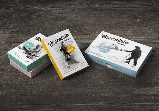
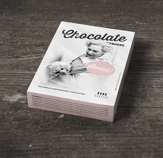
Image Credit: Lovely Package
5) Chocolates with Attitude
"The Hero", "The Seducer", "The Innocent" -- no, these aren't characters in an epic drama.. They're chocolates designed by Danish creative agency Bessermachen. The firm's Chocolates with Attitude box was developed as a way to showcase different personalities in packaging design, with a different chocolate treat cast as each core archetype. Each of the 12 individual packages within the box are an exercise in how different color schemes and typography can truly define the identity of a brand.
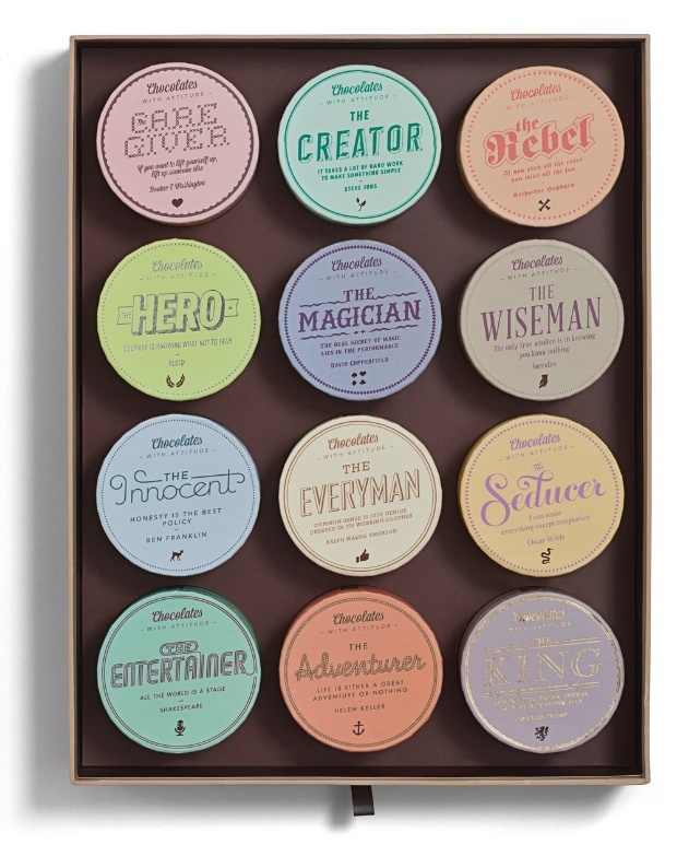
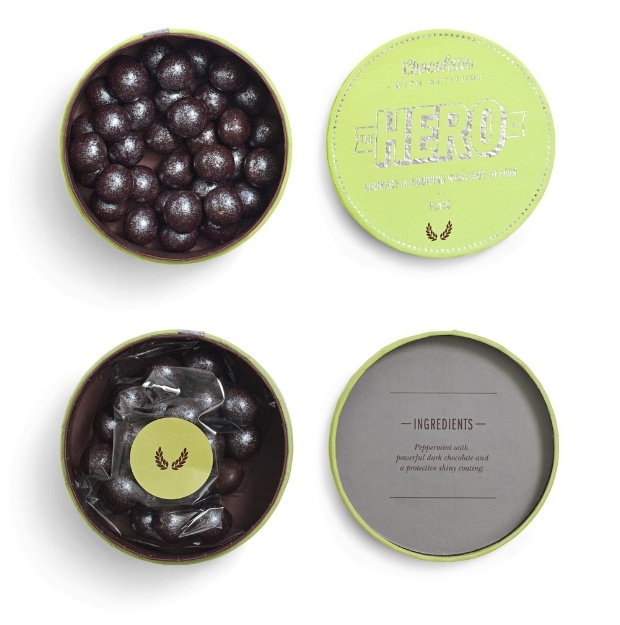
Image Credit: Bessermachen
6) Lapp & Fao
What's better than curling up with a good book? Eating a chocolate book, of course. German designers at Studio Chapeaux modeled these Lapp & Fao chocolate bar wrappers after old-fashioned travel journals, featuring custom illustrations reminiscent of Charles Darwin's specimen sketches. Each "book" features a volume number on the spine and is meant to feel like a "delicious memento" of Lapp & Fao's travels.
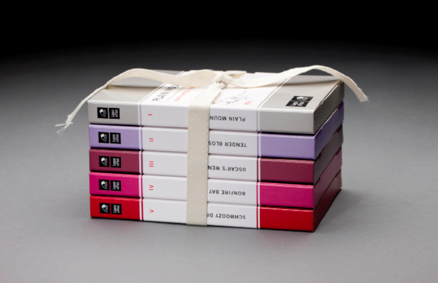
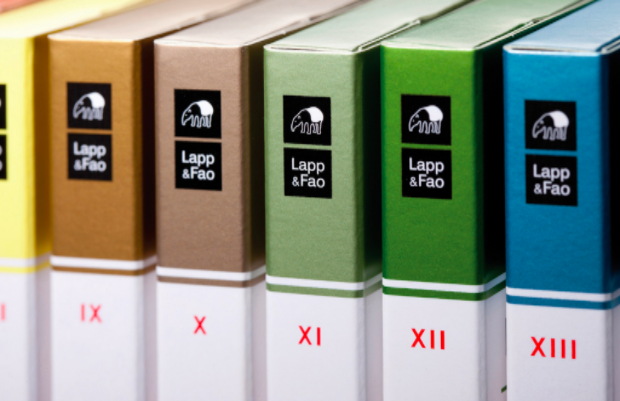
Image Credit: Studio Chapeaux
7) Chocolate Research Facility
Some design agencies would balk at the idea of designing individual packaging for over 100 different varieties of chocolate, but Singapore-based Asylum rose to the challenge. In a year-long project, the team created a collection of eclectic chocolate bar designs for Chocolate Research Facility that are perfectly cohesive in their eccentricity. Using bold graphics, bright patterns, and very limited text, no two flavors' packing look alike.
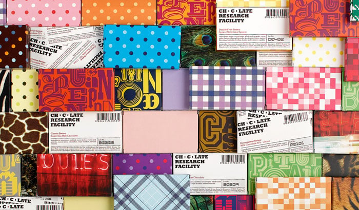
Image Credit: Asylum
8) Filter Chocolate
Tasked with creating an Indian-inspired concept for retailer Filter, Mumbai-based Alok Nanda & Company took a decidedly alternative approach. This monochromatic packaging design is a departure from the modern, colorful wrappers dominating the chocolate world and from what was expected. "We decided to do away with the kitsch and colours generally associated with India," the designer explained.
To keep the desaturated look central to India, the designer retained Indian motifs.
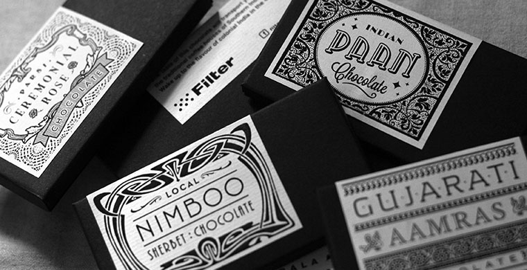
Image Credit: Filter
9) MAST Sea Salt Collection
A chocolate bar packaging roundup wouldn't be complete without a nod to Mast Brothers Chocolate, a pair of Brooklyn-based and self-described "groundbreaking" chocolatiers who emerged on the gourmet chocolate scene in 2007.
Past controversies aside, the Mast Brothers know good design. Their recent collaboration with wallpaper company Calico stands out for its use of organic textures paired with Mast's signature minimal typography. The process for these designs borrows elements from the sea salt chocolates themselves -- salt granules were sprinkled over watercolor paintings before they finished drying, resulting in textures of an otherworldly quality.
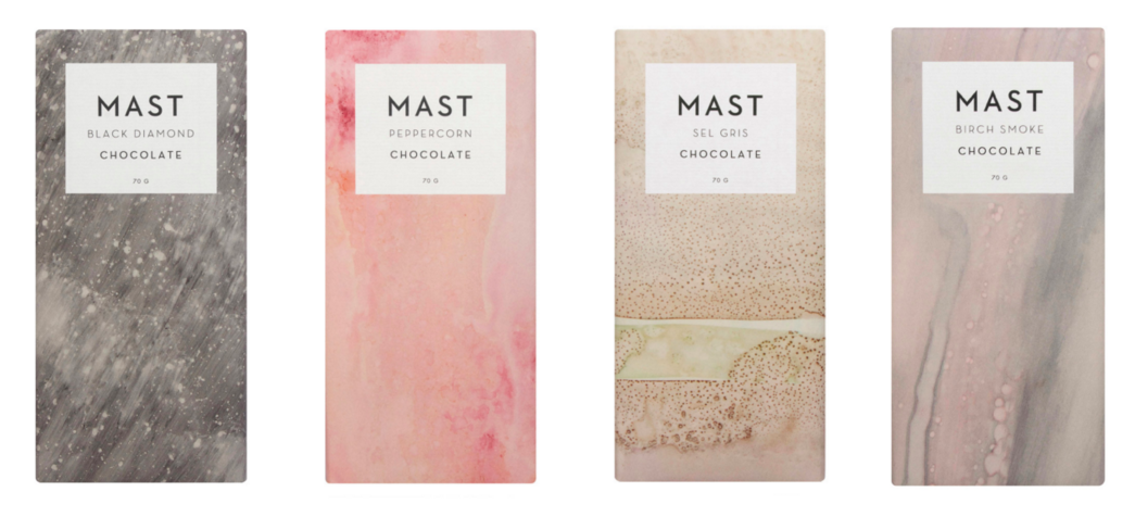
Image Credit: Calico
10) Alice Chocolate
Sometimes great things come in small packages. With sliding packaging inspired by a matchbox, Alice Chocolate was created and designed by Swiss branding consultants Michael Felber and Steven Mark Klein after they noticed a lack of real Swiss chocolate brands on the market.
The package features a classic 18th-century style silhouette and modern sans-serif typography, centered on a white background to minimize distraction. The founders believe that they have something truly iconic on their hands with Alice.
In the brand introduction, it says,"If there was a list of the 100 classic brand icons: Chanel No 5, Patek Philippe Calatrava, Hermès Kelly Bag... the goal is to become the chocolate on that mythical list."
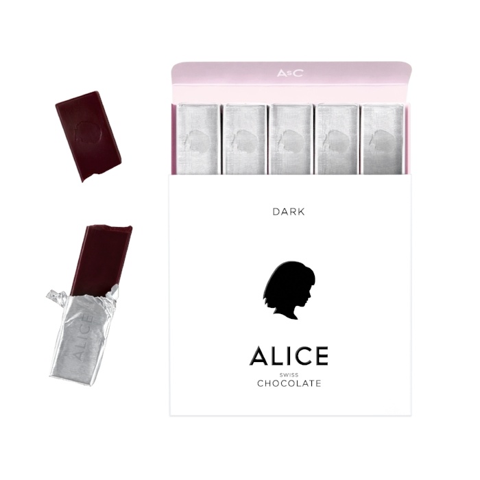
Image Credit: Alice Chocolate
11) Bennetto
This chocolate bar design by ONE DESIGN teaches us that there is probably nothing fancier than a bird in a suit. The folks at the New Zealand design agency spun up the quirky, illustrated packaging after confections company Bennetto requested something contemporary, sophisticated, and out of the box for their organic drinking chocolate, which comes in bar form. The whimsical design features exotic Peruvian birds in tailored clothing -- a nod to the chocolate's South American origins. The packaging is also sure to please environmentalists. Bennetto's website reads: "The grey cellulose wrapper we use on the twin packs is made from plant based renewable resources; use it on your worm farm if you like!"
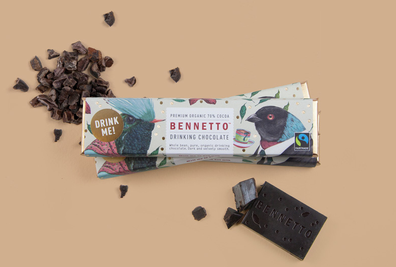
Image Credit: Bennetto
12) Dallmayr
Combining tradition and modernity, German agency Factor Product designed this envelope-inspired branding and packaging for Dallmayr, a delicatessen franchise in Europe. The client wanted packaging that would signal to consumers that they were holding a high-quality, high-class chocolate bar in their hand, and the Munich based designers definitely delivered; each structured paper envelope is sealed with a branded Dallmayr sticker, and features detailed illustrations unique to each flavor.
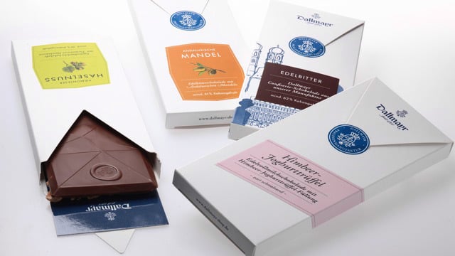
Image Credit: Factor Product
13) Melt
Here's a crazy idea: Why not feature chocolate on the chocolate bar label? JJAAKK Design did just that with their packaging concept for the fictional Melt chocolate company. Using raised ink, the team at JJAAKK covered the wrappers in an artful and realistic webbing of melted chocolate illustrations, "providing a tantalizing glimpse at the wonderfulness contained within."
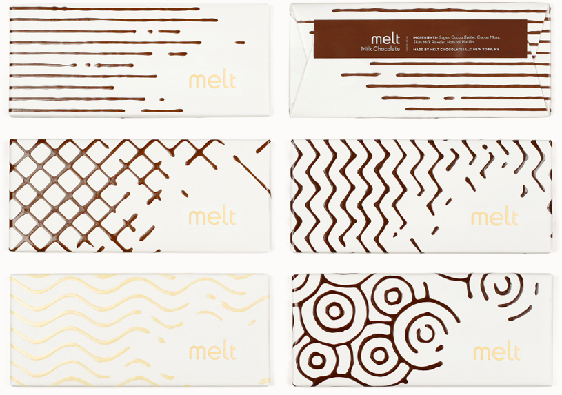
Image Credit: JJAAKK Design
14) Moonstruck
When Oregon-based Moonstruck Chocolate decided to start exploring national distribution for their premium single-origin chocolates, it came to brand design firm Sandstrom Partners for a look that would set the brand apart. The client wanted packaging that would "capture the imagination" and evoke an emotional response in chocolate lovers. The result was this enchanting series of wrappers, which use hand-cut paper illustration, embossing techniques, and multiple paper finishes for an elevated, "multi-sensory" experience.
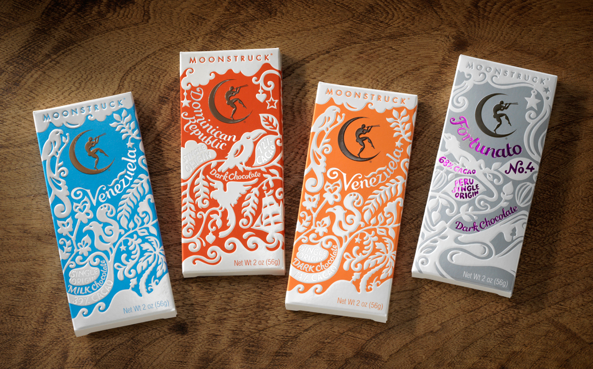
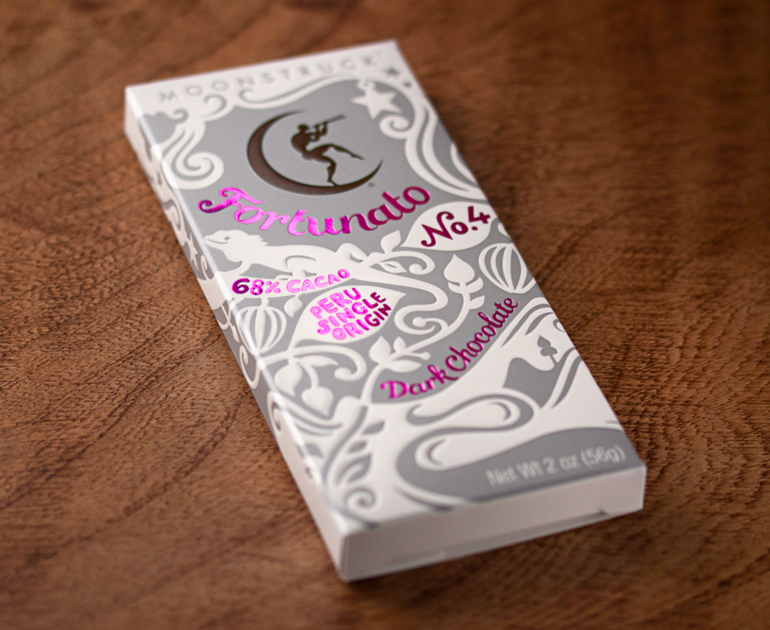
Image Credit: Sandstrom Partners
15) Hippo Hyfryd
These luxury vegan truffles from Welsh company Hyppo Hyfryd manage to look sophisticated and adorable at the same time, thanks to this unique design by Kutchibok. The sleek black box is embellished with a simple line illustration of a hippo, and the company's logo appears in handwritten font.
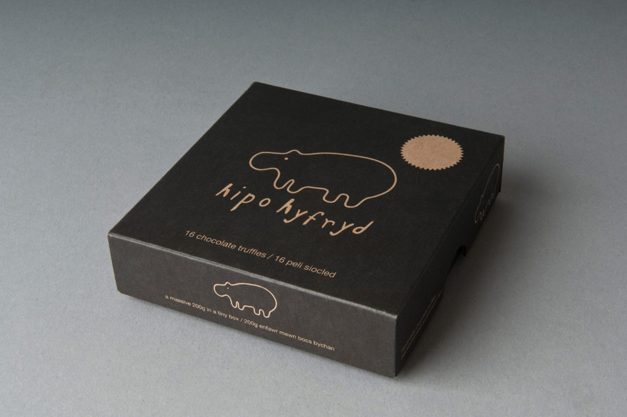
Image Credit: Kutchibok
from HubSpot Marketing Blog http://blog.hubspot.com/marketing/examples-chocolate-packaging-design
Via http://blog.hubspot.com/marketing/examples-chocolate-packaging-design

Great points there, thanks. And here is another relevant article, maybe someone will find it useful too ufo3d.com
ReplyDelete