
One of the barriers to getting your work read and widely shared in the age of information overload is time. With research revealing that 55% of pageviews are less than 15 seconds in duration, your content needs to provide value and pique interest quickly to align with your readers' behavior.
This doesn't mean that you should stop producing long-form content all together. However, it does task you with the challenge of creating more skimmable content that can be read and understood without a ton of effort. 
What does skimmable content look like? While there are many ways you can format your long-form content to make it more digestible, we've put together a list of sites that are doing a particularly good job of adapting their content for skim-readers.
TL;DR: Your readers don't have enough time to fully read your long-form blog content. Use the strategies below to make your content more skim-friendly.
13 Examples of Super Skimmable Content
1) DigiDay
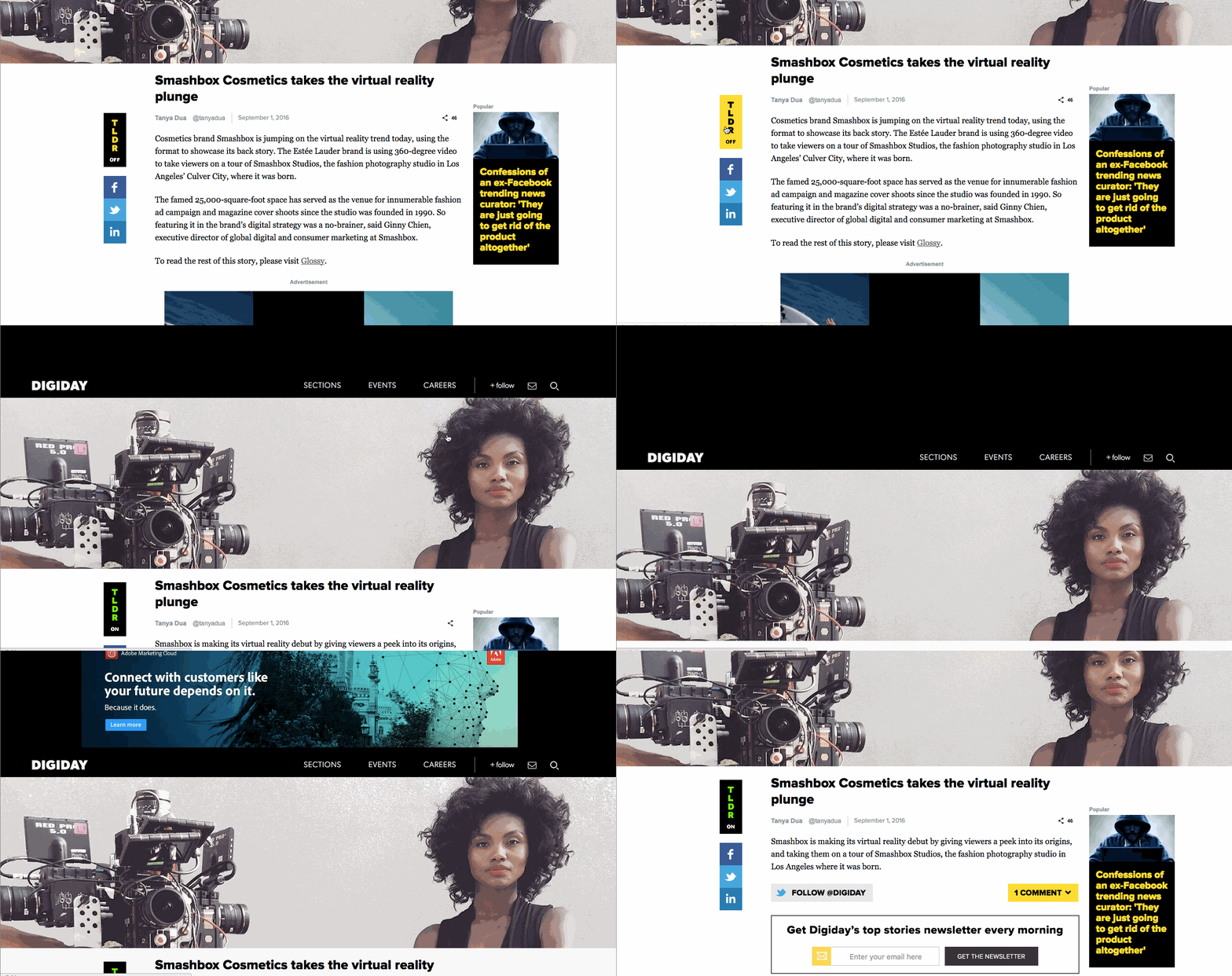
Last year, DigiDay introduced a TL;DR (“Too Long; Didn’t Read”) button for their articles. When TL;DR mode is turned on, long-form articles transform into shorter paragraphs with the article’s main points for maximum skimmability.
Pro Tip: If you can’t create a TL;DR button on your own site, consider writing an explainer paragraph like DigiDay’s that your readers can check out without having to read or skim your entire article.
2) theSkimm
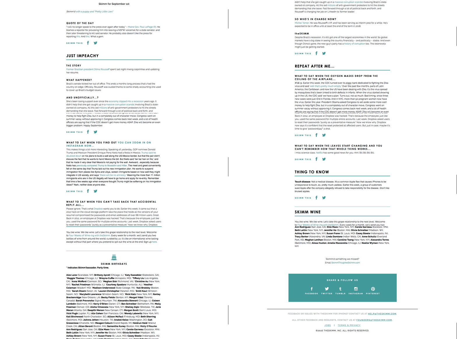
When it comes to skimmable content, there's nothing better than the aptly named newsletter: theSkimm.
The folks at theSkimm curate a newsletter of top stories Monday through Friday, accompanied by a brief summary of each headline. The newsletter is sent out before 8:00 a.m. EST with the intent of allowing readers to skim the news prior to arriving at work. And their approach is working: theSkimm grew its readership to 3.5 million in under two years.
But email isn't all they offer. In fact, theSkimm's website is also home to a series of boiled down news stories known as Skimm Guides, like this one on the Olympics:
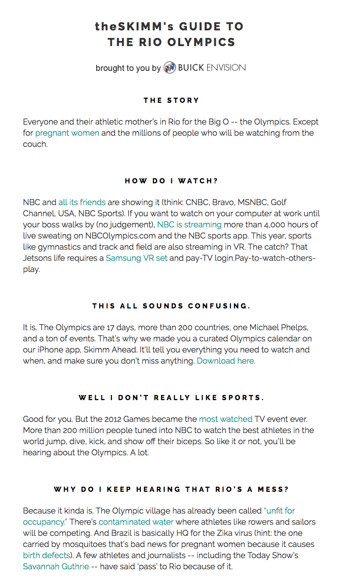 Sliced up into a series of digestible chunks, these guides cover everything you need to know about a specific topic in a way that's easy to consume and understand.
Pro Tip: Roundups rock. They're a great opportunity to beef up your email marketing strategy for subscribers or to publish a highly valuable, skimmable piece to draw more readers to your site.
3) CNN.com
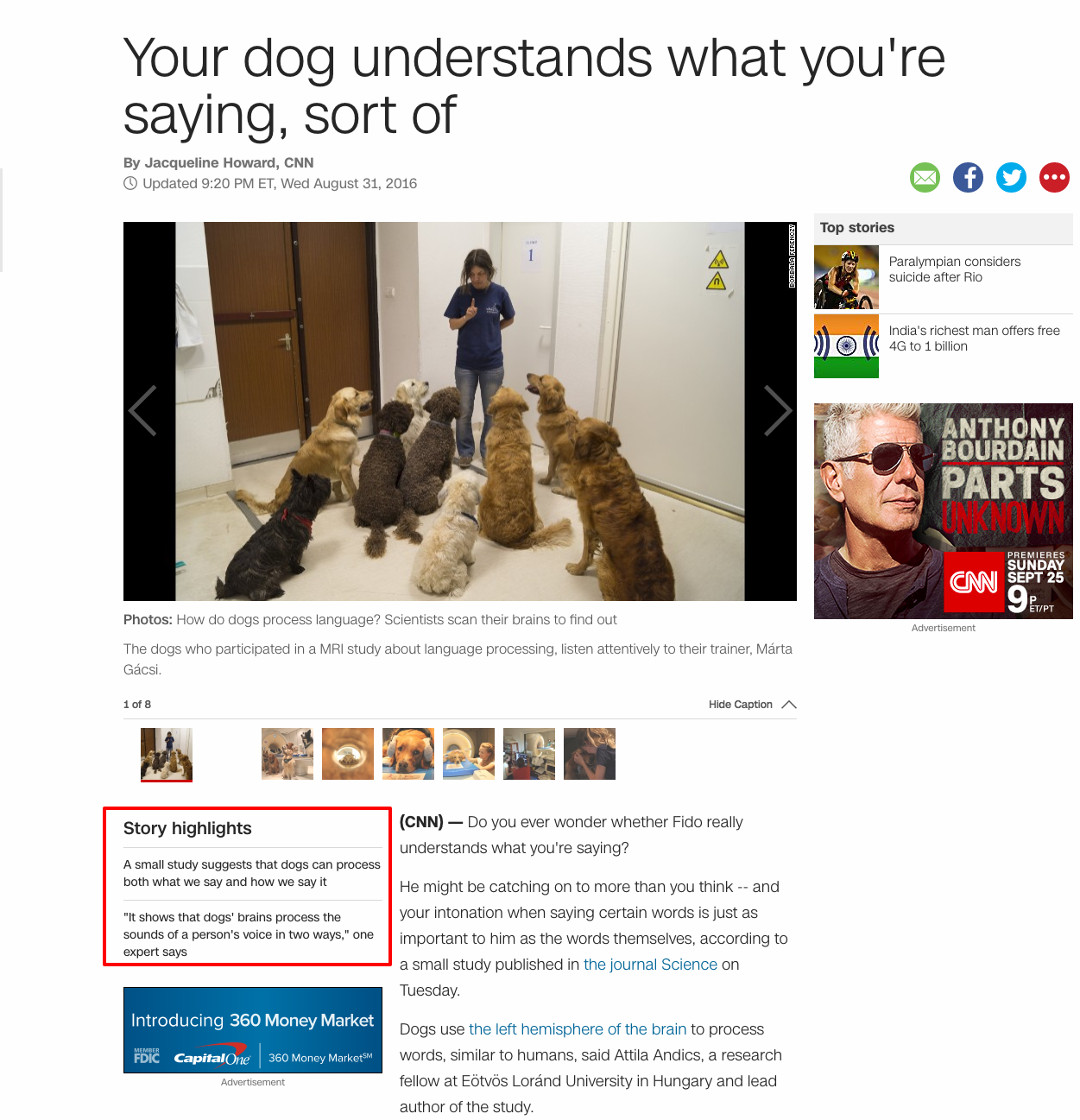
Most of CNN’s online stories are published with a ‘Story Highlights’ section at the top of each article to allow readers to glean the biggest points without having to scroll through the entire piece. Additionally, their articles are shared with a video or photo explainer from CNN News, which is another option for ease of understanding.
Pro Tip: Create a callout box at the beginning of your article with its main points. Try linking them to the different sections of your article to encourage reading the entire piece.
4) Inc.
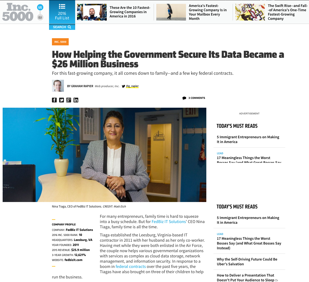
When Inc. publishes articles about companies that are taking part in technology innovation, the article leads off with a ‘Company Profile’ section so readers can understand the need-to-know information about the company and skip to the bottom to learn the big takeaways.
Inc. also uses slideshows in articles, which use engaging visuals and short explainers to help readers skim and distill the most important points:
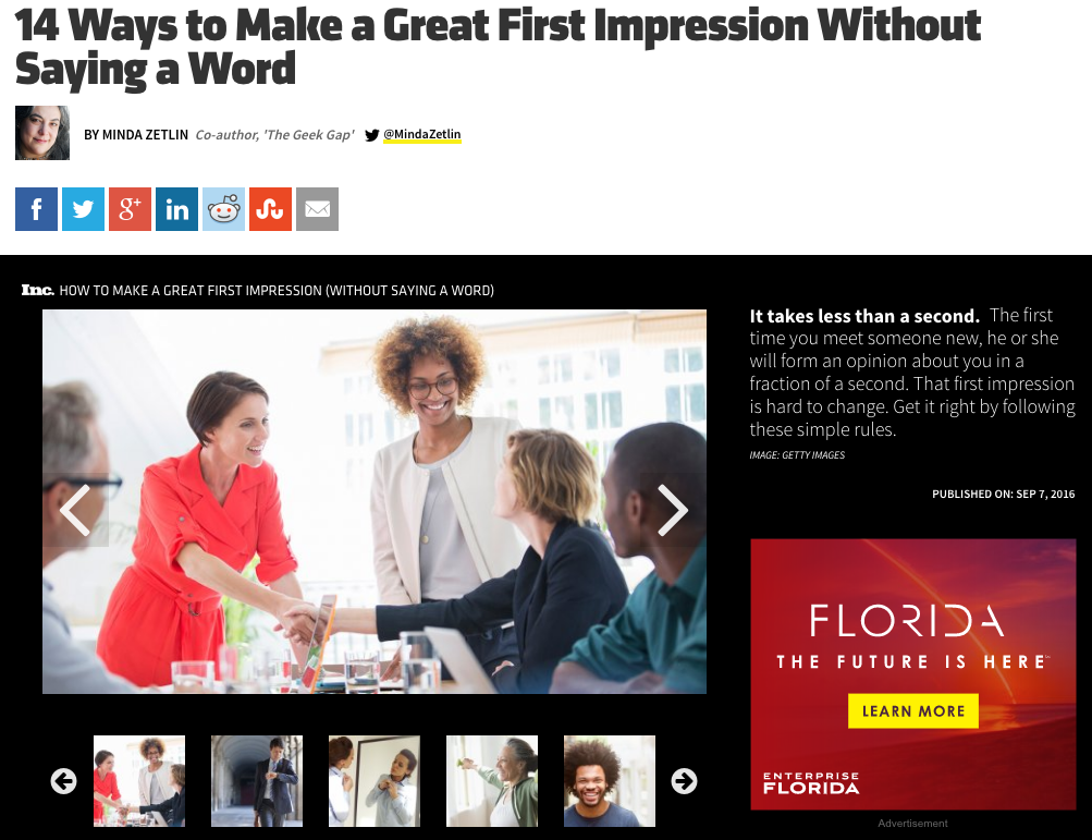
Pro Tip: Make a section at the beginning of the article with bulleted who, what, when, where, and why details about your story’s subject to provide readers context before they dive into the rest of your piece.
5) The Week
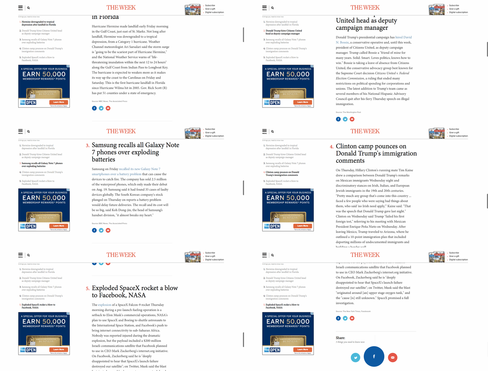
Every day of the week, The Week (get it?) publishes "5 Things You Need to Know," a roundup of political news stories with explainer paragraphs in addition to long-form news content. Readers can check it out on their site, or subscribe to receive it via email.
They also feature a "Speed Reads" section for readers who are on the go:
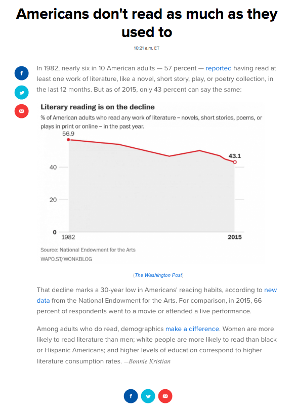
Pro Tip: Send a regular roundup of your strongest articles with a short explainer for readers who might have missed them when they were first published.
6) Bustle
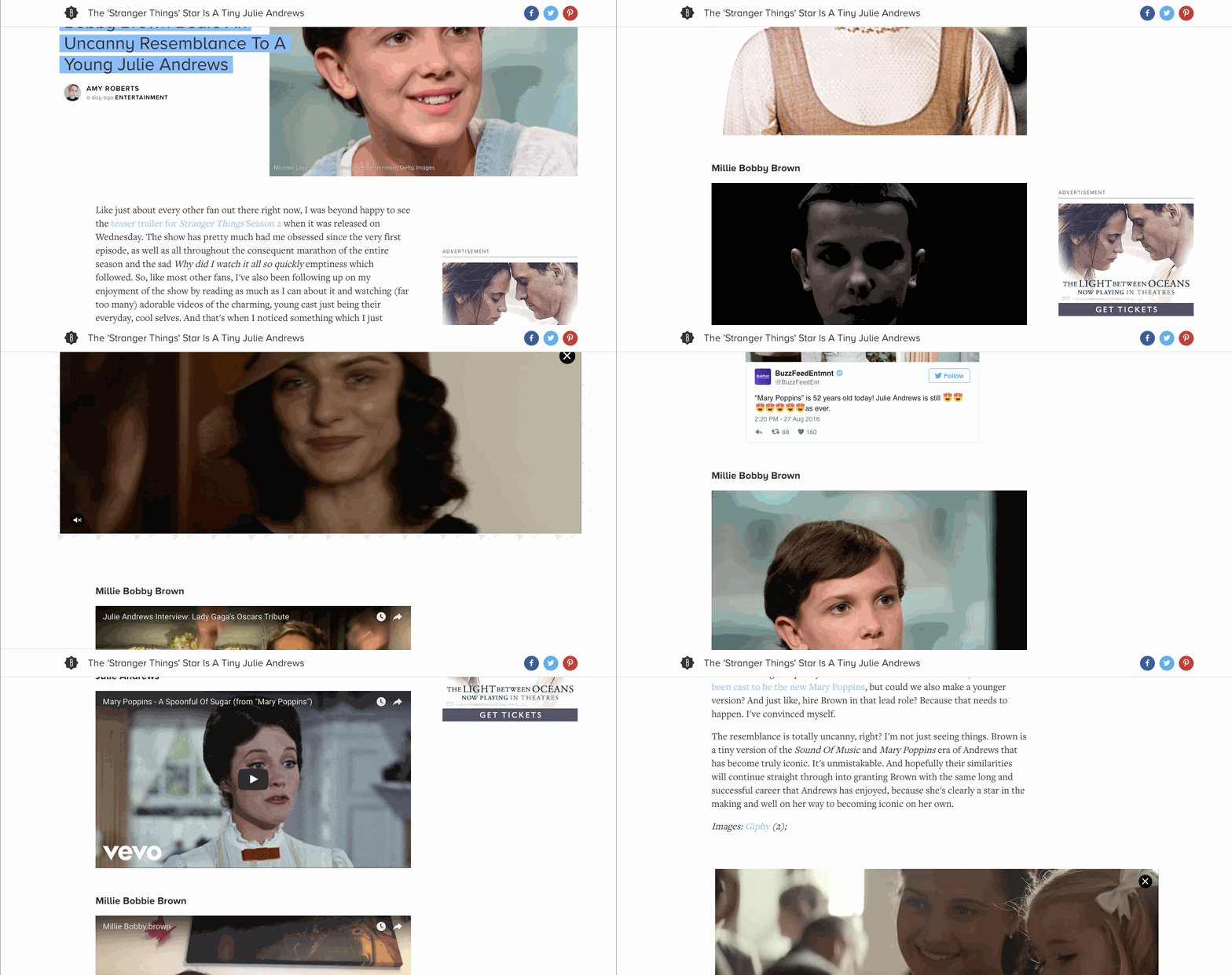
Bustle writes lifestyle articles in formats that allow for skimmability. By using headers and numbered lists in their content, they break up long-form content in a way that allows readers to quickly scan its main points.
Pro Tip: Large pieces of text can benefit from headers, numbers, and bulleting. Formatting will allow you to draw greater attention to your main points and will allow your reader to skim more easily.
7) Newser
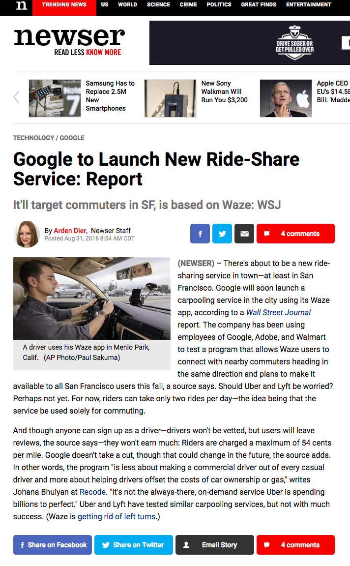
Newser’s slogan is “Read Less, Know More,” and their content’s skimmability achieves that mission. Their articles consist of short explainer paragraphs with links to longer original sources. Newser also uses subheadlines very strategically to drive home the main takeaways from their content.
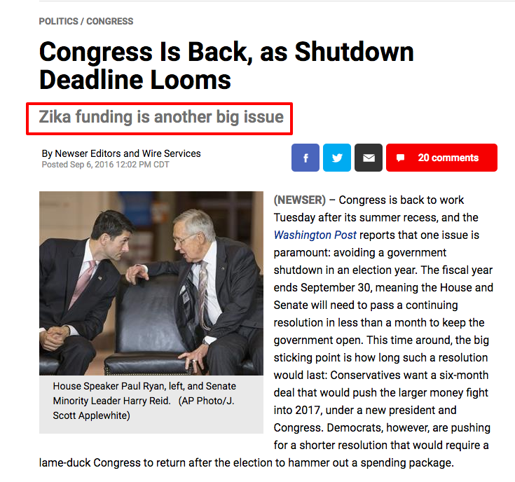
Pro Tip: Try linking out to your sources and condensing information you’re citing from them in your actual article. You’ll shorten your article while still providing additional information and value to your readers.
8) The Daily Beast
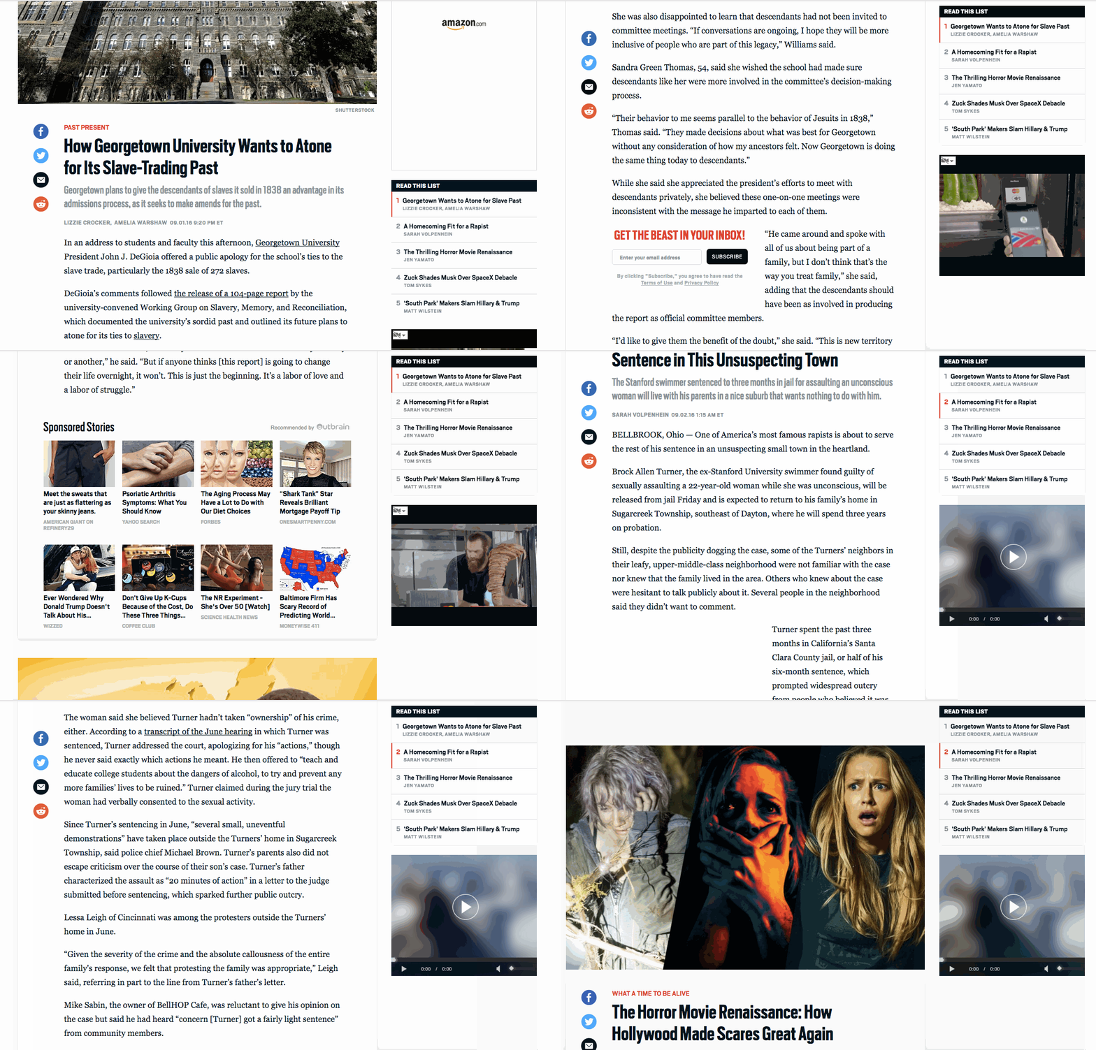
The Daily Beast has a feature that allows readers to visualize the progress they’ve made while reading an article. It doesn’t necessarily make the articles faster reads, but it allows the reader to see how they’ve progressed if they’re considering navigating away from the page before reaching the conclusion.
Pro Tip: Add language throughout your post that helps to set the reader's expectations -- whether that be a helpful nudge like, "Keep reading to learn more about XYZ," or something simple like, "We'll cover XYZ in more detail in the final section." Additionally, if your publication can implement a progress bar, be sure to analyze that information to determine where readers are dropping off to inform your future strategy.
9) Circa News
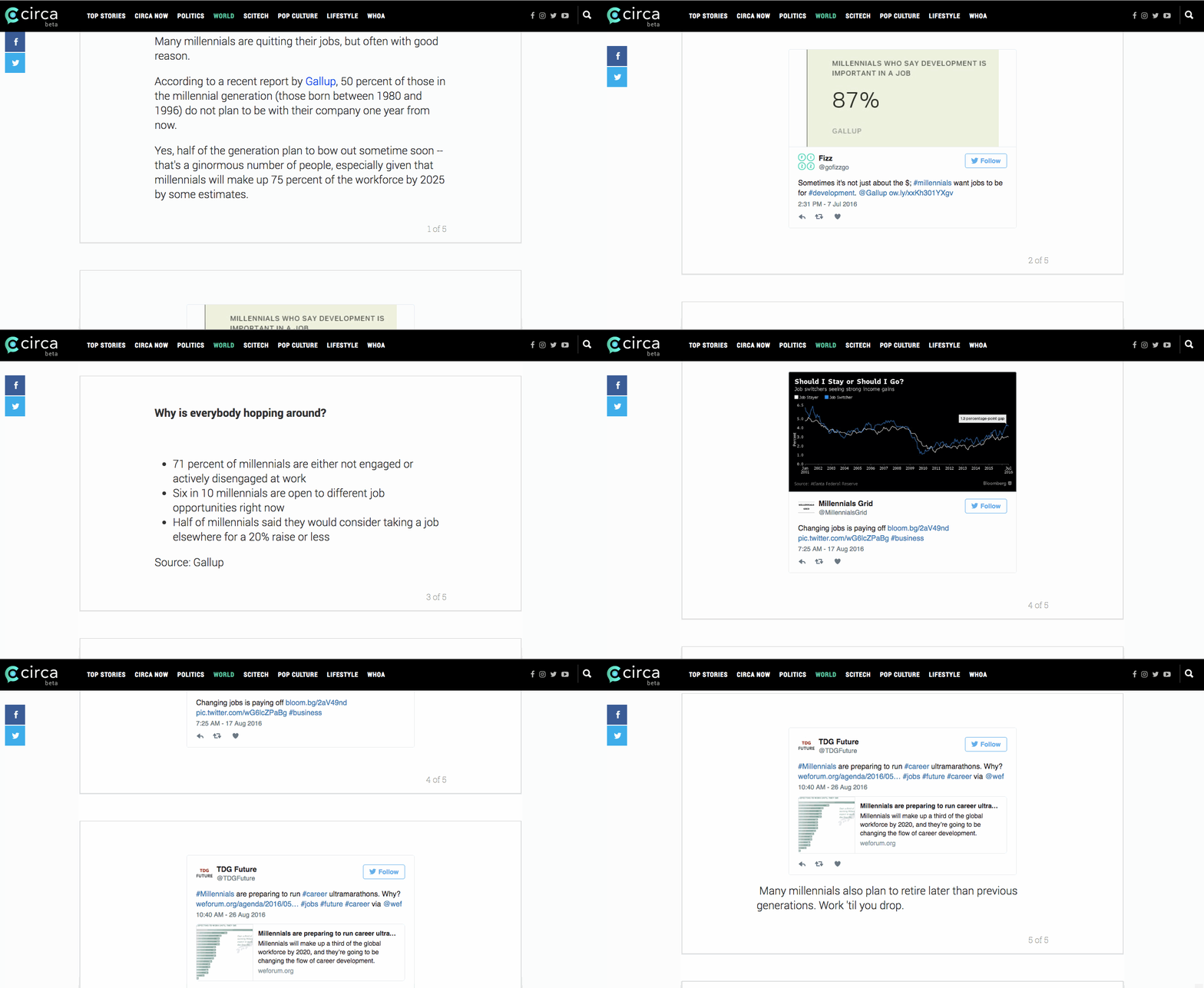
Circa is a news aggregator devoted to speed reading. Their articles take shape with the help of curated paragraph explainers, tweets, and poll results to create a stream of content on a specific topic or story that can be easily skimmed or clicked on for more information.
Pro Tip: Don't be afraid to pull in curated visuals -- charts, tweets, videos, and so on -- to help say more with less.
10) The Verge
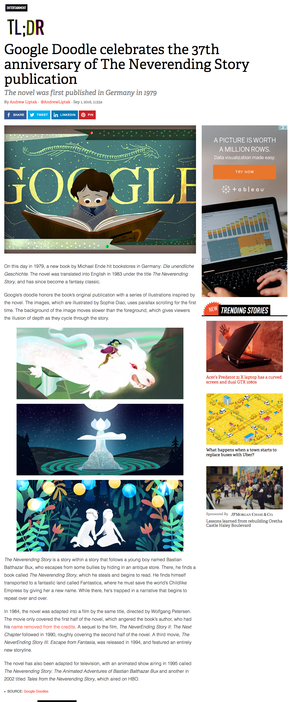
The Verge has an entire TL;DR section of its website for readers who already know that they want to get the information quickly and easily. They position it as its own section on their homepage, like a column, with bright colors to attract more readers.
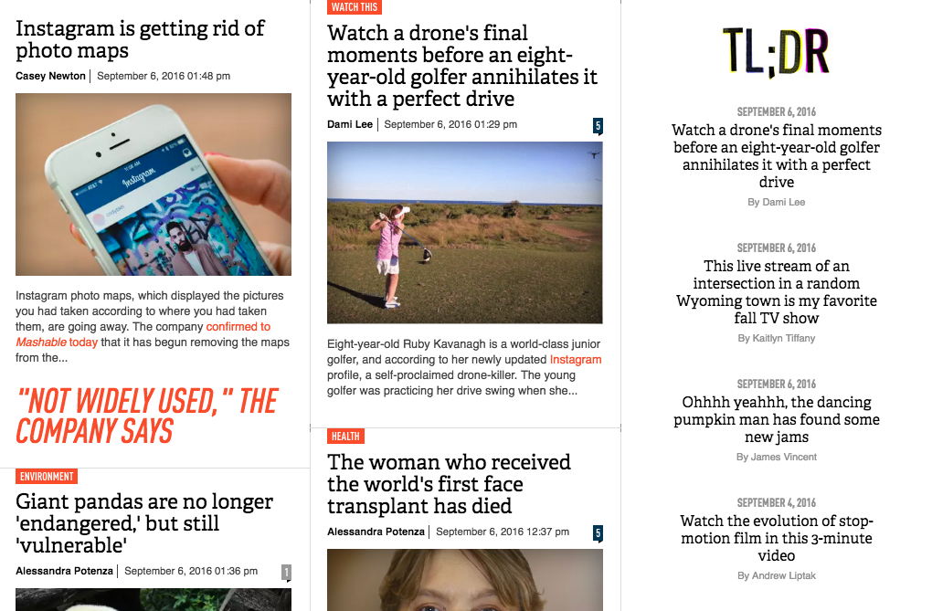
The articles feature big, bold quotes and lots of visuals to make it easy to work through, without sacrificing value.

Pro Tip: If you organize your blog by categories, create one category for quick reads so your visitors can easily identify pieces to skim and pieces to close read.
11) Medium
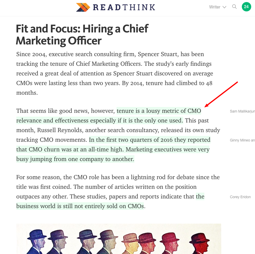
Medium has a highlighting feature that allows readers to highlight key phrases in the articles they read, and see which phrases have been highlighted by other readers. This feature allows for skim-reading in a unique and crowdsourced way, and makes it easy for visitors to see what other readers have found interesting.
Pro Tip: Highlight or type in bold key sentences in your article to signal to skim-readers where they should be close reading.
12) The Los Angeles Times

The Los Angeles Times publishes an Essential California roundup of local news each week featuring short blurbs about news stories in the area and links to the full articles already written about them.
Pro Tip: Do an article roundup featuring your top articles or based on another theme to encourage skimming.
13) The Great Discontent
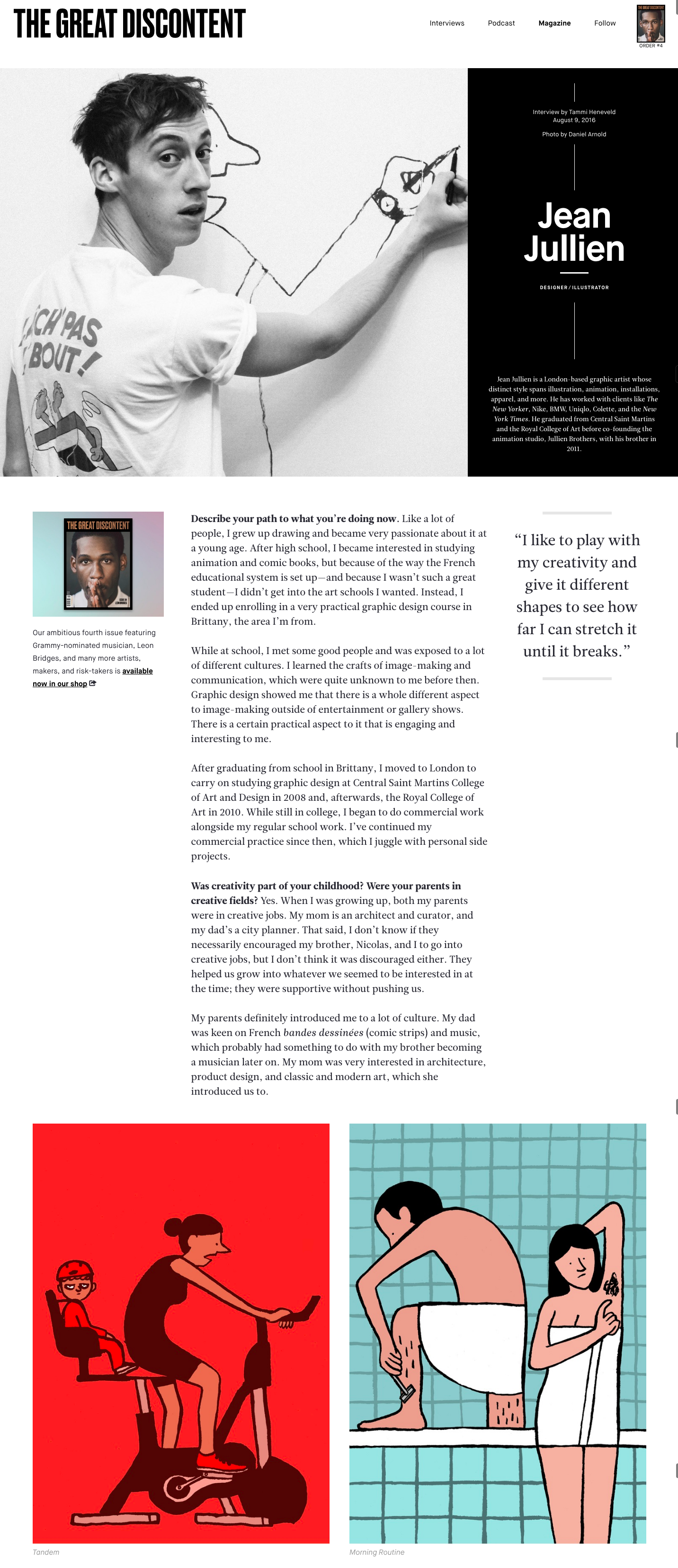
The Great Discontent publishes highly skimmable interviews by incorporating introductory sections, images and illustrations, and blocked quotes to break up large chunks of text in visually interesting and reader-friendly ways.
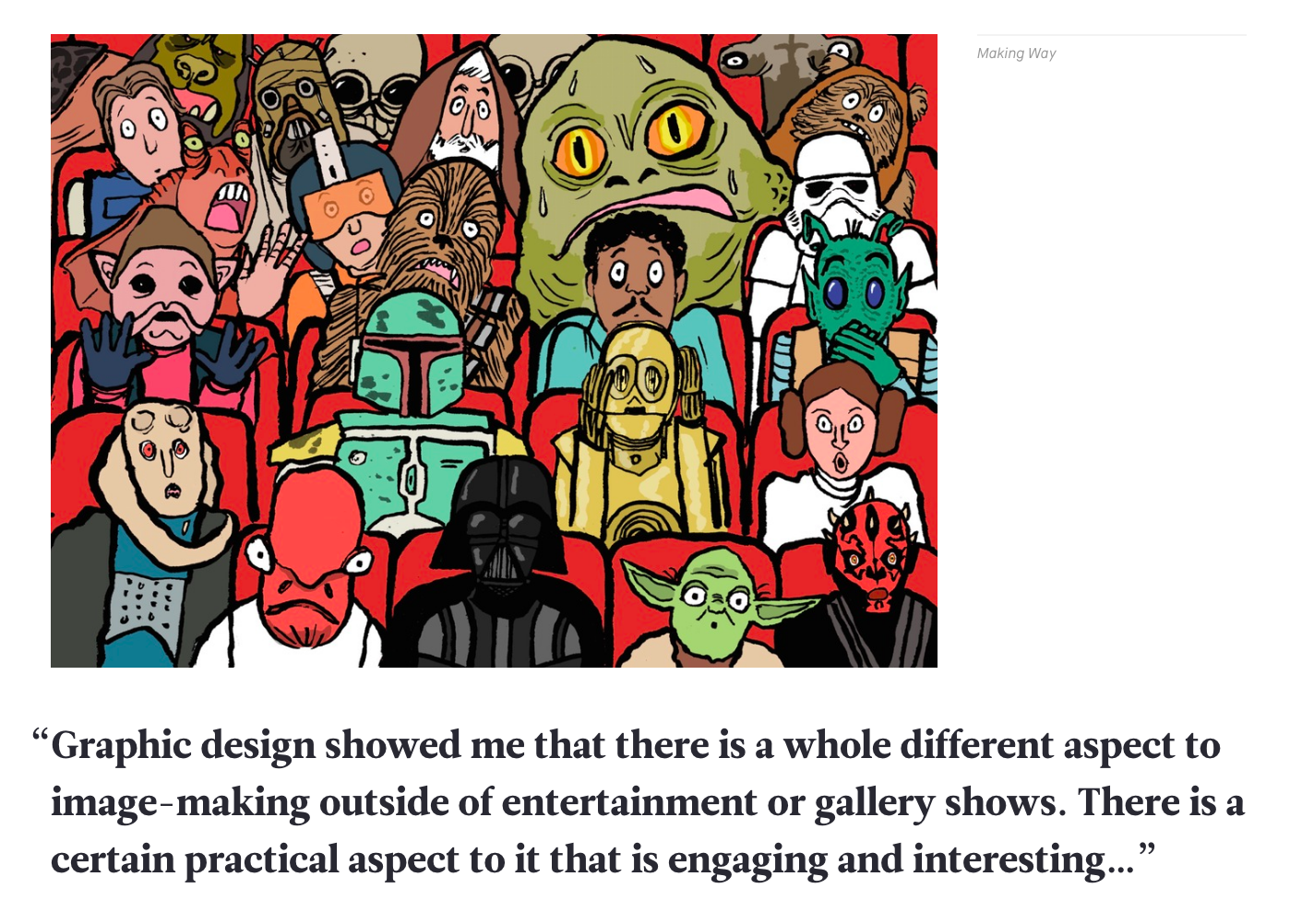
Pro Tip: Images and coded blockquotes or callout boxes can break up your text to highlight must-read sections for your skim-readers.
Now that you’ve learned how to make your long-form content format more skim-friendly, learn some specific strategies for writing more concisely in your next blog post.
What strategies do you use to make your content more readable? Share with us in the comments below!
from HubSpot Marketing Blog http://blog.hubspot.com/marketing/examples-skimmable-content
Via http://blog.hubspot.com/marketing/examples-skimmable-content

No comments:
Post a Comment