Wednesday, 7 September 2016

20 of the Best Personal Websites We've Ever Seen

Personal_Websites.jpeg

Ah, the job search.

Some refer to it as a full-time job in itself, others compare it to dating, and several cats over at BuzzFeed think it just plain sucks. But it doesn't have to be that way ...

When you’re applying for a job, you’re typically asked to submit a resume and cover letter. Maybe your LinkedIn profile. But there are better ways to stand out against your competition, and building a personal website is one of them.

A personal website can serve different goals, but perhaps what it does best is provide you with an opportunity to tell your story. And with 53% of employers reporting that the resume alone did not provide enough information to determine if the candidate would be a good fit, that storytelling element can really help to improve your odds.

If you're thinking about creating a personal website of your very own, check out the examples below that hit the nail on the head.

18 of the Best Personal Websites We've Ever Seen

Resumes

Whether you create a single-page site or a larger portfolio, the web resume serves as a more personalized option for sharing information and demonstrating your technological skills -- and it can be used by all types of job seekers.

Even if you have very little work experience, you can leverage a website to build a better picture of your capabilities and yourself as a candidate, while leaning on your traditional resume to provide the basic background information.

1) Gary Sheng

shengfinal.gif

Unlike a standard resume document, Sheng's website makes it easy for him to include logos and clickable links that allow his software engineering and web development skills to shine.

We love that visitors can choose to scroll down his page to view all of the website’s categories (“About Me,” “My Passion,” etc.), or jump to a specific page using the top navigation.

The "My System" section reads like a company mission statement, and this personal touch helps humanize his work and make him more memorable.

2) Raf Delorez

Raf_Final.gif

Delorez’s web resume is modern, cool, and informative. It shows off his personality, branding, and developing skills in a way that’s still very simple and clear. Not to mention, his use of color and saturation in his photo puts a face to his name in an eye-catching way.

Want to get in touch with Delorez? Simply click the CTA located under his brief bio to open up an email that's pre-addressed directly to him. Or select one of the social media icons to connect with him on platforms like Twitter -- where his cover photo happens to seamlessly align with the branding of his website. Well played, Delorez.

Rafael_Derolez__Twitter_Cover_Photo.png

3) Brandon Johnson

Brandon_JOhnson_gif.gif

Johnson’s incredible resume must be seen to be believed. Beautiful images of planets help to compliment his planetary science background, and animations make his resume more of an experience than a document.

In terms of design, the textured, multi-layered background adds greater depth to the two-dimensional page in a way that evokes feelings of space and the planetary systems, which Johnson's work focuses on.

As an added bonus, Johnson managed to squeeze in some witty "Easter eggs," like this message that appears when you try to select the "OFF" button that appears under the section on hyrdrocode:

Screen_Shot_2016-09-06_at_4.01.44_PM.png

4) Quinton Harris

quinton_harris_gif.gif

Harris' resume uses photos to tell his personal story -- and it reads kind of like a cool, digital scrapbook. It covers all the bases of a resume -- and then some -- by discussing his educational background, work experience, and skills in a highly visual way.

Not to mention, the copy is fantastic. It's clear that Harris took the time to carefully choose the right words to describe each step of his personal and professional journey. For example, the section on storytelling reads:

NYC, my new home, is filled with the necessary secrets to not only propel my craft forward, but my identity as an artist. With every lens snapped and every pixel laid, I am becoming me.

5) Sean Halpin

Sean_Halpin___a_web_designer___developer___About.png

Halpin’s resume is short, sweet, and to the point, which is authentic to his voice and personal branding outlined on the site. The white space allows his designs and copy to pop and command the reader's attention, which helps to improve readability -- especially on mobile devices:

Sean_Halpin_Mobile.pngSean_Halpin_Mobile_Site.png

Best Practices for Resume Websites

  1. Code your resume so it can be crawled by search engines.
  2. Offer a button to download your resume in PDF so the hiring manager can add it to your file.
  3. Keep branding consistent between the website and document versions: Use similar fonts, colors, and images so you’re easy to recognize.
  4. Be creative and authentic to yourself. Think about the colors, images, and media you want to be a part of your story that you couldn’t include in a document resume.

Portfolios

Building an online portfolio is a highly useful personal branding and marketing tool if your work experience and skill set call for content creation. In fact, photographers, graphic designers, illustrators, writers, and content marketers can all use web portfolios to show off their skills in a more user-friendly way than a resume or hard copy portfolio.

6) Tony D'Orio

tony_dorio_gif.gif

It's important to keep the design of your visual portfolio simple to let images capture visitors' attention, and D'Orio accomplishes this by featuring bold photographs front-and-center on his website. His logo and navigation menu are clear and don't distract from his work. And he makes it easy for potential customers to download his work free of charge.

Want to give it a try? Click on the hamburger menu in the top left corner, then select + Create a PDF to select as many images as you'd like to download.

Create_a_PDF.png

Once you open the PDF, you'll notice that it comes fully equipped with D'Orio's business card as the cover ... just in case you need it.

Screen_Shot_2016-09-06_at_4.22.29_PM.png

7) Gari Cruze

Gari_Cruze__copywriter..png

Cruze is a copywriter. But by turning his website into a portfolio featuring images from different campaigns he’s worked on, he makes visitors want to keep clicking to learn more about him.

His site’s humorous copy -- specifically in the “17 Random Things” and “Oh Yes, They’re Talking” sections -- serves to show off his skills, while making himself more memorable as well. These pages also include his contact information on the right-hand side, making it easy to reach out an connect at any point:

Gary_Cruze.png

8) Melanie Daveid

Melanie_Daveid_Portfolio-1.png

Daveid’s website is a great example of “less is more.”

This developer’s portfolio features clear, well-branded imagery of campaigns and apps that Daveid worked on, and she shows off her coding skills when you click through to see the specifics of her work.

While it might seem overly minimal to only include three examples of her work, Daveid did her portfolio a service by including her best, most noteworthy campaigns. At the end of the day, it's better to have fewer examples of excellence in your portfolio than many examples of mediocrity.

9) The Beast is Back

The_Beast_is_Back_Portfolio.png

Christopher Lee's portfolio is busy and colorful in a way that works. When you read more about Lee on his easily navigable site, you realize that such a fun and vibrant homepage is perfect for an illustrator and toy designer.

His web portfolio highlights eye-catching designs with recognizable brands, such as Target and Mario, along with links to purchase his work. This is another gallery-style portfolio with pops of color that make it fun and give it personality, thus making it more memorable.


Best Practices for Portfolio Websites

  1. Use mainly visuals. Even if you're showcasing your written work, using logos or other branding is more eye-catching for your visitors.
  2. Don't be afraid to be yourself. Your personality, style, and sense of humor could be what sets you apart against other sites!
  3. Organization is key. If your portfolio is full of photos, logos, and other images, make sure it's easy for visitors to navigate to where they can contact you.
  4. Brand yourself. Choose a logo or icon to make your information easily identifiable.

Blogs

Consistently publishing on a blog is a great way to attract attention on social media and search engines -- and drive traffic to your site. Blogging is a smart way to give your work a personality, chronicle your experiences, and stretch your writing muscles. You might write a personal blog if you're a writer by trade, but virtually anyone can benefit from adding a blog to their site and providing useful content for their audience.

10) Everywhereist

Everywhereist_Blog.png

This blog looks a bit busier, but its consistent branding helps visitors easily navigate the site. The travel blog uses globe iconography to move visitors around the site, making it easy to explore sections beyond the blog.

It also features a "Best Of" section that allows new visitors to learn about what the blog covers to get acclimated. The color scheme is warm, neutral, and free of excess clutter that could distract from the content.

11) fifty coffees

Fifty_Coffees_Blog.png

fifty coffees chronicles the author's series of coffee meetings in search of her next job opportunity, and it does a great job of using photography and visuals to assist in the telling of her lengthy stories.

The best part? Each post ends with numbered takeaways from her meetings for ease of reading comprehension. The high-quality photography used to complement the stories is like icing on the cake.

12) Minimalist Baker

min_baker_final.gif

I'm not highlighting Dana's food blog just because the food looks delicious and I'm hungry. Her blog uses a simple white background to let her food photography pop, unique branding to make her memorable, and mini-bio to personalize her website.

13) Kendra Schaefer

KENDRAAA.gif

Kendra's blog is chock-full of information about her life, background, and professional experience, but she avoids overwhelming visitors by using a light background and organizing her blog's modules to minimize clutter. She also shares links to additional writing samples, which bolsters her writing authority and credibility.

Best Practices for Blogs

  1. Keep your site simple and clutter-free to avoid additional distractions beyond blog posts.
  2. Publish often. Company blogs that publish more than 16 posts per months get nearly 3.5X the web traffic of blogs that published less than four posts per month.
  3. Experiment with different blog styles, such as lists, interviews, graphics, and bullets.
  4. Employ visuals to break up text and add context to your discussion.

Demos

Another cool way to promote yourself and your skills is to create a personal website that doubles as a demonstration of your coding, design, illustration, or developer skills. These sites can be interactive and animated in a way that provides information about you and also shows hiring managers why they should work with you. This is a great website option for technical and artistic content creators such as developers, animators, UX designers, website content managers, and illustrators.

14) Albino Tonnina

albino_final.gif

Tonnina is showcasing advanced and complicated web development skills, but the images and icons he uses are still clear and easy to understand. He also offers a simple option to view his resume at the beginning of his site, for those who don't want to scroll through the animation.

15) Bobby Kane

bobbykanefinal.gif

Kane's site is aesthetically beautiful. And thanks to the cool background photo and minimalist site design, his experience really stands out. He further shows off his design and coding skills at the very bottom of his site, where he demonstrates his ability to code background design changes. This small touch makes his demo more interactive and will make visitors stop and think, "that's cool!"

Want to check it out? Pull down the arrow at the top of his site to refresh the background.

16) Robby Leonardi

robby_leonardi.gif

Leonardi's incredible demo website uses animation and web development skills to turn his portfolio and resume into a video game for site visitors. The whimsical branding and unique way of sharing information ensures that his site is memorable to visitors.

17) Samuel Reed

reed_final.gif

Reed uses his page as a start-to-finish demo of how to code a website. His website starts as a blank white page and ends as a fully interactive site that visitors can watch him code themselves. The cool factor makes this website memorable, and it makes his skills extremely marketable.

18) Devon Stank

devonstank.gif

Stank's demo site does a great job of showing that he has the web design chops and it takes it a step further by telling visitors all about him, his agency, and his passions. It's the perfect balance of a demo and a mini-resume.

Plus, we love this highly personal video of Stank describing his passion:

Best Practices for Demo Websites

  1. Brand yourself and use consistent logos and colors to identify your name and your skills amongst the bevy of visuals.
  2. Don't overwhelm your visitors with too many visuals at once -- especially if your demo is animated. Be sure to keep imagery easy to understand so visitors aren't bombarded when they visit your site.

Need help updating or building your personal website? Learn more about the specifics of writing a great bio and creating your personal brand.

What's the best personal website you've ever seen? Share your thoughts in the comments below.

Some refer to it as a full-time job in itself, others compare it to dating, and several cats over at BuzzFeed think it just plain sucks. But it doesn't have to be that way ...

When you’re applying for a job, you’re typically asked to submit a resume and cover letter. Maybe your LinkedIn profile. But there are better ways to stand out against your competition, and building a personal website is one of them.

A personal website can serve different goals, but perhaps what it does best is provide you with an opportunity to tell your story. And with 53% of employers reporting that the resume alone did not provide enough information to determine if the candidate would be a good fit, that storytelling elements can really help to improve your odds.

If you're thinking about creating a personal website of your very own, check out the examples below that hit the nail on the head.

17 of the Best Personal Websites We've Ever Seen

Resumes

Whether you create a single-page site or a larger portfolio, the web resume serves as a more personalized option for sharing information and demonstrating your technological skills -- and it can be used by all types of job seekers.

Even if you have very little work experience, you can leverage a website to build a better picture of your capabilities and yourself as a candidate, while leaning on your traditional resume to provide the basic background information.

1) Gary Sheng

shengfinal.gif

Unlike a standard resume document, Sheng's website makes it easy for him to include logos and clickable links that allow his software engineering and web development skills to shine.

We love that visitors can choose to scroll down his page to view all of the website’s categories (“About Me,” “My Passion,” etc.), or jump to a specific page using the top navigation.

The "My System" section reads like a company mission statement, and this personal touch helps humanize his work and make him more memorable.

2) Raf Delorez

Raf_Final.gif

Delorez’s web resume is modern, cool, and informative. It shows off his personality, branding, and developing skills in a way that’s still very simple and clear. Not to mention, his use of color and saturation in his photo puts a face to his name in an eye-catching way.

Want to get in touch with Delorez? Simply click the CTA located under his brief bio to open up an email that's pre-adressed directly to him. Or select one of the social media icons to connect with him on platforms like Twitter -- where his cover photo happens to seamlessly align with the branding of his website. Well played, Delorez.

Rafael_Derolez__Twitter_Cover_Photo.png

3) Brandon Johnson

Brandon_JOhnson_gif.gif

Johnson’s incredible resume must be seen to be believed. Beautiful images of planets help to compliment his planetary science background, and animations make his resume more of an experience than a document.

In terms of design, the textured, multi-layered background adds greater depth to the two-dimensional page in a way that evokes feelings of space and the planetary systems, which Johnson's work focuses on.

As an added bonus, Johnson managed to squeeze in some witty "Easter eggs," like this message that appears when you try to select the "OFF" button that appears under the section on hyrdrocode:

Screen_Shot_2016-09-06_at_4.01.44_PM.png

4) Quinton Harris

quinton_harris_gif.gif

Harris' resume uses photos to tell his personal story -- and it reads kind of like a cool, digital scrapbook. It covers all the bases of a resume -- and then some -- by discussing his educational background, work experience, and skills in a highly visual way.

Not to mention, the copy is fantastic. It's clear that Harris took the time to carefully choose the right words to describe each step of his personal and professional journey. For example, the section on storytelling reads:

NYC, my new home, is filled with the necessary secrets to not only propel my craft forward, but my identity as an artist. With every lens snapped and every pixel laid, I am becoming me.

5) Sean Halpin

Sean_Halpin___a_web_designer___developer___About.png

Halpin’s resume is short, sweet, and to the point, which is authentic to his voice and personal branding outlined on the site. The white space allows his designs and copy to pop and command the reader's attention, which helps to improve readability -- especially on mobile devices:

Sean_Halpin_Mobile.pngSean_Halpin_Mobile_Site.png

Best Practices for Resume Websites

  1. Code your resume so it can be crawled by search engines.
  2. Offer a button to download your resume in PDF so the hiring manager can add it to your file.
  3. Keep branding consistent between the website and document versions: Use similar fonts, colors, and images so you’re easy to recognize.
  4. Be creative and authentic to yourself. Think about the colors, images, and media you want to be a part of your story that you couldn’t include in a document resume.

Portfolios

Building an online portfolio is a highly useful personal branding and marketing tool if your work experience and skill set call for content creation. In fact, photographers, graphic designers, illustrators, writers, and content marketers can all use web portfolios to show off their skills in a more user-friendly way than a resume or hard copy portfolio.

6) Tony D'Orio

tony_dorio_gif.gif

It's important to keep the design of your visual portfolio simple to let images capture visitors' attention, and D'Orio accomplishes this by featuring bold photographs front-and-center on his website. His logo and navigation menu are clear and don't distract from his work. And he makes it easy for potential customers to download his work free of charge.

Want to give it a try? Click on the hamburger menu in the top left corner, then select + Create a PDF to select as many images as you'd like to download.

Create_a_PDF.png

Once you open the PDF, you'll notice that it comes fully equipped with D'Orio's business card as the cover ... just in case you need it.

Screen_Shot_2016-09-06_at_4.22.29_PM.png

7) Gari Cruze

Gari_Cruze__copywriter..png

Cruze is a copywriter. But by turning his website into a portfolio featuring images from different campaigns he’s worked on, he makes visitors want to keep clicking to learn more about him.

His site’s humorous copy -- specifically in the “17 Random Things” and “Oh Yes, They’re Talking” sections -- serves to show off his skills, while making himself more memorable as well. These pages also include his contact information on the right-hand side, making it easy to reach out an connect at any point:

Gary_Cruze.png

8) Melanie Daveid

Melanie_Daveid_Portfolio-1.png

Daveid’s website is a great example of “less is more.”

This developer’s portfolio features clear, well-branded imagery of campaigns and apps that Daveid worked on, and she shows off her coding skills when you click through to see the specifics of her work.

While it might seem overly minimal to only include three examples of her work, Daveid did her portfolio a service by including her best, most noteworthy campaigns. At the end of the day, it's better to have fewer examples of excellence in your portfolio than many examples of mediocrity.

9) The Beast is Back

The_Beast_is_Back_Portfolio.png

Christopher Lee's portfolio is busy and colorful in a way that works. When you read more about Lee on his easily navigable site, you realize that such a fun and vibrant homepage is perfect for an illustrator and toy designer.

His web portfolio highlights eye-catching designs with recognizable brands, such as Target and Mario, along with links to purchase his work. This is another gallery-style portfolio with pops of color that make it fun and give it personality, thus making it more memorable.


Best Practices for Portfolio Websites

  1. Use mainly visuals. Even if you're showcasing your written work, using logos or other branding is more eye-catching for your visitors.
  2. Don't be afraid to be yourself. Your personality, style, and sense of humor could be what sets you apart against other sites!
  3. Organization is key. If your portfolio is full of photos, logos, and other images, make sure it's easy for visitors to navigate to where they can contact you.
  4. Brand yourself. Choose a logo or icon to make your information easily identifiable.

Blogs

Consistently publishing on a blog is a great way to attract attention on social media and search engines -- and drive traffic to your site. Blogging is a smart way to give your work a personality, chronicle your experiences, and stretch your writing muscles. You might write a personal blog if you're a writer by trade, but virtually anyone can benefit from adding a blog to their site and providing useful content for their audience.


10) Everywhereist

Everywhereist_Blog.png

This blog looks a bit busier, but its consistent branding helps visitors easily navigate the site. The travel blog uses globe iconography to move visitors around the site, making it easy to explore sections beyond the blog.

It also features a "Best Of" section that allows new visitors to learn about what the blog covers to get acclimated. The color scheme is warm, neutral, and free of excess clutter that could distract from the content.

11) fifty coffees

Fifty_Coffees_Blog.png

fifty coffees chronicles the author's series of coffee meetings in search of her next job opportunity, and it does a great job of using photography and visuals to assist in the telling of her lengthy stories.

The best part? Each post ends with numbered takeaways from her meetings for ease of reading comprehension. The high-quality photography used to complement the stories are like icing on the cake.

12) Minimalist Baker

min_baker_final.gif

I'm not highlighting Dana's food blog just because the food looks delicious and I'm hungry. Her blog uses a simple white background to let her food photography pop, unique branding to make her memorable, and mini-bio to personalize her website.

13) Kendra Schaefer

KENDRAAA.gif

Kendra's blog is chock-full of information about her life, background, and professional experience, but she avoids overwhelming visitors by using a light background and organizing her blog's modules to minimize clutter. She also shares links to additional writing samples, which bolsters her writing authority and credibility.

Best Practices for Blogs

  1. Keep your site simple and clutter-free to avoid additional distractions beyond blog posts.
  2. Publish often. Company blogs that publish more than 16 posts per months get nearly 3.5X the web traffic of blogs that published less than four posts per month.
  3. Experiment with different blog styles, such as lists, interviews, graphics, and bullets.
  4. Employ visuals to break up text and add context to your discussion.

Demos

Another cool way to promote yourself and your skills is to create a personal website that doubles as a demonstration of your coding, design, illustration, or developer skills. These sites can be interactive and animated in a way that provides information about you and also shows hiring managers why they should work with you. This is a great website option for technical and artistic content creators such as developers, animators, UX designers, website content managers, and illustrators.

14) Albino Tonnina

albino_final.gif

Tonnina is showcasing advanced and complicated web development skills, but the images and icons he uses are still clear and easy to understand. He also offers a simple option to view his resume at the beginning of his site, for those who don't want to scroll through the animation.

15) Bobby Kane

bobbykanefinal.gif

Kane's site is aesthetically beautiful. And thanks to the cool background photo and minimalist site design, his experience really stands out. He further shows off his design and coding skills at the very bottom of his site, where he demonstrates his ability to code background design changes. This small touch makes his demo more interactive and will make visitors stop and think, "that's cool!"

Want to check it out? Pull down the arrow at the top of his site to refresh the background.

16) Robby Leonardi

robby_leonardi.gif

Leonardi's incredible demo website uses animation and web development skills to turn his portfolio and resume into a video game for site visitors. The whimsical branding and unique way of sharing information ensures that his site is memorable to visitors.

17) Samuel Reed

reed_final.gif

Reed uses his page as a start-to-finish demo of how to code a website. His website starts as a blank white page and ends as a fully interactive site that visitors can watch him code themselves. The cool factor makes this website memorable, and it makes his skills extremely marketable.

18) Devon Stank

devonstank.gif

Stank's demo site does a great job of showing that he has the web design chops and it takes it a step further by telling visitors all about him, his agency, and his passions. It's the perfect balance of a demo and a mini-resume.

Plus, we love this highly personal video of Stank describing his passion:

Best Practices for Demo Websites

  1. Brand yourself and use consistent logos and colors to identify your name and your skills amongst the bevy of visuals.
  2. Don't overwhelm your visitors with too many visuals at once -- especially if your demo is animated. Be sure to keep imagery easy to understand so visitors aren't bombarded when they visit your site.

Need help updating or building your personal website? Learn more about the specifics of writing a great bio and creating your personal brand.

What's the best personal website you've ever seen? Share your thoughts in the comments below.

50 examples of beautiful website design


from HubSpot Marketing Blog http://blog.hubspot.com/marketing/best-personal-websites
Via http://blog.hubspot.com/marketing/best-personal-websites

Essential Interview with the PR specialist

Public relation is the most diverse and very wide field that is why we asked Lizz Clark head Managing Director from Marketing Agency Hampshire. If anyone is asked what public relation is, there is a high likelihood that the response will be different from person to person is about three-quarters of the time. But all in all, public relations remain an important. You may view public relation as the spread of information and manage how that information is spread between the organization and the general public. Whether it is a product and its consumers, a sports team and its fans, a recruiting agency, and its clients, for an effective elevation of an organization brand a reliable two-way communication has to be maintained. When the public is kept happy that will translate into a wider audience and in turn draw more sales.

What do public relations mean to you?
The question tries to gauge a PR candidate’s approach and thinking to public relations. Because public relation can be further broken down, to touch areas such crisis control, marketing or even online community management, the question lets you gauge whether a candidate’s perceptions of public relations are in line with the company’s philosophy. An experienced PR should be all rounded, but specialization can, in turn, help the company move towards the right direction.

What skills have you do possess that would help you communicate a customer’s message?
A good PR candidate has great oral and written communication overall and has to be able to meet the set deadlines, persuasive and more importantly be able to make a long lasting connection. The best PR professional is also the best writer that clearly understands human nature. They can clearly articulate ideas in a concise way; they also must have beautiful intuition. What makes them stand out, even more, is their ability to be creative and energized during communicating a customer’s message.

How can you use social media to reach and impress media?
Social media can either leverage the company’s brand or completely break it in this information age. Traditional media like television print and radio goes hand in hand with the social media. This is where a good PR candidate goes out of her way to promote her personal brand on the social media. For example, a successful PR candidate will understand the existing connection between the social media and producing great content. If you take a look at a job candidate’s twitter feedsor LinkedIn page and nothing is impressive that clearly translates to real life when the candidate will be representing a client.

How would you handle a product recall or corporate fraud?
This is definitely a crisis management or problem-solving question. Take for an example where a situation that could in the worse of circumstances to the company. What you need to do is to explain what corporate fraud occurred or why the product had to be recalled so you can see how the candidate comes up a story. How well your PR candidate works under pressure or within a deadline? With this interview question, you are able to understand how a candidate may creatively or structurally handle a particular situation. It may be as small as working with colleagues and resolving conflicts or as big as managing product recall

The post Essential Interview with the PR specialist appeared first on Slick Social Media Job's.


from Slick Social Media Job's http://www.slicksocialmediajobs.com/essential-interview-with-the-pr-specialist/
Via http://www.slicksocialmediajobs.com/essential-interview-with-the-pr-specialist/

3 Leadership Styles to Strive For, and 3 to Avoid

"A good leader should always … "

How you finish that sentence could reveal a lot about your leadership style.

That's the idea behind a management survey tool called the Leadership Development Profile. Created by psychologist Susanne Cook-Greuter and professor Bill Torbert, the survey relies on a set of 36 open-ended sentence completion tasks to help researchers better understand how leaders develop and grow.

Participants are asked to finish open-ended phrases like "Good leaders always ... " with whatever sounds most natural to them. After that, a team of trained evaluators examine the results and determine where the survey taker's current leadership style fits into one of the predetermined categories called "action logics." In a Harvard Business Review article, action logics are defined as "how [leaders] interpret their surroundings and react when their power or safety is challenged."

The framework has been popularized and expanded upon by U.K.-based consulting group Harthill, and was the subject of Personal and Organizational Transformations -- a book by Harthill partner David Rooke, professor Dal Fisher, and Torbert. 

Through Harthill's leadership development work, Torbert and Rooke have surveyed thousands of American and European managers to determine their current leadership styles and explore their capacities for improvement. The researchers' work has revealed invaluable information about the distinct developmental stages of leaders, and what qualities and skills truly make a leader successful. 

Although the only way to know your current Leadership Development Profile is to have your results analyzed by a professional evaluator, it can't hurt to get acquainted with a few of the action logic profiles, and do some light self-analysis. "Relatively few leaders try to understand their own action logic, and fewer still have explored the possibility of changing it," Tolbert and Rooke wrote in Harvard Business Review.

Below, we've broken down three action logics that correspond to leaders with the capacity to bring effective, transformative change to their organization, and three that are correlated with less effective leaders. Keep in mind that these action logics are considered developmental stages, not fixed attributes -- most leaders will progress through multiple stages throughout their careers. 

3 Action Logics of Well-Developed Leaders 

1) Individualist

The individualist, according to Rooke and Tolbert, is self-aware, creative, and primarily focused on their own actions and development as opposed to overall organizational performance. This action logic is exceptionally driven by the desire to exceed personal goals and constantly improve their skills.

Leaders who align with this action logic have a tendency to trust their own intuition over established organizational processes, which can get them into trouble at times. However, in addition to enjoying exceptional self-awareness, the individualist is adept at relating to people with different perspectives and clearly communicating complex ideas.

These adaptive rhetoricians also possess a drive for constant improvement. An individualist is more comfortable with progress than sustained success, making them ideal leaders for heralding in organizational change.

2) Strategist

Strategists are acutely aware of the environments in which they operate. They have a deep understanding of the structures and processes that make their businesses tick, but they're also able to consider these frameworks critically and evaluate what could be improved.

This action logic is uncommonly adept at building consensus in divided groups. Like the individualist, they're able to perceive differences in perspective and adapt their message to appeal to multiple viewpoints. Unlike the individualist, the strategist is concerned with much more than their own personal development: They value the development of their organization as a whole, as well as the growth and individual achievements of those they manage.

"Strategists are highly effective change agents," Rooke and Tolbert explain. This action logic understands that conflict is inevitable -- especially in the face of change -- and they're well equipped to handle friction and lead the team towards a common vision. They are able to use their knowledge of personal relationships and professional structures to propel their ideas into action. 

3) Alchemist

Rooke and Tolbert describe this charismatic action logic as the most highly-evolved and effective at managing transformative organizational change. What distinguishes alchemists from other action logics is their unique ability to balance short-term needs and long-term goals; while they see the big picture in everything, they also fully understand the need to take details seriously. Under an alchemist leader, no department or employee is overlooked.

Alchemists are concerned with creating deep, foundational change that resonates not only across their individual organization, but also across the greater context in which they operate. In other words, alchemists want to make a profound and positive impact on whatever they do, and they possess the necessary empathy and moral awareness to get there. 

Leaders who correlate with this action logic are concerned with helping their employees reach their highest potential, and are extremely aware of the ripple effects of their decisions.

3 Action Logics of Less Developed Leaders

1) Opportunist

The action logic worst suited to leadership is by far the opportunist. These individuals tend to let their mistrust of others and egocentrism guide their actions, relying on a facade of control and intimidation tactics to keep their employees in line. "Opportunists tend to regard their bad behavior as legitimate in the cut and thrust of an eye-for-an-eye world," Rooke and Tolbert write.

Opportunists aren't concerned with personal development or the development of those they manage. Instead, they view others as competition to be bested, rejecting anyone who questions or criticizes their ideas.

With their behavior at odds with the organization's progress, opportunists don't tend to thrive in leadership roles. Their drive for constant competition can only get them so far. If they don't commit themselves to changing their ways, they tend to get replaced by more developed leaders.

2) Diplomat

Unlike the opportunist, the diplomat isn't concerned with competition or assuming control over situations. Instead, this action logic seeks to cause minimal impact on their organization by conforming to existing norms and completing their daily tasks with as little friction as possible.

These qualities make the diplomat a ideal fit for more team-oriented or supporting roles, but ill-suited to senior leadership positions.

"Diplomats are much more problematic in top leadership roles because they try to ignore conflict," explain Rooke and Tolbert. "They tend to be overly polite and friendly and find it virtually impossible to give challenging feedback to others."

Diplomats thrust into leadership roles will resist change at any cost, which can lead to problems for an organization looking to evolve. This type is most successful when they can provide the "social glue" in team situations, safely away from conflict.

3) Expert

The expert is a pro in their given field, constantly striving to perfect their knowledge of a subject and perform to meet their own high expectations. Rooke and Tolbert describe the expert as a talented individual contributor and a source of knowledge for the team. But this action logic does lack something central to great leaders: emotional intelligence.

Experts are so focused on their own pursuit of knowledge that they aren't always tuned into the needs of the organization or those around them. And as leaders, they suffer from always assuming that their opinion is correct. "When subordinates talk about a my-way-or-the-highway type of boss, they are probably talking about someone operating from an Expert action logic," write Rooke and Tolbert.

What action logics do you think are best suited to leadership at your agency? 

free ebook: leadership lessons


from HubSpot Marketing Blog http://blog.hubspot.com/marketing/leadership-styles-to-strive-avoid
Via http://blog.hubspot.com/marketing/leadership-styles-to-strive-avoid

Tuesday, 6 September 2016

7 Ways You're Letting Guilt Sabotage Your Work

Guilty_Puppy.jpg

When was the last time you felt bad about something you did -- or didn’t do?

For me, it happened about 30 minutes prior to typing this sentence. I left the house later than I had planned, because I allowed extra time for my workout. I felt guilty for dedicating time to my own stuff, when I knew I had a looming deadline.

But guess what? Yesterday, when I skipped my workout to get to the office earlier, I felt bad about that, too.

I can sense the proverbial chorus nodding in unison with me. That’s because guilt is an epidemic -- in fact, one in five people cite it as the reason why they don't take breaks. And it’s killing the quality of our work.

Many of us accept that as common sense -- overwork = underproductive. So why do we continue to self-sabotage and feel bad about the time we don't spend getting things done? Read on to learn the different ways we let guilt overtake our productivity, and why we do it.

7 Ways You're Letting Guilt Sabotage Your Work

1) You feel like you can’t take a break.

The correlation between workplace happiness and productivity isn’t exactly news at this point. And yet, we continue to ignore that advice. 

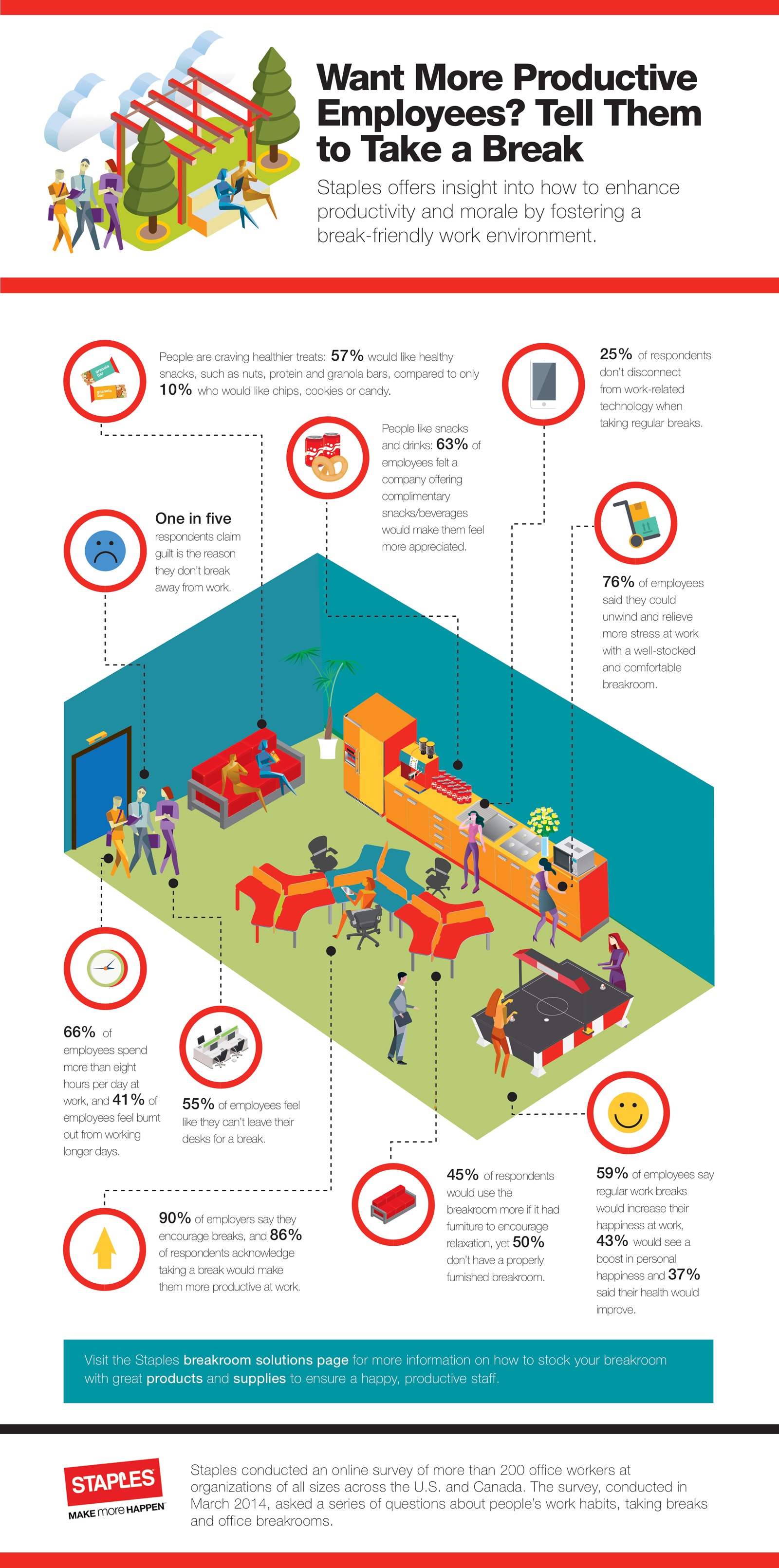
A survey conducted by Staples, for example, showed that 90% of employers say they encourage breaks. But here’s the thing -- 55% of employees feel like they can’t leave their desks for one. It’s not like we don’t know any better, though. In that same survey, 86% of workers acknowledged that taking a break would make them more productive.

So what’s stopping us?

I've definitely experienced mixed feelings about leaving my desk frequently throughout the day. What if my colleagues think I’m weird, or that I'm not getting my work done? In today’s workplace, we’re big on perception.

Luckily, I work somewhere that encourages taking that time to breathe, and has resources in place to support it. Maybe that's why Staples Advantage, the division that conducted the aforementioned survey, says that employers need to play their part in creating a break-taking culture.

Even if employees are fundamentally encouraged to take breaks, putting tangible resources behind it will create the cultural shift that really allows them to step away. Something like a break room goes a long way -- 76% percent of respondents said that having a well-equipped one would help relieve stress throughout the workday.

And the result of that relief? Getting more done, with higher quality. According to data collected by DeskTime, the top 10% most productive employees take 17-minute breaks for every 52 minutes of work they put in. And during those periods, they use hyper focus: No work during breaks (that includes email), and no distractions during the work time.

2) You feel bad asking for help.

Earlier this year, New York Times Magazine did a great job of summarizing the fine line between stress and guilt.

Guilt, Susan Dominus wrote, is “an especially corrosive form of distress: It’s that feeling that nags at you as you rush into the office, sweating, knowing that you are already late, or as you slip out for a ‘meeting’ that is, in fact, a much-needed haircut appointment.”

Lying about the time we put toward self-care indicates how guilty we feel for acknowledging that we need it. So maybe that’s why we feel like we’re falling short when we can’t do everything ourselves.

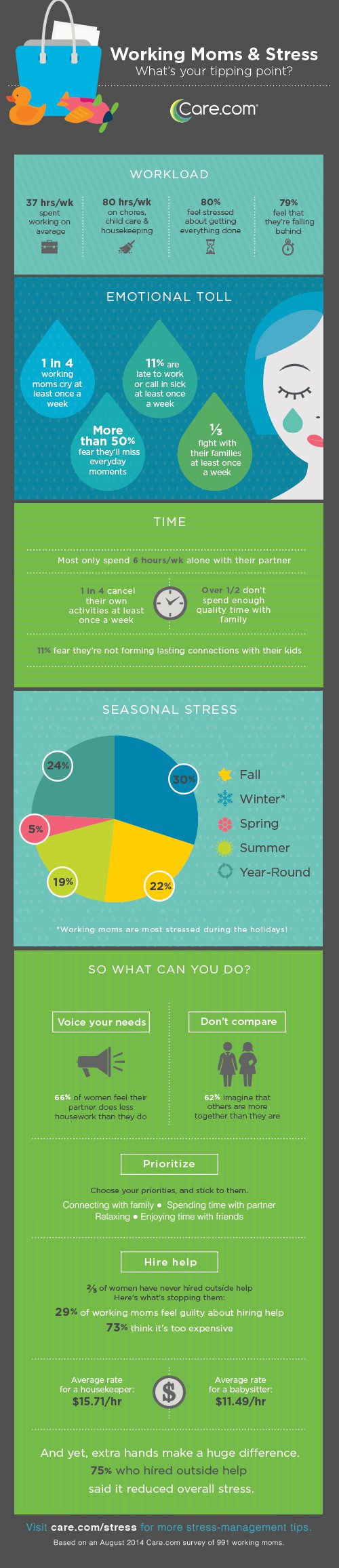
In turn, that makes us less likely to ask for help. In a survey of working mothers, Care.com found that 29% of respondents felt guilty about hiring someone to assist with things at home -- they feared missing out on important moments, for example. But at the same time, 79% of them also felt like they were falling behind at work.

The guilt had multiple sources. That’s the case for many of us -- not just working moms.

It makes sense that 75% of these survey respondents also saw an overall reduction in stress when they did hire outside help. That’s not limited to home or family care -- asking for help at work, too, can be hugely productive.

In fact, that’s something my own boss told me on my first day at HubSpot: “To help you be more successful, I’ll help you with whatever you ask me for help with. The most successful people ask for help when they need it!”

I wish everyone’s boss would say the same thing. Because she set that tone for me from the very beginning, I knew that I didn’t have to feel guilty about not knowing something, or not being able to do something completely on my own. So don’t be afraid to ask for help. Chances are, the person you need it from is happy to step in.

3) You’re comparing yourself to everyone else.

We all have those friends -- or distant acquaintances who we observe on social media -- who seem to have the so-called “perfect life.” And many of us are sometimes guilty of comparing our own lives to theirs, wondering if maybe -- had we just done things a little differently -- we, too, could have the perfect life.

It’s no wonder, then, that 62% of folks think that their peers are holding it together better than they are. When we perceive that someone is doing a better job than we are, we feel guilty or inadequate.

In the past, I’ve had to remind myself that anyone’s life can look perfect on the outside -- especially on social media. I like to think of Facebook, for example, like tabloids. People can paint any picture they want, and post it for the world (depending on their privacy settings) to see.

And even if someone else really is doing things "perfectly," which is completely subjective, feeling guilty about how your performance stacks up to others’ is a waste of time. And we've already talked about how to use our time productively -- squandering your precious minutes comparing yourself to others isn’t going to accomplish anything of value.

4) You have Vacation Shame.

Remember earlier, when we talked about how many of us feel bad taking time for ourselves? Vacation is no exception.

In fact, that phenomenon has a name: “Vacation Shaming.” It was coined by Alamo Rent A Car after the company’s annual Family Vacation Survey revealed that 47% of workers feel shame or guilt at work for taking that time off. The same percentage feels the need to justify using their vacation days to their employer -- even if they’ve earned it.

There are certainly other reasons -- financial ones, especially -- why people don’t go on vacation. Nonetheless, 28% of people don’t take advantage of paid time off because they’re afraid they won’t look as dedicated to their work.

But that logic is kind of counter-intuitive. I mean, for all intents and purposes, managers place the most value on your productivity, right? And in regions where people tend to take more vacation (like Brazil and Sweden, where paid time off is mandatory), employees tend to bring greater urgency to their work.

That could be due to the fact that, according to the Harvard Business Review, “spending less time at your desk forces you to waste less time.” That echoes the research done by DeskTime about the productivity levels of people who take regular breaks.

Simply put: Don’t feel bad about giving yourself the opportunity to step away, whether for a few minutes or a few days. It’ll enhance your productivity while you are at work, and give you a chance to decompress when you're not.

5) You’re just not busy enough.

How many of you out there work best under pressure?

Me. I do. I have never met a deadline I didn’t like. Am I insane? Probably. But also, I just don’t get as much done when I’m not bound by a timeline.

As it turns out, I’m not alone. In a study published in the Journal of Personality and Social Psychology, it was reported that people feel more motivated to complete tasks when they’re busy -- even if the deadline to get it done has passed.

“Being busy may make people more likely to fail to achieve a specific goal,” the authors report, but “it can also make people more likely to achieve the goal by augmenting the perception that a different goal [like using one’s time effectively] is being achieved.”

In other words, when we mess up as a result of having too much to do, we don’t feel as guilty about it. After all, it’s not like we were sitting around doing nothing -- we were being productive. But when we make a mistake and don’t have the excuse of our industriousness to fall back on, we feel bad.

Staying busy at work might seem like a tall order when only 31.5% of us -- in the U.S., at least -- are actually engaged there. But there are ways to keep up your motivation and productivity, which my colleague Lindsay Kolowich wrote about here.

6) You have action bias.

We’ve all had friends who have gotten a bit upset with us at one time or another. When that happens, the best thing is to step away and give her space, right? I don’t do that, and that's because I have action bias.

Also known as a “bias for action,” the Business Dictionary defines action bias as the “propensity to act or decide without customary analysis or sufficient information,” or to “'just do it' and contemplate later.”

It reminds me of something that a leadership professor said to me about extroverts: “We tend to operate in the order of: Ready? Fire! Aim.”

We’re all about taking action and getting things done, before all else. So when our time has to be spent on something other than our most essential tasks, or even inaction -- like in the case of our angry friend -- we freak out.

Kolowich has experienced something like this. “In the past, I’ve felt guilty whenever I’ve been doing work that doesn’t have measurable output, like brainstorming, strategizing, and even catching up on industry news,” she told me. (She writes more about these biases here.)

“Ironically, that can make you less productive because you’re less thoughtful in approaching the work you do do,” she continued. “I’m far more productive when I take the time to understand a project and plan it out rather than jumping right in.”

That’s why it’s valuable to take the time to be thoughtful when it comes to your work, and even take the time to reflect on it. On the surface, that might seem like a waste of time, but it can actually be tremendously beneficial.

Take this a Harvard Business School study, for example. A team of employees was divided into two groups. The first was instructed to spend the last 15 minutes of the workday writing their reflections. The other group kept working during those 15 minutes. When each group took a final training test, the one that spent the extra time reflecting performed 22.8% better than the one that worked longer.

It might seem counter-intuitive, given our advice above about deadlines and staying busy. And we get it -- for those of us with action bias, according to a Barclays white paper, “inaction can make a stressful time even worse.”

But you can be industrious and also be patient, without feeling bad about it. Even when a deadline is present, take the time you need to bring quality to your work -- you’ll be glad you aimed before you fired.

7) You’re experiencing the Zeigarnik Effect.

"The what?"

The Zeigarnik Effect. Merriam-Webster defines it as “the psychological tendency to remember an uncompleted task rather than a completed one.”

Sound familiar?

At the end of the day, no matter how productive we’ve been, it seems like we always dwell on the things we didn’t get done. So maybe we can chalk it up the aforementioned Effect, named for Bluma Zeigarnik, the Russian psychologist who found that having a task interrupted can actually improve the focus you put toward it later.

That’s good news -- and it supports the advice to take breaks and step away from your work, without feeling bad about it. And even though I’m a repeat offender of what we’ve discussed, like action bias, I actually have experienced the value of letting a task go until the next day.

I find that to be particularly applicable to writing. Of course, I have deadlines to meet, but every time I let an article “marinate” overnight, I see multiple things I want to change in the morning -- and in the end, I’m actually glad I put it off, despite not feeling great about letting it go “unfinished” the night before.

It probably took you a few minutes to read this blog, right? It likely took time out of your day. But hopefully, the time you spent reading it -- and next, thinking about it -- will actually help you bring more focus and less guilt to your work. 

How do you keep guilt from getting in your way? Let us know in the comments.

free email productivity tips

from HubSpot Marketing Blog http://blog.hubspot.com/marketing/guilt-sabotage-work
Via http://blog.hubspot.com/marketing/guilt-sabotage-work

How Can Schools Find Budget for Inbound?

schoolbudget.jpg

Everyone is looking for more marketing budget. As the well-known song goes: "You can't always get what you want." To even make the case for more budget, you need to show how your current marketing contributes to filling your school's enrollment class with the right number of ideal students. 

The first place to start is determine where your marketing budget and efforts are giving you a return, and where they can be better spent. This way, regardless of whether you get a budget increase, you'll still find more money to spend more wisely in your current budget.

To identify where to allocate your current budget to better effect, you need to:

  • Be clear on what you're currently spending
  • Understand how much it costs to acquire each enrolled student
  • Determine your current ROI on your efforts

How Are You Using Your Budget Now?

Small team or big team, hopefully you have a formal marketing budget that spells out what you're spending for all your content and campaigns. Take a look at these sample marketing budget templates to get an idea of what you should to include. 

Don't overlook the cost of what other departments contribute in terms of creating content for your campaigns. You can include those numbers in your budget for purposes of identifying actual costs, even if this sort of inter-departmental exchange isn't a formal cost item on your marketing budget.

Now there are other costs associated with getting a prospect to become an applicant, and still more to become an enrolled student. You only want to include the marketing costs. So for example, you don't want to include the costs of Admission's activities throughout the enrollment journey. That's on their budget, and you're trying to reclaim your own dollars.

Start with a list of all your discrete and ongoing campaigns. This includes every piece of your blog, newsletters, email nurturing series, premium content, and landing pages, as well as your PPC ad spend and social media efforts. We're talking about costs for photos, graphic design, copywriting — anything and everything from student labor to hard dollars for advertising.

Understanding Your Student Acquisition Costs

In a commercial context, businesses always want to know their CAC – client acquisition cost. The economics for schools are different, even if you're a for-profit school. But you still have an acquisition cost for each student you enroll.

The formula for determining the marketing CAC is to divide your total marketing budget by the number of enrolled students. So if you have 2,000 students in one enrollment class and an annual marketing of $200,000, your marketing CAC is $100 per enrolled student.

The marketing CAC is the baseline metric you use to get make decisions about what specific marketing campaigns and costs are more valuable than others. 

Re-assess your CAC each year to find how it changes. As you expand and refine your inbound marketing efforts, you'll find your cost of acquiring new students continues to goes down with time. A robust inbound strategy helps your school develop a strong online reputation through the awesome content you keep publishing over time. You'll continue to reap the benefits from your established authority and historical content, making inbound the most cost-effective method of filling your enrollment class with the right students.

Determining ROI for Specific Marketing Campaigns

This is where the heavy lifting comes in. You want to understand your budget costs, but also the relative cost of your team's efforts. If your team doesn't track its time, here are some time tracking tools you can look at. When you know how many hours are spent on a campaign, you can assign the effort expended on it in dollar terms.

The trickier part is knowing how much of your marketing effort and spend contribute to a student enrolling. You probably already gauge the success for specific campaigns using other metrics, such as new leads, applications downloaded, or applications sent in. You probably set a goal for each campaign based on one of these conversion metrics.

But what you want to know now is how much a campaign contributed to an enrolled student. It's truly the only success metric that really matters to you and your boss.

For this, you need to attribute specific campaigns as the reason(s) a student ultimately enrolled at your school.

There are three basic models of marketing attribution:

Single campaign – This is the simplest, but crudest model. It can be a good place to start attribution when it's new for your team. Under this attribution model, you select one marketing touch point to get the full value of a student. This would typically be either that student's first or last touchpoint.

Equal value – Also a simple model, but uses more data. You give every touchpoint for a student the same value. Or you might decide to use only the first and last touch, but give them equal weight.

Weighted value – In this model, different touch points have different weights. This is best done after you've been tracking attribution for a few enrollment drives. You may find that a high percentage of students watch a webinar at some point, but only a small fraction of people who read the blog ultimately enroll. So you'll weight attending a webinar more heavily than reading your blog. 

Let's play this out using the single campaign model, using the first touch point you can identify, which is the point at which they entered your database.

If 10% of your enrolled students got into your database because they subscribed to your newsletter, your newsletter is their first touch point. Now let's say you spend $30,000 of your annual marketing spend on your newsletter, 15% of your annual budget. But that 15% accounts for only 10% of all enrolled students. 

You're spending $150 a year on your newsletter per enrolled student ($30,000/ 200 students). That's well above your overall CAC.  In this case, you might decide sending out your newsletter twice a month, instead of weekly, frees up time and money you can use running other more effective campaigns. 

You can apply the single campaign model on every campaign. Then start aggregating what you learn. One email nurturing campaign may have a high CAC, but overall, your email campaigns do well. In that case, analyze the campaigns to discover what causes the discrepancy and do more of what works, less of what doesn't. 

As you get used to running single campaign attribution formulas, you'll learn more about the value of your marketing activities to use the more precise attribution models to learn even more.

Then you can sing along with the Rolling Stones as you rework your current budget: "But if you try sometimes, you just might find, you get what you need."

Email MArketing For Schools


from HubSpot Marketing Blog http://blog.hubspot.com/marketing/how-can-schools-find-budget-for-inbound
Via http://blog.hubspot.com/marketing/how-can-schools-find-budget-for-inbound

The Best Time of Day to Do Everything, According to Science [Infographic]

peak-time-of-day.jpg

We often talk about optimizing your website and optimizing your marketing ... but what about optimizing your day?

Think about all the things you do in a given day, from eating meals and cleaning your apartment to brainstorming ideas and holding meetings. Believe it or not, there's an optimum time of day to complete every single one of these activities.

A lot of it has to do with taking advantage of your body's natural rhythms. For example, neuroscientists recommend waiting until 9:30 a.m. to drink your morning coffee because that’s when your stress levels tend to drop, and you really don’t need the caffeine boost until afterward. Others have to do with weekly schedules: Studies also show that scheduling meetings at 3:00 p.m., especially on Tuesdays, increases the likelihood of high attendance.

What other activities have an optimum time in the day? Check out the infographic below from NetCredit for a full list.

 peak-time-of-day-infographic.png

free productivity tips


from HubSpot Marketing Blog http://blog.hubspot.com/marketing/best-time-of-day-activities
Via http://blog.hubspot.com/marketing/best-time-of-day-activities

The Stories Behind 6 Major Brand Makeovers

Makeovers aren't just for 80's movie montages -- they're also an important way for brands to future proof, reach new audiences, and remain relevant in competitive markets.

But changing up your entire image comes with considerable risks -- especially for bigger, more established brands. If you pivot too far away from your core identity too fast, you could alienate your base audience. But if the changes aren't big enough, no one will notice.

If you're considering shaking up your brand and could use some guidance on the line between not enough and too much change, we're here to help. Let's explore how six major companies were able to refresh their well-established brands for the better.

6 Successful Big Brand Makeovers

1) Kentucky Fried Chicken

In an appeal to millennials, the ubiquitous chicken chain recently resurrected the goateed visage of their founder and original mascot, Colonel Sanders, to appear in print, TV, and social ads.

Colonel Sanders -- the real man behind the brand -- appeared in KFC ads until close to his death in 1980. In his trademark white suit and western bowtie, Sanders' big personality and natural salesmanship proved to be pivotal in the fast food franchise's success.

During the 1990s and 2000s, KFC pivoted away from their founder's iconic image, first phasing out actors who played Sanders and then removing the animated version of him as well. The mascot-free look was accompanied by a push to focus more on the quality of the brand's food, staff, and American roots under the slogan "So good."

But the company soon realized that the Sanders-free KFC didn't resonate well with the coveted millennial set. So in 2015, KFC brought on global ad agency Wieden + Kennedy for a much needed brand facelift to boost sales and increase engagement.

The new colonel -- who has been played by a number of actors over the last year, including Darrell Hammond and George Hamilton -- is a quirky, patriotic spokesman for the brand. And even though not everyone loves him, KFC is happy that they've got people talking about them again.

"So far the response has been about 80% positive, 20% hate it," said KFC's parent company's CEO Greg Creed. "Now they at least have an opinion. They’re actually talking about KFC, and you can market to love and hate; you cannot market to indifference."

2) AXE

AXE is no stranger to controversy. The male grooming brand has been slammed in the past for ads featuring hordes of scantily clad women appearing whenever a man applies body spray. Their ads have found their way onto many sexist campaign roundups, including Adweek's Most Sexist Ads of 2013.

This year, AXE's parent company Unilever decided to make a big change, vowing to drop sexist messaging and stereotypes in all their ads. This has signaled a completely new direction for AXE.

"Masculinity today is going through seismic changes. More than ever, guys are rejecting rigid male stereotypes," Matthew McCarthy, the senior director of Axe and men's grooming at Unilever said to Adweek. "We've been part of guys' lives for decades, and Axe champions real guys and the unique traits that make them attractive to the world around them."

In their latest campaign by Amsterdam's 72andsunny, AXE changes up their usual formula of six-pack abs and heterosexual pursuit, opting instead for a broad and inclusive representation of masculinity.

3) The Milk Processor Education Program (MilkPEP)

If you picked up a magazine or flipped on the TV in the 1990s or 2000s, you were likely to see a celebrity proudly brandishing a milk mustache with the tagline, "Got Milk?"

Developed by ad agency Goodby, Silverstein & Partners, the "Got Milk?" ads are commonly cited as one of the most iconic marketing campaigns of all time. For nearly 20 years, MilkPEP used the slogan to promote the consumption of dairy milk nationally.

But the pervasiveness of "Got Milk?" couldn't stop dairy milk sales from slumping beneath the growing popularity of dairy-free nut milk in 2014. "The milk industry has had a tough bill over the last few years. Consumers seem to be forgetting about milk," Julia Kadison, the then-interim CEO of MilkPEP said to USA Today. "They needed to be educated or reminded of the nutritional value of milk."

The decline in dairy milk sales prompted MilkPEP to stop producing "Got Milk?" ads in favor of an updated "Milk Life" campaign. The $50 million revamp by New York's Lowe Campbell Ewald puts the focus on regular people instead of celebrities, and highlights dairy milk's high protein content. Another series of Milk Life ads try to differentiate dairy milk from popular alternatives like almond milk.

4) Buick

To shake off their grandfatherly image and appeal to younger drivers, Buick re-launched several updated versions of their cars in 2014, along with a new, hilariously self-aware advertising campaign.

The "That's a Buick?" TV spots, which began in 2014, played on Buick's older, out-of-touch image, showing unbelieving consumers that the sleek, modern car in front of them was actually a Buick.

"We're attacking that false familiarity directly, because we've got this new portfolio now," US Vice President of Marketing for Buick, Tony DiSalle, said to Automotive News today. "We know that consumers' perception takes a long time to change."

The ads were produced by DigitasLBi, and deftly introduced the fresher, cooler side of the car company. And in 2016, Buick is taking things even further into millennial territory, enlisting the help of up-and-coming comedians Ellie Kemper and Max Greenfield to give the brand an edge.

5) GoDaddy

Known for their bawdy, provocative ad campaigns, the domain registrar and web hosting company has made deliberate steps away from their macho image in recent years, choosing instead to focus on the small business owners who depend on their services.

For years, GoDaddy's marketing seemed centered around the adage that "all press is good press." They stoked controversies left and right with their racy television spots, and many of their ads were denounced as sexist. GoDaddy CEO Blake Irving even revealed in a New York Times interview that a group of female small business owners were pressuring Etsy to stop doing business with GoDaddy because of their ads' portrayals of women.

Under the helm of CMO Phil Bienert and with direction from global ad agency TBWA/Chiat/Day New York, the company's advertising is now pivoting to better serve their real target demographic -- female small business owners.

"We've had some famous, very notable messaging in the past, and as we've evolved in the U.S. -- where 58% of small businesses are owned by women -- we've had advertising that reflects who the audience is, getting away from the tactics we've done [before]," Bienert said to AdAge.

GoDaddy's latest ads depict funny, fictionalized accounts of small business owners, such as an artist who designs little hats for cats.

6) Bud Light

In 2016, the beer of choice for football games and college parties received its first rebrand in 15 years, along with a humorous new series of ads parodying the presidential election.

The new logo and can design is decidedly less sporty and more reminiscent of craft beer label trends. In a nod to their parent company's 160-year-old brewing tradition, a retro Anheuser-Busch crest appears front and center. The composition might be a nod to original Budweiser packaging, but the reimagined packaging is intended to appeal to a new generation of beer drinkers.

"Anheuser-Busch is seeking to find the right look and messaging to attract more millennial drinkers, who may have never even consumed Bud Light, while maintaining brand loyalty among established drinkers of the brand," Eric Shepard, the executive editor of Beer Marketer's Insights, told Entrepreneur.

Despite being the dominant beer on the American market, Bud Light has seen sales slip in the face of craft beer's growing popularity. Along with their craft-beer-esque packaging revamp, they're also updating their sense of humor to align with modern tastes.

"If you look at the humor that was relevant back in the ‘80s, ‘90s, early 2000s, it was very different than the humor that is [relevant] right now," Bud Light vice president Alexander Lambrecht said to Business Insider.

Bud Light's newest commercials were created by Wieden + Kennedy, and focus on a fictional political party -- The Bud Light Party, naturally -- led by comedians Amy Schumer and Seth Rogen. The topical ads take a relaxed but direct approach to politics, with Rogen and Schumer throwing their support behind gay marriage, equal pay, and of course, beer.

"We don't care, we'll sell you a beer!" Rogan says in one of the spots promoting gender identity.

Feature image from AXE's "Find Your Magic" ad, via Fast Company.

marketing-campaigns


from HubSpot Marketing Blog http://blog.hubspot.com/marketing/big-brand-makeovers
Via http://blog.hubspot.com/marketing/big-brand-makeovers