
When people arrive at your Facebook Page, where do you think they first look?
I'll give you some hints. It's a visual piece of content that sits at the top of your page. Its dimensions are 851 pixels wide by 315 pixels tall. It takes up almost a quarter of the screen on most desktop browsers.
That's right -- it's your Facebook cover photo.
Since it's one of the most noticeable parts of your page, it's crucial that you follow Facebook cover photo best practices.
Whether you're using Facebook to generate leads, close your next sale, or create a customer community, knowing how to make and optimize your cover photo is very important. Read on to learn what you should (and shouldn't) do in your cover photo. 
(You'll also get cover photo templates for Twitter, LinkedIn, YouTube, and Google+ with your cover photo template download!)
11 Best Practices for Your Facebook Cover Image
1) Do abide by Facebook's cover photo guidelines.
It seems like a no-brainer, but obeying Facebook guidelines is crucial to your Facebook Page existing in the first place. I'd highly suggest reading through the full Page Guidelines, but here are a few important things to keep in mind for your cover photo:
- Your cover is public.
- Covers can't be deceptive, misleading, or infringe on anyone else's copyright.
- You can't encourage people to upload your cover to their personal timelines.
If you get caught violating the above terms, Facebook could take action against your Page. And while Facebook doesn't explicitly say what will happen if you violate their Page guidelines, it's probably not smart to get your Facebook Page taken down over a cover photo infraction, so read the guidelines in full and adhere to them.
2) Do make sure your Facebook cover photo size is right: 851 px wide by 315 px tall.
You don't want to spend all this time designing a cover photo ... only to have it look weird when you upload it to Facebook.
Make sure your cover photo will look fabulous from the get-go by making sure it's the right dimensions: 851 pixels wide and 315 pixels tall.
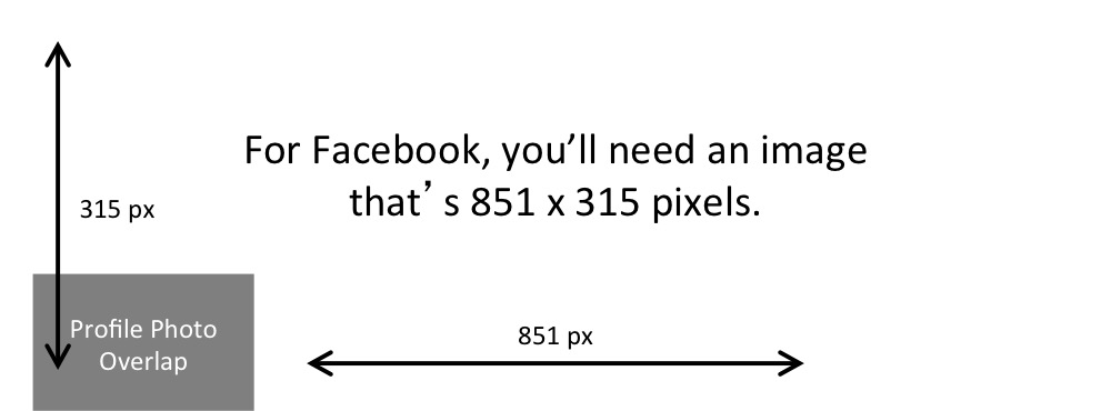
If you upload an image smaller than those dimensions, Facebook will stretch it to fit the right size, as long as it's at least 399 pixels wide and 150 pixels tall.
If you want a no-hassle way to make sure your cover photos are the right size, download our pre-sized template for Facebook cover photos here.
3) Don't worry about the old "20% text" rule, but still try to stay visual.
Back in 2013, Facebook removed any reference to the 20% rule on text in cover photos ... but that doesn't mean you should go wild with using text in your cover photo. The previous rule said that only 20% of your cover photo could be text. Personally, I thought that was way too restrictive for marketers, but the sentiment behind the rule was a good one.
If you're going to use text in your cover photo, keep that text concise. Your photo will be much more informative and engaging.

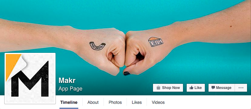
4) Keep the image simple, with a clear focal point.
Think of your cover photo as the portion of your Page that's "above the fold." If it's distracting or poor quality, people will be more likely to click off the page.
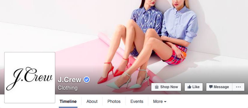
Many of the best Facebook cover photos include a single subject as the focal point. They also use negative white (i.e., empty space) as an advantage to make the subject, any copy on there, and other elements unique to Facebook (like the CTA button on Facebook business Pages) stand out even more.
Here's an example from Makr:
And another from J.Crew:
5) Don't hide content behind your profile picture.
Because of the way profile pictures are featured on Facebook Pages, there's a section of your cover photo that won't appear unless you click on it. Your Page name and the buttons on the bottom right also cover portions of your photo.
Check out the example below from NikeWomen. The portions highlighted in red are the parts of the cover photo that aren't immediately viewable to your Facebook Fans.
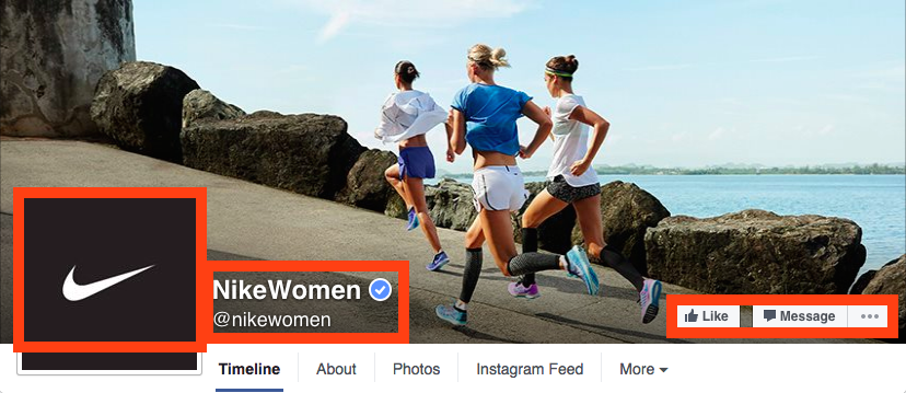
According to Facebook's Help page, on desktop computers, the profile picture is located 16 pixels from the left edge of the cover photo, and 176 pixels from the top of the cover photo.
That being said, you can also use this hidden space to your advantage -- maybe even hiding an Easter egg behind the profile picture for a contest. But typically, keeping that space clear is a good best practice.
6) Don't put important content on the bottom of your photo, either.
Your profile photo isn't the only part of your cover photo that will be partially hidden on your main Page. You'll also want to avoid putting important content or key parts of your image on the bottom of your photo where the name of your Page and CTA buttons are.
We recommend drawing an imaginary line about halfway up your profile picture, and keeping important content (like text or hashtags) above that.
You can see what I mean in HubSpot's cover photo below, where we've placed the text above the "HubSpot" name.

7) Do right-align the objects in your cover photo.
Since your profile picture is on left, you want to add some balance to your Facebook cover photo design by having the focus of the image be on the right.
Take a look at these cover photos. Which one looks more aesthetically pleasing?
Right-aligned focus:
Left-aligned focus:
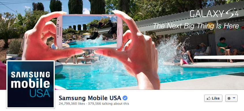
Doesn't the right-aligned cover photo look better? The biggest design elements (the profile picture, the text, and the beer) are evenly spaced. In the Samsung cover photo, your attention goes immediately to the left side of the page, completely missing the name of the product on the upper right side.
Not only is adding balance a crucial element of design, but it also allows for your cover photos to be more visually effective on mobile. Which brings me to my next point ...
8) Do keep mobile users in mind.
In April 2016, Facebook reported that over half of its user base (54.2%) access the social network exclusively from mobile devices. That's huge -- and it's exactly why it's so important to keep mobile users top-of-mind when designing your Facebook cover photo.
On mobile, a much larger portion of your cover photo is blocked out because the profile picture and the Page name are on top of the cover photo.
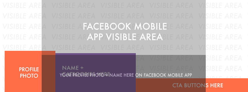
Image Credit: Twelveskip
Let's take a look at a real-life example. Below, take a look at what Adobe's Facebook Page looks like in a desktop browser versus on Facebook's mobile app.
Desktop:
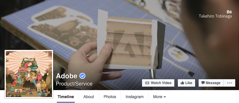
Mobile:
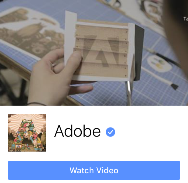
Notice that the sides of the photo are cut off on mobile. Whereas your cover photo displays at 851 pixels wide by 315 pixels tall on desktop, it displays only the center 640 pixels wide by 360 pixels tall on smartphones. Take a look at this Facebook help document for more information.
Notice, by the way, how the text in Adobe's cover photo is cut off on the right-hand side. While it looks best to right-align your visual elements, be careful not to put important content so far to the right that it gets cut off on mobile.
9) Do integrate the cover photo design with other parts of your Facebook Page.
If you really want to get creative with your cover photo, try integrating its design with other parts of your Facebook Page. You could make your profile picture and cover photo one big canvas, or use some design elements to draw attention to different functionalities of your Facebook Page.
Below are some ideas of what these cover photo integrations might look like.
Combine your profile picture and cover photo.
With a little creativity and some design tweaks, you can make your profile picture and cover photo appear as if they're two parts of one canvas. Check out one of Paris' cover photos for a subtle but compelling way to do that.
Note: Since cover photos display differently on mobile and on desktop, you'll have to choose one format to design your cover photo and profile combination for. Since cover photos are much more noticeable on desktop, I'd suggest prioritizing that layout for your cover photo and profile picture combination design.

Draw attention to the buttons on right.
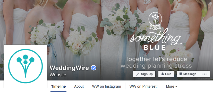
Following the best practices mentioned above, WeddingWire places all of its important text to the right of their cover photo -- not only achieving a good design aesthetic, but also drawing attention to the main calls-to-action on the Page: Like, Follow, and Message.
Note: While it might seem like a good idea to add directional cues like an arrow to get people to click on the CTA buttons, note that those CTA buttons don't appear the same way on the mobile app. In other words, it might be confusing to mobile users if you integrate the cover photo design with the buttons.
10) Do include a shortened link in your cover photo description that aligns with your page CTA.
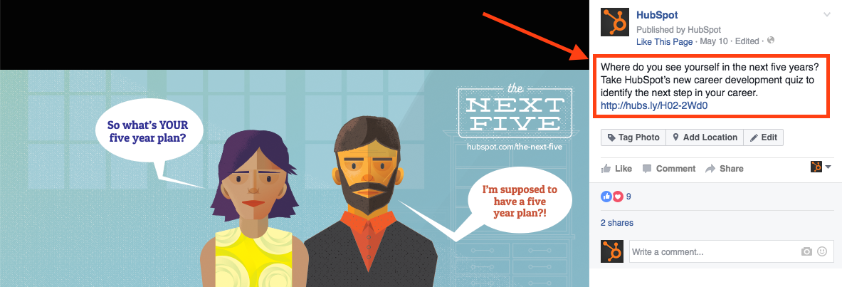
If you want to use your cover photo to support your page CTA, make sure your cover photo description also includes a text CTA and link to the same offer. This way, any time people view your cover photo directly, they can access the download link.
Here's this practice in action on HubSpot's Facebook Page:
Make sure you shorten your links and add UTM codes so you can track clicks on them. Shortening and tracking features are available in the HubSpot Marketing Platform and in tools like bitly.
(If you want to learn more about how to write effective call-to-action copy for your cover photo description, click here to download our free ebook on creating compelling CTAs.)
11) Do pin a related post right below your Facebook cover image.
Have you ever "pinned" a post to your Facebook Page's Timeline? Basically, pinning a post allows you to highlight a typical Facebook post on the top of your Timeline for seven days. It's signified by a small yellow flag on the top right of the post, like on Refinery29's Page below:

How does this relate to optimizing your Facebook cover photo? Well, if you're spending time aligning your Facebook Page CTA, your cover photo design, and your cover photo description copy, you should also make sure to post about the same thing directly to your page, and pin that post to the top of your Timeline.
That way, you're giving people one very clear call-to-action when they arrive to your page (albeit in several different locations) -- which should help conversions.
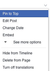
To pin a Facebook post: Simply publish the post to Facebook, then click the downward arrow on the top right corner of the post and choose "Pin to Top."
Want to see how HubSpot uses Facebook? Like our Facebook Page here.
Editor's Note: This post was originally published in September 2013, and has been updated for freshness, accuracy, and comprehensiveness.
from HubSpot Marketing Blog http://blog.hubspot.com/marketing/facebook-cover-photos-best-practices-ht
Via http://blog.hubspot.com/marketing/facebook-cover-photos-best-practices-ht


No comments:
Post a Comment