 As an Inbound Marketer, driving targeted traffic and leads to your website should always be your primary goal. Whether you're improving your content for SEO, tweaking your Adwords copy to boost click throughs, or testing messaging in social media updates, every incremental gain in traffic and leads matters.
That’s why it’s so critical to ensure that your website meets these widely accepted accessibility standards. By maximizing your accessibility, not only will you be ensuring your website can be viewed by the largest audience possible but you’ll also be providing a better overall user experience for each of your visitors.
That said, when you’re focus on driving inbound marketing results evaluating your website for accessibility can seem like a daunting or unnecessary task at first glance.
Region dependent accessibility legislation can further complicate this matter - different countries may have their own preferred accessibility standards. However, by focusing on four core areas—text contrast, form structure, image tags, and navigational pathfinding—you’ll improve the overall accessibility of your site and nurture inbound and design best practices at the same time.
In this article, we will take a closer look at these four core areas.
Along the way, we will offers tips on how to maximize the accessibility of your website. We’ll also provide you with a collection of helpful tools that can ensure your website is meeting the lofty accessibility standards you have set for it.
Before we get started, every year we dig into the latest research, trends and opportunities in the field of inbound marketing. If you’d like to brush up on your current knowledge of inbound marketing download a free copy of our recently released 2016 Edition of the Executive’s Guide to Inbound Marketing. The 40+ page document is packed with actionable insight to help you accelerate your inbound marketing results.
Without further ado, let’s go over the four basic website accessibility tests every inbound marketer should be aware of.
1) Contrast
You put a lot of time and thought into writing great copy, so why risk it not being accessible to a portion of the visitors to your site? Ensuring that your text content is readable for your entire audience by checking its contrast can improve the overall accessibility of your website and could even help drive down your bounce rate.
Similar to how contrast can be used to allow a CTA to really “pop”, it’s important that the contrast ratios of text and background pairings facilitate ease of readability. Generally speaking, the following standards should be met:
Small Text (less than 18 point, or 14 point point bold) - Minimum ratio of 4.5:1
Large Text (18 point or 14 point bold) - Minimum ratio of 3:1
Strictly speaking, these minimums are borrowed from a set of web accessibility guidelines called Web Content Accessibility Guidelines 2.0 (WCAG 2.0) but similar guidelines are common to ISO and ANSI standards.

While the example above is a bit exaggerated, it clearly demonstrates how a less than ideal contrast ratio can impact the readability of your content. Ensuring that the ratio between your text and its background meets these minimums will help improve your website user experience, especially for those visitors with low colour vision.
While a variety of semi-automated tools exist for checking contrast, they can often get tripped up when checking text placed over a background image. As a result, doing a manual check using a tool like Colour Contrast Analyzer is often the best approach. Remember, page copy is not the only element that should be evaluated. By checking CTAs, menus, tooltips and forms, you will support the best possible user experience.
2) Images
Like copy, you depend on the images within your sites to convey a tremendous amount of information, so it’s critical that visual site content be accessible to all traffic.
Visitors to a site with a visual impairment may be reliant on assistive technologies such as screen readers which convert content to audio descriptions and cues. If an image is added to the site “as-is”, they will be ignored by these types of technologies and you risk subjecting that segment of traffic to a less than ideal experience.
So how can you prevent this from happening?
Tagging images within your site with a particular type of notation called “alt text” allows assistive technologies to parse images within your page. This ensures your content can be consumed by the widest possible audience.


Review the two images above. While they are both images of an apple, they are not entirely the same. If you inspect the underlying code for each image, you’ll discover the one on the left contains alt text that describes its content. This simple addition makes a tremendous difference to users relying on screen readers:


When evaluating your image content there are two further things to keep in mind (per W3):
- Avoid using images of text, for example, an image of a word. While alt text can be used to enhance the accessibility of this content it is often better conveyed as some form of text.
- If you’re confident that a given image is purely decorative, use a null alt text attribute to allow screen readers to ignore the content.
You can easily identify missing or poor alt text on your website by using the Wave Toolbar.
Taking the time to effectively include alt text tags has an added benefit beyond addressing accessibility. Search engines employe automated tools called spiders which index the content of your site. These tools can easily parse the images within your page, ensuring your page is ranked based on the full value of its content.
3) Forms
The use of forms in websites, with an inbound marketing focus or otherwise, is ubiquitous. Ideally, the data you collect through the use of forms will be accurate and complete, especially when that form information is being used in the context of e-commerce or in generating inbound leads.
You may think that the accessibility of forms would add another layer of complication, but the opposite is true. In fact, ensuring forms follow accessibility guidelines actually works to improve the quality of data you’re collecting and should encourage completion rates.
Let’s look at three ways to address form accessibility:
Labels
Ensuring all forms within your site have a label element allows visitors using assistive technologies to identify the purpose of the form prior to providing input. Without a label element, the intent of a given form could be lost or misunderstood by a segment of your traffic. This technique can be taken a step further by including an example of the data a field is requesting (ex. MM-DD-YYYY) within the label itself.
Instructions
Providing instructions for forms can be addressed in a number of different ways besides the form label. The two further common methods would be the use of a placeholder tag with associated placeholder text, or adding instructions in the page itself. These form instructions can be linked to single form element or a group of inputs depending on the the information being requested.
Error correction/validation
Although it may not be suitable for all form types, validation or error correction can provide one last safeguard against incorrect or invalid data being submitted by a visitor to your site.
On a text entry field for an e-mail address, you can verify the address a visitor provides meets a basic set of criteria before accepting it (for example, does it contain an “@” symbol). Taking the email example a step further, free API’s can be leveraged which provide rich feedback for a wide set of error conditions like common email domain misspellings.
More broadly, required field should also have a means of drawing attention to themselves if left empty. Effectively using highlights and alerts will ensure no form is abandoned before submission.
Once again, the Wave Toolbar is an excellent tool for reviewing form accessibility on your website.
It is important to note that you do not necessarily need to implement every one of these strategies for every form - improving accessibility should not hinder the overall usability of the page. Conversely, excessive or incorrect use of these approaches can cause further accessibility problems. For example, adding multiple or conflicting form labels will cause more harm than good.
Frequently, the most critical functions of websites depend on form data - implementation of these basic accessibility strategies will help all visitors complete them.
4) Navigation
Implementation of well thought out site navigation and location cues is an exercise that serves many masters. Effective execution of this design element can have a positive effect on SEO, general usability and adherence to accessibility best practices. Similar to the other accessibility areas discussed previously, you do not want to hide great content behind unclear navigation.
Staying with the theme of easy wins, let’s review three aspects of navigation that can have a substantial positive impact on your site:
Multiple Ways to Navigate
While it is often overlooked, there should be multiple paths for users to browse to any given page. Where possible, inclusion of a search mechanism will ensure that pages at all levels of your site can be accessed with a minimum number of required actions from users. Further supporting the idea of minimizing impediments to content is the implementation of a sitemap, which offers a simplified representation of your site architecture to those who need it. Last, the use of breadcrumbs (as shown below) can support two goals.

First of all, navigation breadcrumbs provide a supplementary means of accessing content, while indicating to the user where they are currently located with respect to the site structure.
Location is Always Clear
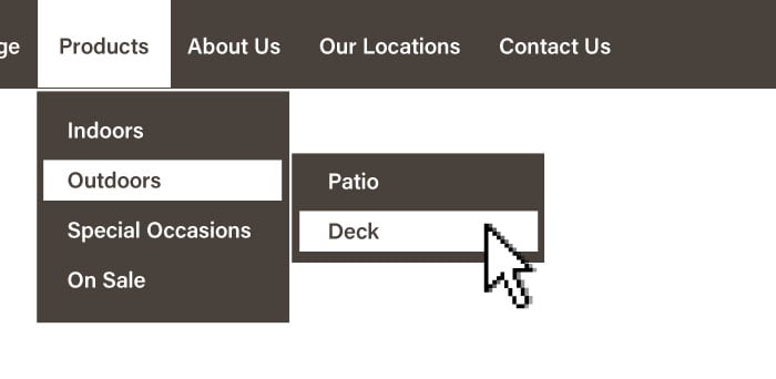
A user should never feel lost while browsing your site and great design can go a long way to support this goal. As noted previously, breadcrumbs are a common solution to this problem as they address multiple accessibility concerns and require minimal effort to implement. Existing menu elements can also be updated to provide navigational cues by highlighting the current location (page and sub-section) of the user with respect to the site layout as seen in the example below:

Now that you’ve put the time into an effective menu, search and breadcrumbs, you need to make sure that they are consistently displayed from page to page.
Consistent Navigation
Assume for a moment that a user is visiting you site for the first time and is searching for information, starting at its homepage. They briefly assess the menus available then navigate to where they believe they will find the content they came for. If they don’t find the information they wanted, or they require further information, what is their next step?
Ideally, they should be able to refer back to their previous navigational assumptions and continue without returning to the homepage. In this scenario— and to support an overall accessible design—it is imperative that the location and behaviour of your site’s navigational elements are predictable from page to page.
Beyond removing hurdles between users and your site content, navigational design elements like sitemaps, breadcrumbs and search provide additional avenues through which your site sub-pages can be found and indexed by search engines.
In Closing
By focusing on and addressing these oft-overlooked accessibility problems, you can confidently lay the foundation for a fully accessible website. In doing so, you can improve the overall user experience of visitors to your website, resulting in an increase of traffic, leads, and—most importantly—customers.
from HubSpot Marketing Blog http://blog.hubspot.com/marketing/inbound-marketing-website-failing-basic-accessibility-tests
Via http://blog.hubspot.com/marketing/inbound-marketing-website-failing-basic-accessibility-tests
No comments:
Post a Comment