
If you’re a frequent user of Excel, there are probably a few features you’ve found yourself using over and over again in your work.
VLOOKUPs, autofilters, and conditional formatting are critical pieces of any veteran’s arsenal -- and they’ve been making appearances in spreadsheets for years.
But what most Excel users don’t know is that these features only represent a fraction of the program’s capabilities. Beyond the basics, Excel has a variety of tools that can make your spreadsheets more beautiful -- and your life a lot easier.
Today, in the spirit of exploration, we’ll dive into six of these little-known Excel features to explore some of the most helpful -- but least-used capabilities -- of our favorite spreadsheet program. These tips and features are designed to help you work faster and smarter ... and who doesn't need more hours back in their day?
(Note: If you aren't familiar with these features above, don't panic. Excel can be really tricky to master, so you may want to start here or here ... or here.)
How to Work Faster in Excel: 6 Helpful Tips
1) Leverage the Tables Tools to organize data and conduct quick analyses.
Although much of the data we enter into Excel is technically in table format -- meaning that it’s organized into rows and columns -- Excel has a separate Tables feature that allows you to analyze a group of related data more easily.
To get started with Tables, we’ve got to begin with a set of data. In this case, we're working with some fake data from one of our favorite television series: Game of Thrones.
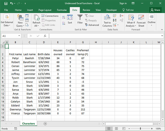
To create a table, select your data. Once your data is selected, follow the instructions below.
- On Windows:
-
- Navigate to the “Insert” tab on the ribbon, then click “Table.”
- If your data has headers already, be sure to check the “My Data Contains Headers” box so that Excel knows to create a separate header row for your column titles.
- Press "OK."
- On a Mac:
-
- Navigate to the “Tables” tab on the ribbon.
- If your data already has headers, click “New" > "Insert Table With Headers.”
- If it does not have headers, click “New" > "Insert Table Without Headers.”
Our data immediately becomes much more beautiful, with tastefully-striped rows and a nice blue color theme. Notice that Excel has also automatically added sorting and filtering dropdowns at the top of each column, so we don’t need to insert those ourselves.
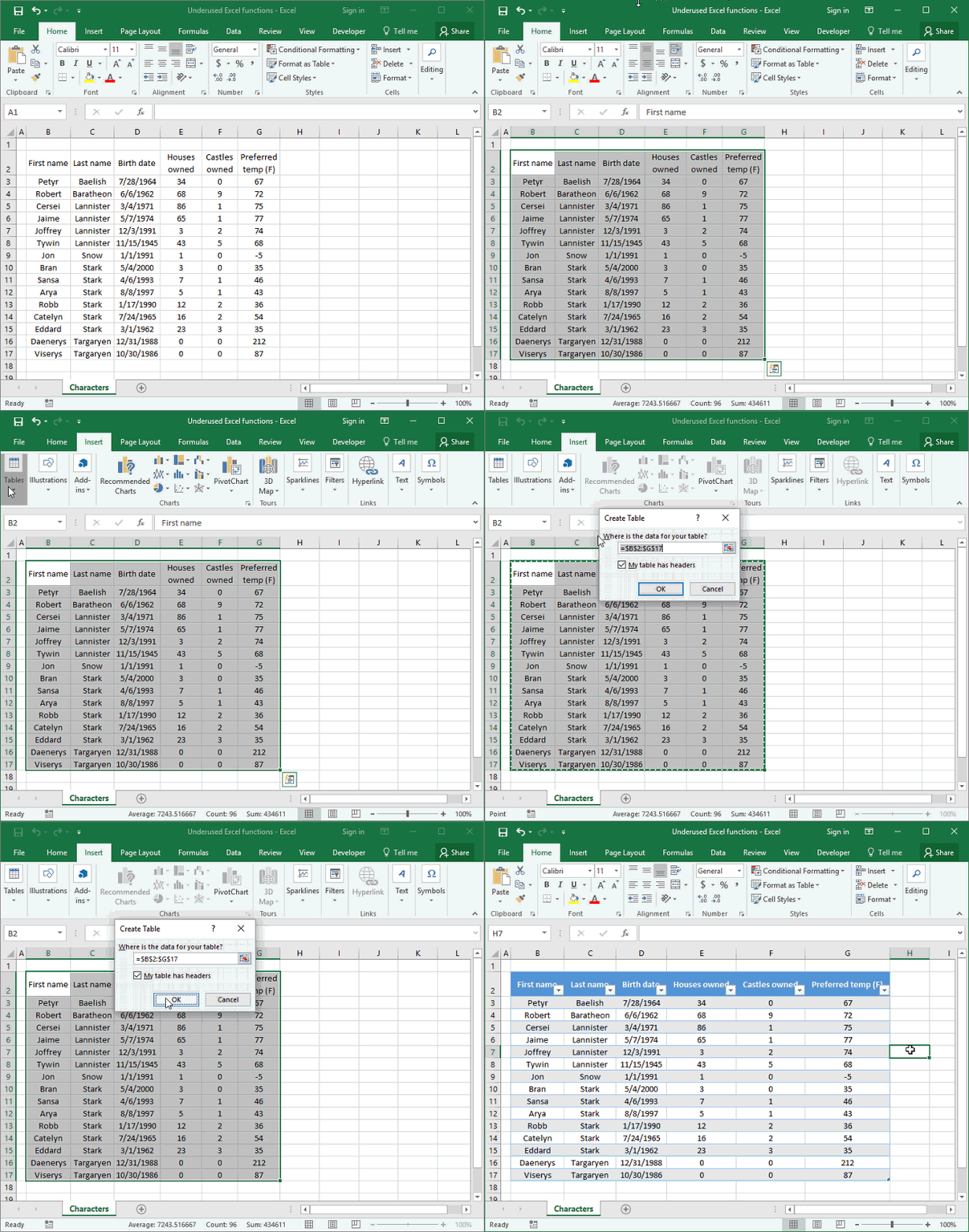
But pretty formatting isn’t the only advantage of using a data table. There are a couple other key features that will make analyzing this data set supremely easy.
First of all, we can reference columns of our table by name within functions. Let’s try summing up the number of castles owned for everyone in our data set. Normally, we’d have to use cell references to obscure cell letters and numbers to perform this calculation. But with Tables, we can reference an entire column at once by name. In this case, we’ll take the SUM of the “Castles owned” column like so:
=SUM(Table2[Castles owned])
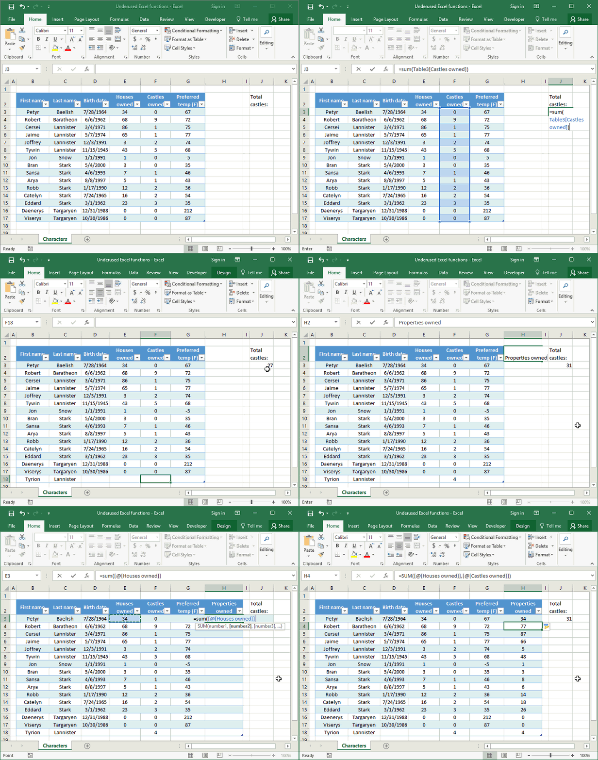
It’s that easy! No confusing numbers or letters to memorize -- just the name of a column.
Second, we can easily add data rows to our table without worrying about breaking formulas. Let’s add a row for our dear friend Tyrion, who we’d be remiss to leave off of this spreadsheet.
When we start typing at the bottom of the table, Excel automatically adds a row and autoformats it per the table’s specifications. Best of all, the SUM() function we created automatically updates -- no need to change the cell references once we’ve added a table row.
Finally, we can easily add formulas to every row of the table itself without copying and pasting. Let’s create a new column that calculates each character’s total number of properties by adding together their “Castles owned” and “Houses owned.”
In the first row of this column, take the SUM of the “Castled owned” and “Houses owned” columns. Notice that rather than using the standard cell reference nomenclature, Excel has used a new format: =SUM([@[Houses owned]],[@[Castles owned]]). And the formula automatically applies itself to every cell on the table.
2) Use the CONVERT formula to make speedy calculations.
We often find ourselves needing to perform unit conversions in Excel -- like degrees Fahrenheit to degrees Celsius or kilograms to pounds -- particularly when we’re collaborating internationally.
It’s typically an onerous process involving some online research and manual copy-and-pasting. But there’s an easier way: Excel includes a generic conversion function called CONVERT() that helps us convert weight, distance, time, and temperature to and from various units.
The CONVERT formula looks like this: =CONVERT(number, from_unit, to_unit)
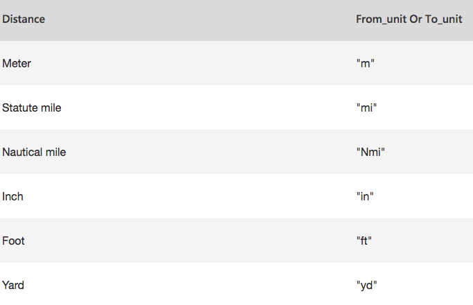
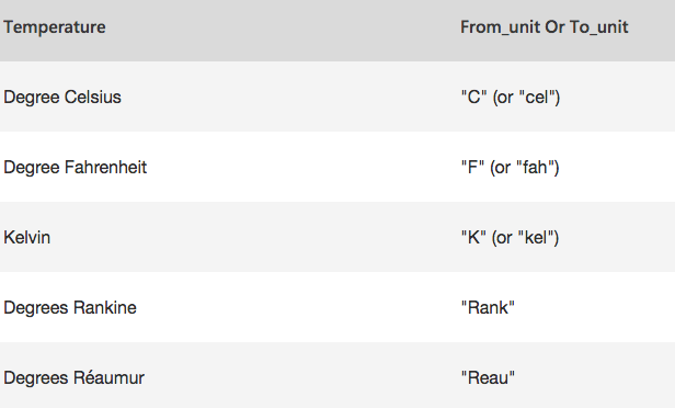
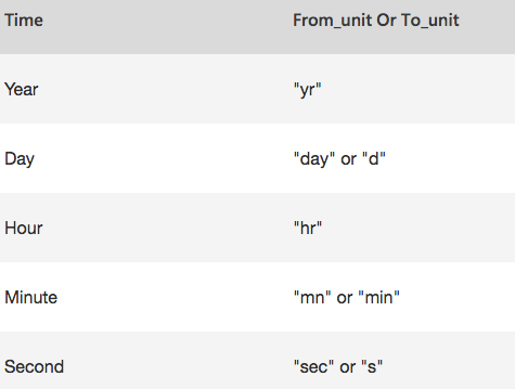
The from_unit and to_unit arguments are strings pulled from a pre-defined set of units built into Excel. Here are some of the most useful:
Distance
Temperature
Time
(Click here for a complete list of text values)
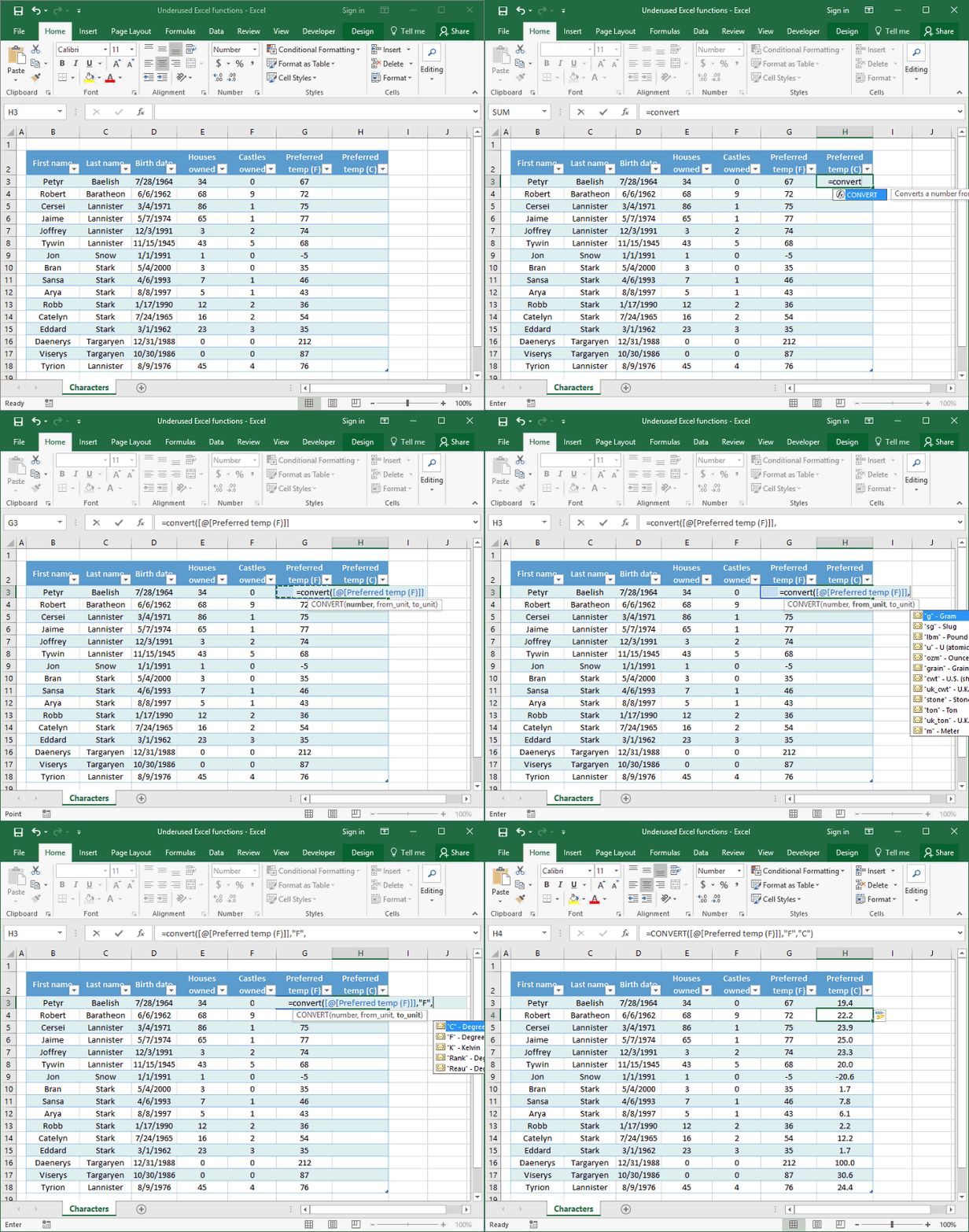
Let’s try it out by converting each character’s preferred temperature from degrees Fahrenheit to degrees Celsius. Rather than looking online for conversion formulas, we can simply use the following formula in a row column of our Table:
=convert([@[Preferred temp (F)]], “F”, “C”)
3) Use the DATEDIF function to calculate the difference between dates.
We often need to calculate the differences between dates in our spreadsheets -- particularly when formatting tables to be used to generate charts and graphs. Many Excel users resort to using numerous columns full of complicated YEAR(), MONTH(), and DAY() columns to extract and compare date information from various cells.
But there’s an easier way: The seldom-used DATEDIF() function. DATEDIF() allows us to take the difference between two dates using a number of predetermined Excel settings. For example, we can find the total difference between two dates, in days. Or we can find the difference between two dates ignoring their years and months, so that only the numerical days are considered.
The DATEDIF() function looks like this: =DATEDIF(start_date, end_date, unit)
That ‘unit’ argument tells Excel what to take the difference between, based on the following table:
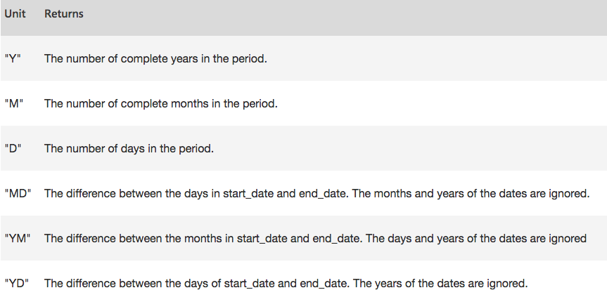
(Click here for more on the DATEDIF function and units.)
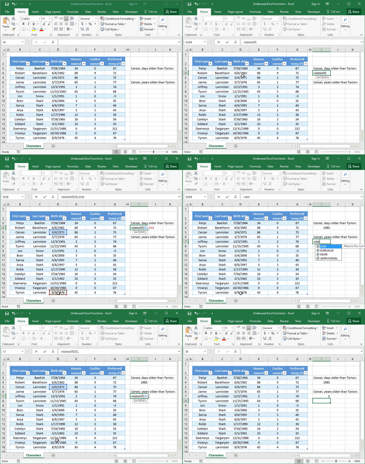
Let’s say, for example, that we wanted to find the difference, in days, between the birth dates of Cersei and Tyrion. We could do it like so:
=DATEDIF(D5,D18,”D”)
If we wanted to look up the same value in years, we could use a very similar formula, with the ‘unit’ argument slightly modified:
=DATEDIF(D5,D18,”Y”)
4) Analyze numerical comparisons using Data Bars.
Setting up a chart in Excel takes time. You’ve got to select your data set, generate the chart, and ensure that the data is being displayed correctly. Then, you have to format the chart, adding axis labels, titles, gridlines, and more. Charts are a great tool for making beautiful data visualizations in Excel, but what if you just want to get a quick look at how a set of data compares internally?
Enter data bars. These are a handy way to visualize numerical comparisons using Conditional Formatting -- without going through all the complexity of chart creation and development.
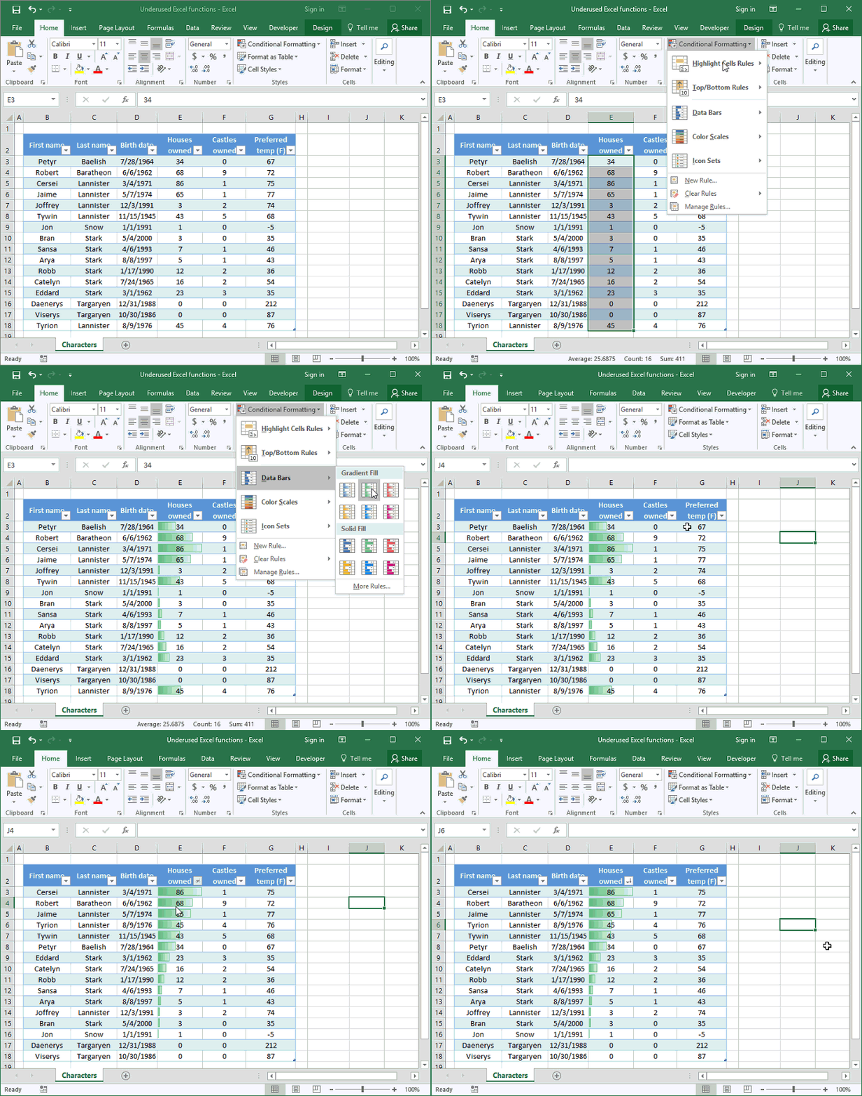
To get started, simply select a row or column of numbers to compare, then -- on either Windows or Mac -- hit "Home" > "Conditional Formatting" > "Data Bars" and pick the bar color of your choice.
Cells in our selected row or column will automatically fill with in-cell data bars. The length of these bars will be proportional to that of the other bars in our data series, with the largest numbers almost filling the cells in question.
Let’s try it out on our “Houses owned” column. With a couple of keystrokes, it’s easy to get a visual sense for who owns the most houses -- no charts required.
5) Identify trends over time using Sparklines.
Data bars, described above, are an easy way to get an at-a-glance visual comparison of different static numerical quantities. Trouble is, they don’t help us much if we want to quickly look at trends over time.
Of course, we can always use charts and graphs to visualize data, but they become cumbersome and cluttered if we’re trying to look at multiple data sets at once.
Fortunately, there’s an easier way to visualize this data: Sparklines.
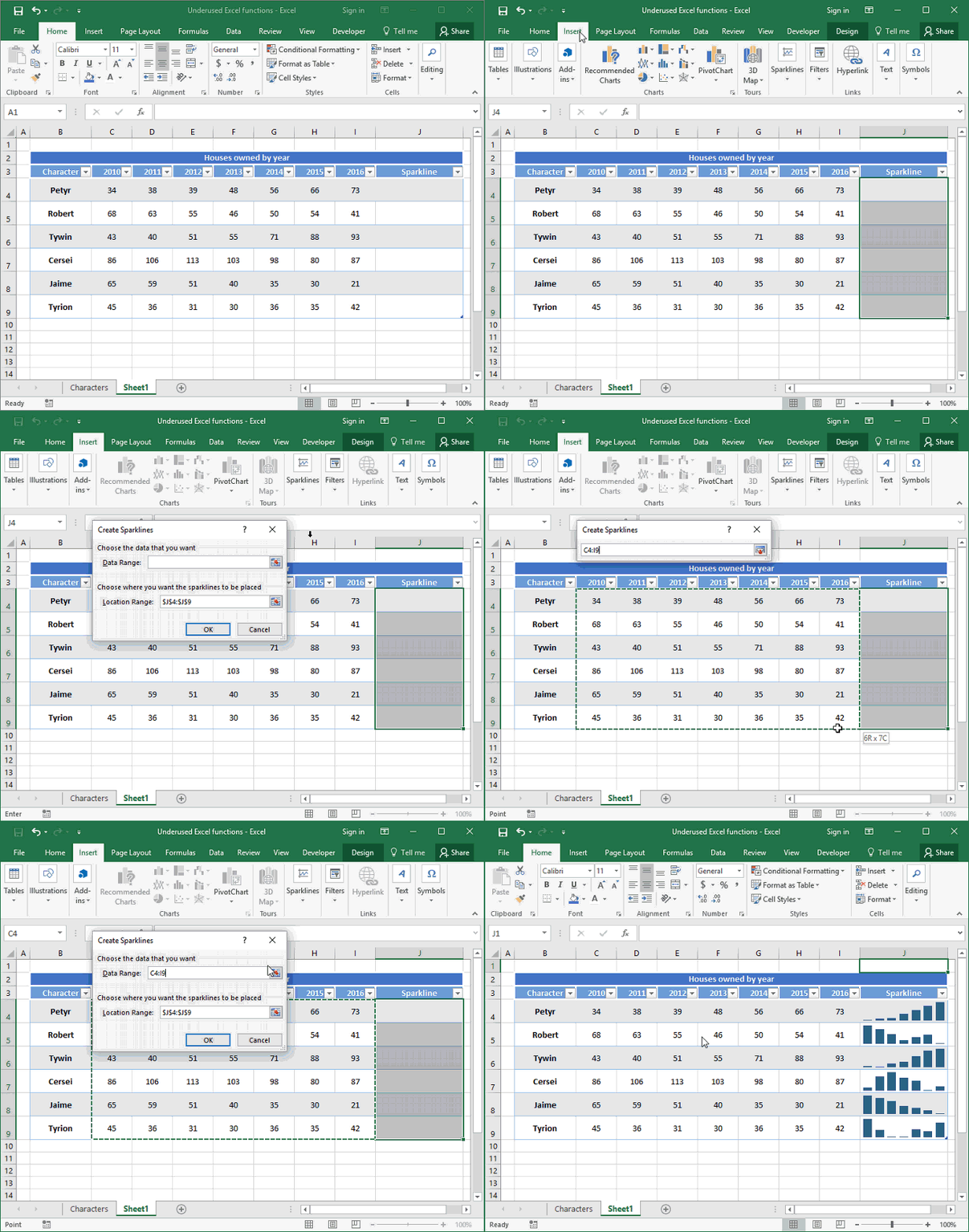
Sparklines are in-cell graphics (just like data bars), but they don’t show just static quantities. Instead, they show multiple pieces of data at once -- like a mini-chart within a cell. Here’s an example of Sparklines in action, used to show trends in houses owned over time for a number of different people:
Follow the instructions below to try out Sparklines on your own.
- On Windows:
-
- First, select a column or partial column; this is where our completed Sparklines will be inserted. (Note: Sparklines can only be inserted into adjacent cells within a single column -- they don’t work as well when used within adjacent cells in a row.)
- Click “Insert” then select the type of Sparklines you’d like to insert under the “Sparklines” section. There are several options here: line charts, column charts, or win/loss charts. Choose the one that will best assist in visualizing your data.
- Enter the data range from which you’d like to generate your Sparklines in the “Data Range” box. The data range you select should be a two-dimensional matrix, and its number of rows should always be equal to the number of cells you selected before creating your Sparklines.
- Press "OK."
- On a Mac:
-
- First, select a column or partial column; this is where our completed Sparklines will be inserted. (Note: Sparklines can only be inserted into adjacent cells within a single column -- they don’t work as well when used within adjacent cells in a row.)
- Click “Charts” then select the type of Sparklines you’d like to insert under the “Insert Sparklines” section. There are several options here: line charts, column charts, or win/loss charts. Choose the one that will best assist in visualizing your data.
- Enter the data range from which you’d like to generate your Sparklines in the “Select a data range for the Sparklines:” box. The data range you select should be a two-dimensional matrix, and its number of rows should always be equal to the number of cells you selected before creating your Sparklines.
- Press "OK."
Sparklines provide a quick and easy way to interpret trends in our data without having to invest time and effort in formatting multiple charts.
6) Arrange data using multiple Custom Sort levels.
If you're a veteran Excel user, you’ve probably used Quick Sort quite a bit to arrange your data in a logical and coherent fashion. (If not, read up on how to alphabetize in Excel here.)
But many spreadsheet users don’t know that it’s possible to sort on multiple levels. For example, we can sort a sheet by last name, and, if two people on the sheet share the same last name, sort by first name next. Each level of our sort can be totally customized -- with contents sorted from A to Z, or largest to smallest.
To Custom Sort on both Windows and Mac, select your data and head to “Data" > "Sort" > "Custom Sort." A window will appear asking which column you’d like to sort by first, and how. Press the small "+" icon at the bottom of the screen to add an additional level of sorting. Using the dropdowns provided, you can choose to sort based on cell values (either numerical or alphabetical), or based on more advanced features such as cell color, font color, or icons.
In the following example, we’ll use an advanced Custom Sort to rearrange our list of people, ordering first by last name, then by gender, and finally by houses owned.
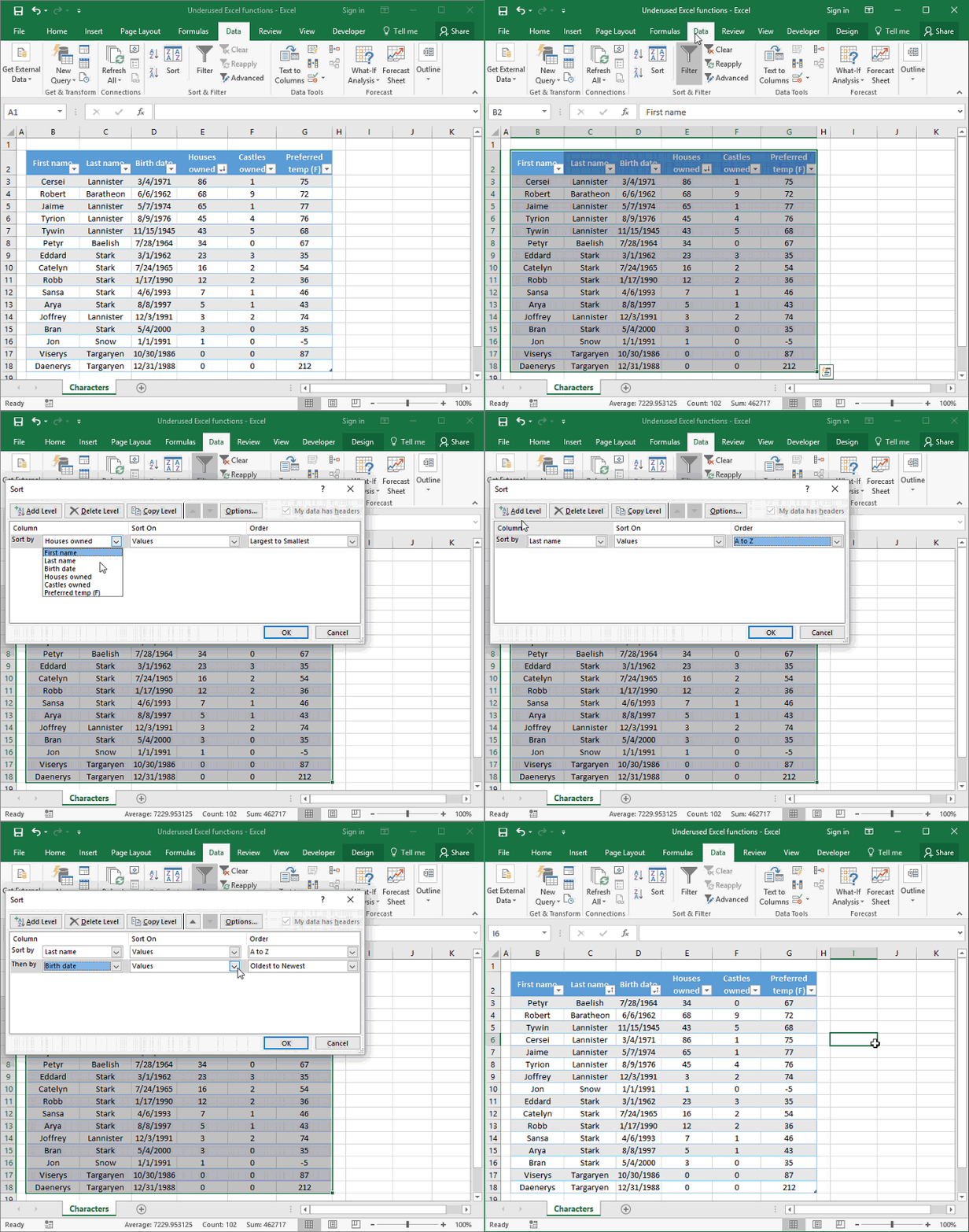
We now have an easy-to-read list of people ordered by family and properties.
There you have it: six of the most helpful Excel functions to make you faster and more productive. If you enjoyed this article, put it in your bookmarks bar to keep these Excel tips on hand at work.
What do you want to learn how to do in Excel? Share your thoughts below.

from HubSpot Marketing Blog http://blog.hubspot.com/marketing/work-faster-excel-features
Via http://blog.hubspot.com/marketing/work-faster-excel-features
No comments:
Post a Comment