
From blog posts to landing pages to job postings, your website may be made up of tens, hundreds; even thousands of individual pages.
But regardless how many pages you have on your site, you'll find that the vast majority of your traffic comes in to a few, very specific pages -- often your homepage, your "About" page, your "Contact Us" page, and maybe one or two of your most popular blog posts.
And because so many people are landing on those four or five pages, it's very important that you take special care to optimizing those pages for conversions. 
Otherwise, you're leaving potentially massive lead and sales numbers on the table. Research shows that companies that take on a structured approach towards conversion optimization are 2X as likely to see a large increase in sales. Trust me: Optimizing these pages can pay off big time in the long run.
So, how do you figure out which pages on your website get the most traffic? And once you've found that out, what are the best ways to optimize those pages for leads -- and which tools can help? Let's start with the first question.
Which Pages Get the Most Traffic?
Which pages get the most traffic will vary from website to website. Typically, you'll find that the most-visited pages on a given website include the homepage, the 'About Us' page, the 'Contact Us' page. But to figure it out for sure, you'll need to turn to your marketing software.
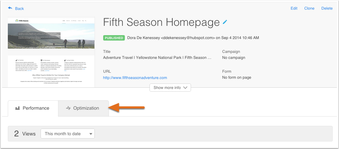
If you're a HubSpot customer, simply log in to your main HubSpot dashboard and go to Reports > Page Performance, then filter the report by Views. (Pro tip: Click the "Optimization" tab inside of each of your top pages to learn how to further optimize different aspects of your page.)
You can also use Google Analytics to find your most popular web pages by looking at your "Top Content" report. To get this report, log in to Google Analytics and go to Content Optimization > Content Performance > Top Content. This'll give you your top webpages based on the visits and pageviews for each page, as well as the average amount of time visitors spend on each page and the page's bounce rate (i.e. how frequently visitors left your site after viewing the page).
How to Generate Leads from the Most Popular Pages on Your Website
Once you've identified which pages on your site get the most traffic, it's time to optimize them for leads. (There are ways to optimize them to get even more traffic, too, which you can read about here and in section #10 below.)
1) Make sure these pages pass the "blink test."
If you want the people who visit your site to convert into leads, first thing's first: You have to keep them on the page once they get there. You have only a few seconds to grab their attention, get your message across, and spark their interest.
The "blink test" refers to those few seconds when a visitor lands on your webpage, judges it, and decides if they want to either stay there and take an action or leave. There are many ways to make sure a webpage will pass a "blink test," but I'll go through two of the most important factors here.
For one, you'll want to test how long the page takes to load and make adjustments if needed. Slower page load time leads to poor user experience and can result in an increase in page abandonment. You won't be able to generate leads from your high-traffic pages if people are visiting the page but not spending time on it. (Plus, Google also uses load times as a ranking factor for search, so the faster your page loads, the more traffic it'll get in the first place.)
To test your top pages for load time, plug their URLs into Google's Page Speed Testing tool. If you're finding these important pages are taking more than two or three seconds to load, you might need to compress the images on those pages, minify your code, and load videos in the background (or not at all). (Learn how to do these things here.)
You'll also want to make sure these specific pages are designed beautifully, intuitively, and with lead generation in mind. In a perfect world, every page on your website is designed beautifully and looks exactly how you want it to look; but in reality, you'll have to prioritize the most important pages on your website -- both when you first design them, and in subsequent redesigns.
The right design and layout will help you focus your visitor’s attention on the areas of the page that will convert them into leads. You never want your visitors to be wondering what they should do next -- you need to show them the next step to take. To learn more about designing webpages for lead generation, take a look at this blog post.
Here's a collection of beautifully designed site pages divided by category to help give you inspiration for your own high-traffic pages:
- 16 Examples of Beautiful Homepage Design
- 12 Examples of Beautiful 'Contact Us' Page Design
- 12 Examples of Beautiful 'About Us' Page Design
- 15 Examples of Beautiful Product Page Design
- 16 Examples of Beautiful Landing Page Design
- 16 Examples of Beautiful Blog Design
2) Use the right tools.
Your website might look good, but is it getting you leads? And if you are getting leads from it, does your website make it easy for you to identify and quality those leads, segment them into appropriate lists with the rest of your marketing toolset, nurture them, and close them into customers?
That's where using the right tools becomes really important for your bottom line. If you want to build a website that captures leads effectively, you're going to need to figure out which tools are worth investing in -- and which free tools to add to your arsenal.
It all starts, of course, with investing in a Content Management System (CMS) like HubSpot's, which'll integrate your website content with all of your marketing channels. That'll make it much easier for you to not only track who's visiting your site and what they're doing once they get there, but also which parts of your site are converting visitors into leads -- and then track, nurture, and close them when the time comes. (Among other things.)
Along with a CMS, you'll want lead capture tools to help you, you know, make business out of the people visiting your site. Here are a few you might like:
- CTA Templates: 50+ free, customizable call-to-action (CTA) templates in PowerPoint that you can use as guidelines when creating your own calls-to-action for your website.
- Leadin: A free lead capture and contact insights tool from HubSpot that'll scrape your any pre-existing forms you have on your website and add those contacts to your existing contact database, and also give you the option of creating new pop-ups, hello bars, or slide-ins that'll capture leads right away.
- Hotjar: A great tool to help you understand what users want, care about, and do on your site using heatmaps, visitor recordings, analyses of your forms, feedback forms and surveys, and more.
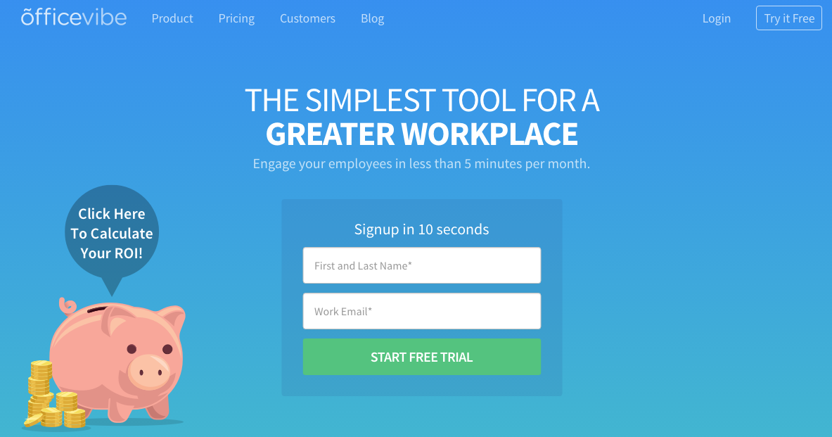
- A form embedding tool so you can capture leads from forms embedded right on your website, like the one below from Officevibe's homepage. If you're a HubSpot customer, you can create and embed forms using HubSpot. Non-HubSpot customers can use a tool like Contact Form 7, JetPack, or Google Forms, and then use Leadin's free Collected Forms tool to automatically capture these form submissions on your website.
3) Place your CTAs where people's eyes naturally go on your site.
The leads you generate from your webpages have to come from somewhere. For the most part, they'll come from the CTAs you place on your webpages. Without them, you won't gain any leads or sales from all that traffic you get to your popular site pages.
Designing effective CTAs for each webpage depends on what action(s) you want your site visitors to take when they get to that webpage. For example, on your home page, you may want to place CTAs that prompt visitors to sign up, log in, or learn more. On a blog page, perhaps you want people to download an ebook or subscribe to your blog.
Regardless what your CTA is for, placement is key for driving conversions. When users land on your site, where do they look first?
Turns out our natural eye path starts in the upper lefthand corner of a website and moves on from there, according to an eyetracking study.
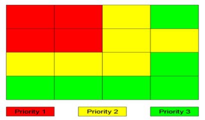
Image Credit: ConversionXL
From that top left corner, eyetracking studies also show people often read site content in an F-shaped pattern. They'll read from left to right twice in a row, in two horizonal stripes, followed by a vertical stripe.
![]()
Image Credit: KISSmetrics
Here's what that looks like in a barebone wireframe:
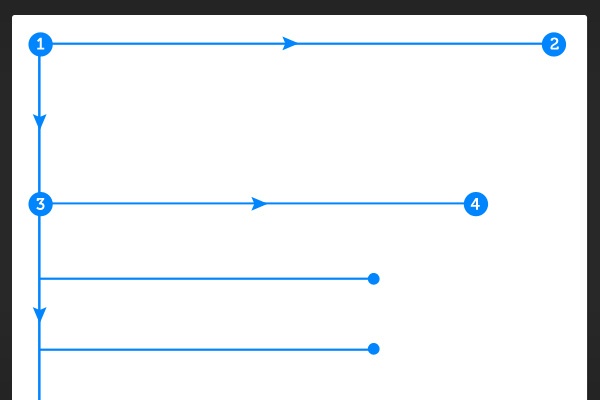
Image Credit: Envato Studio
What does this mean for CTA placement? To take advantage of where your readers are looking first, you'll want to think carefully about which important information to place in these key spots. In the example below, the business' name is in the top left, followed by the navigation bar placed on the top, horizontally.
From there, the second row of the F-pattern includes a primary call-to-action (by #4).
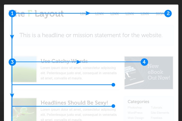
Image Credit: Envato Studio
You'll want to test and tweak the layout to see what works best for you, but we recommend using the F-pattern scanning behavior to dictate the overall layout and design of these pages and placing CTAs strategically along the site lines.
4) Make sure your CTAs stand out from the page.
In addition to placing your CTAs in places where people will find them quickly, you'll also want them to stand out visually. This'll help draw your visitors' eye on top of their natural scanning paterns -- especially for people who are scanning your page looking for an action to take.
One way to catch people's eye is to use contrasting colors in the CTA from the rest of your site. Try a tool like Canva to create images for free easily, quickly that you can use as your CTA images.
Another way is to make good use of white space. In the example below of Dropbox's homepage, you'll notice they've used simple design and negative space to make that blue "Sign up for free" CTA pop. Also, because both the CTA and the Dropbox logo at the top of the page are the same color, it's easy for the visitor to interpret this CTA as "Sign up for Dropbox."
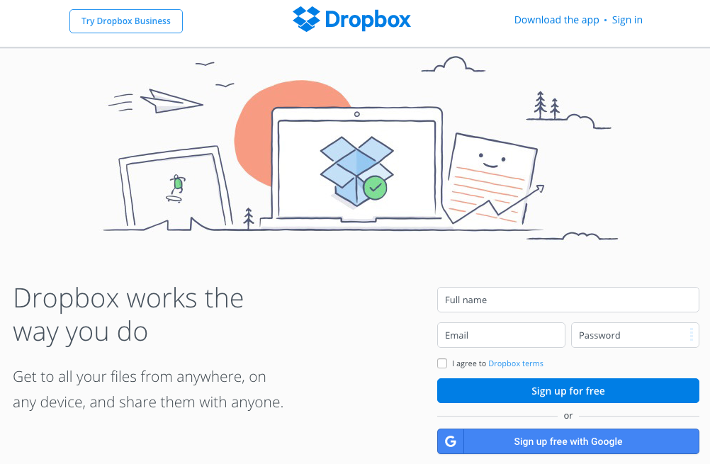
You might be wondering, What about using large text to get people's attention? Actually, larger text doesn't necessarily draw people's eye, according to data from Eyequant. In some cases, it even has negative effects on drawing attention. Here's an example of an eye tracking study that shows how readers' eyes aren't automatically drawn to large text on a page:
![]()
Image Credit: EyeQuant
Want to see more examples of compelling CTA design? Here are 31 CTA design examples to look through for ideas.
5) Create offers specifically for your most popular pages.
If a few of your webpages are getting a whole lot of views every month, it might be worth it to create a special content offer aligned with those pages. Most of the people who go to your website aren't ready to buy right off the bat, so offering them content that's super relevant to what's on the site they're already on, you're playing off of a pre-existing interest.
Although creating a brand new offer can time-consuming, it could be much more effective for lead generation than optimizing button color, language, images, and so on. To save time, you might consider repurposing existing content into a gated offer by aggregating multiple, small pieces of content on similar topics into a cohesive collection.
Here are two examples of businesses showing site visitors relevant content. This first one is from Aquaspresso, which added this pop-up CTA on their main blog page. Here, they wanted their blog readers to check out what they're actually selling -- and hopefully buy from them:

(Created using HubSpot's free conversion tool, Leadin.)
Here's another example from Eastern International College. They created a quiz for students on which college major they should choose, which they linked to on their popular Careers page.

This quiz was used to capture leads, which they did by asking quiz-takers for their name, phone number, and email address to see their results.
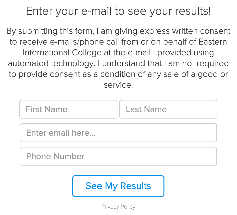
There are many other ways you can use specific content offers to capture leads. If one of your most popular pages is a product page, for instnace, then you might consider creating a content offer teaching people how to use that product. If you goal is growing your email list via blog subscribers, your relevant CTA can be as simple as a blog subscription CTA. Here an example from Beebom:
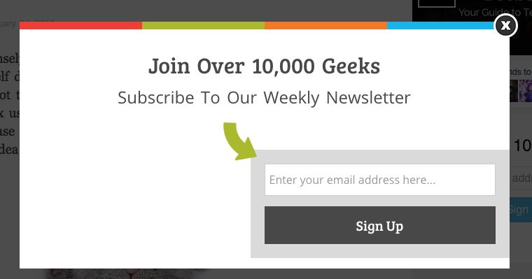
6) Make sure your CTAs, forms, and fonts are optimized for mobile.
Regardless what you're doing to capture leads on your website, it needs to work well for your mobile site visitors. After all, the number of people searching Google on mobile surpassed the number of people searching on desktop over a year ago -- which means a whole lot of the people who are visiting your website are doing so on their smartphone or tablet.
If your website is hard to navigate on mobile, you run the risk of losing all those people before they have a chance to turn into leads. Research from Adobe shows nearly 8 in 10 digital device users would switch devices or stop viewing altogether if the content doesn’t display well on their device.
The best marketers not only optimize their websites for mobile users to offer a good experience, but they also optimize their avenues for lead generation. A few ways to optimize for mobile that relate to your lead generation efforts include:
- Making your CTAs easy to tap on a mobile device. Make your buttons a minimum size of 44 px by 44 px, and put them front-and-center so they're easy to see and reach. Also, make sure there's plenty of space around the CTAs so people don't accidentally click on something else.
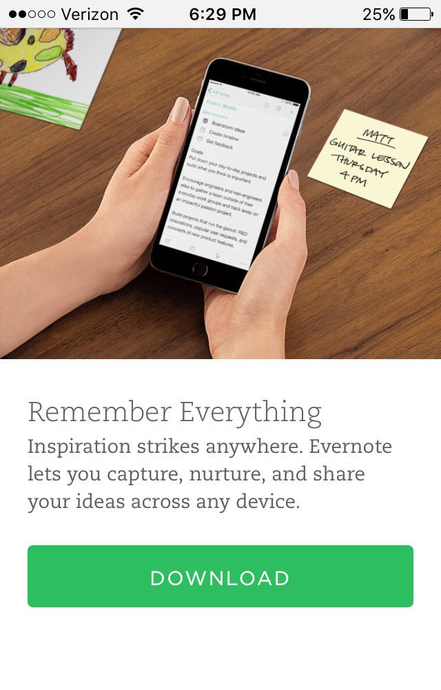
- Enlarge and shorten your forms on mobile. Filling out forms on mobile can be frustrating, and people may not complete your forms if they're too long or too hard to type in. Here at HubSpot, for example, we experimented with shorter forms for mobile users and saw our mobile leads increase by 5X in just two weeks. If you're a HubSpot Professional or Enterprise customer, you can show a different form to mobile users than you do desktop users by following these steps. For both HubSpot and non-HubSpot users, ensure that your website is responsive to mobile devices so it functions properly on any device.
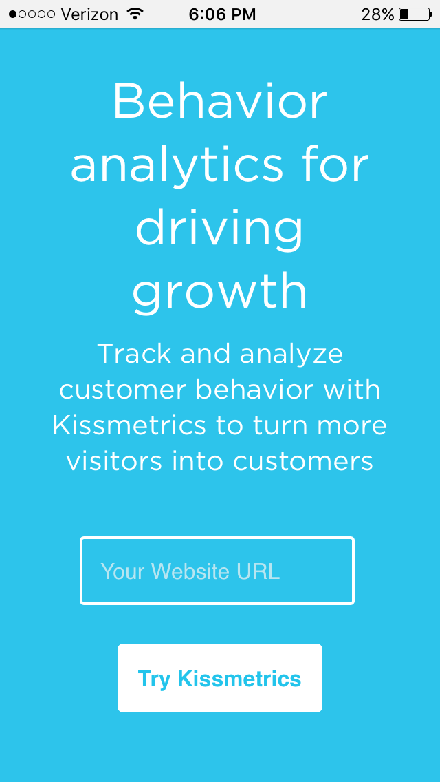
- Enlarge your fonts and links on mobile pages so it's easier for mobile users to read and click instead of pinching-and-zooming. We recommend font sozes of 22 px minimum for headlines and 14 px minimum for body copy. (Note that iOS automatically resizes fonts under 13 px, making them larger on your behalf. Thanks, Apple!)
Want to see some good examples of mobile-friendly websites? Here's our list of 18 of the best mobile-friendly website design examples you can borrow ideas from.
7) Make your CTAs and forms "smart."
Smart CTAs are CTAs on your site pages that change depending on whom they're being shown to. That means every single person who lands on your page will see images, buttons, and product options that are specifically tailored to their interests, locations, the pages they've viewed already, the items or services they've bought before, and so on.
Not only does this give people a better experience on your site, but it also gives you the chance to upsell your pre-existing customers and continue to answer their questions with fresh content and offers. Unsurprisingly, personalized calls-to-action CTAS convert 42% more visitors than basic calls-to-action. Dynamic content and on-page personalization helps you generate more leads.
Here's an example of a smart CTA in action on one of our product pages here at HubSpot. Notice the CTA displays a specific CTA just for HubSpot customers that invites them to try the product (Social Inbox) in their own HubSpot account, versus a free trial CTA for non-HubSpot customers.
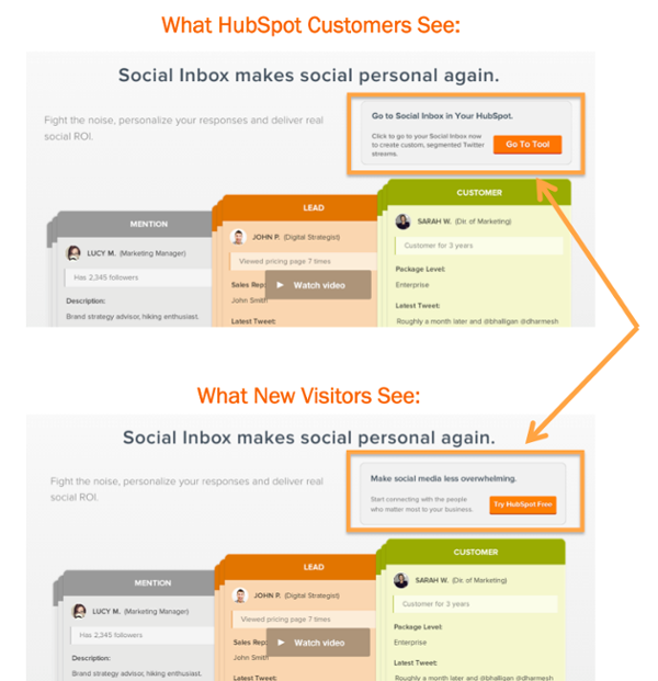
You can learn more about smart CTAs and how to use them here.
8) Add social proof.
Another way to boost conversions on your popular site pages? Add social proof to encourage people to click on your CTAs, fill out your forms, and otherwise become a lead. Social proof refers to testimonials from people who are vouching for whatever you're selling, and it's based on the idea that consumers will adapt their behavior according to what other people are doing.
In doing our own research, we've seen that testimonials featuring photos perform best, thanks to a study from ConversionXL. Here's a great example of using photos as social proof from Codecademy's homepage. It features three different versions of social proof, one after another: a case study video, links to stories from folks who've taken the courses, and a reference to the impressive number of people who've completed the course:
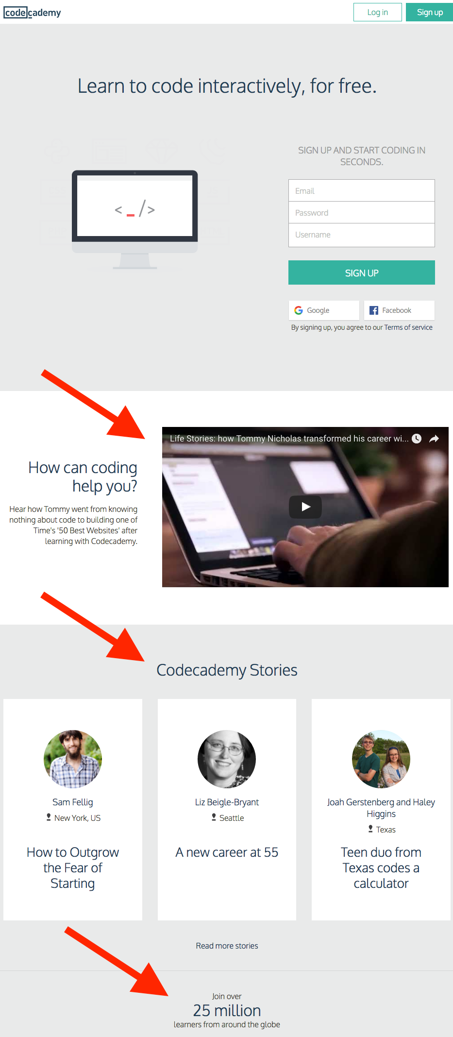
In addition to including photos and stories, the folks at ConversionXL found that readers remember press mentions featuring company logos more than press mentions featuring quotes. Prominent client logos in testimonials are also highly memorable.
When you review your most popular pages, see where you might add in social proof, whether it's in the form of a simple statistic, or whether it's as detailed as customer success stories. Here's a great list of social proof examples to get you started.
9) Test these ideas for yourself.
As much as you might wish there were a one-size-fits-all solution to conversion rate optimization, every business is different. Every audience is unique, and what works for one business may not work for yours. You're going to have to test these ideas for youself.
If you're new to optimizing your website for leads, then you may want to start with A/B tests, which are the easier (and most common) types of the conversion rate optimization tests. An A/B test simply tests one variable in a piece of marketing content against another, like a call-to-action buttons with two different phrases on it, to see which performs better. Here's a checklist that'll walk you through what to do before, during, and after an A/B test.
10) Find more ways to increase traffic to those pages.
Finally, in order to increase leads on your popular pages, you should always be looking for opportunities to increase the traffic to those pages even more. There are many ways to increase traffic to specific site pages, but two of the most critical ones are optimizing these pages for the keywords they're ranking for, and linking to these pages internally and externally.
Remember that your top webpages for traffic are likely so popular because they're already ranking for certain keywords and people are finding them on Google. To rank these pages even higher in search, you'll want to figure out which keywords these pages are ranking for, and then optimize them for those keywords to give them a boost.
To identify which keywords your pages are getting found for, use a combination o fkeyword research and a keyword tracking tool (like the ones on this list of the best keyword tracking tools). Then, prioritize your keyword list based on the one or two keywords the majority of each post's traffic seems to be coming from. After that, optimize these pages for those target keywords by incorporating those exact keyword phrase(s) into your posts' titles, headers, and CTAs. (Learn more about general on-page SEO tactics that'll help your website pages rank higher in search by reading this blog post.)
Linking to your already-popular webpages will also help give them a boost in search engine results because links tell search engines that your website is an authority on a certain subject or keyword. The more backlinks you have from high quality, high authority sites, the better your website will rank in search engine results pages (SERPs).
If you're ready to build links to those popular webpages, read this list of 33 "white hat" ways to get legitimate links to your website, and apply those tips to help you get more traffic to your top site pages.
There you have it, folks. We hope this list will give you some good ideas for generating a whole lot of leads from your already-popular pages.
What tips can you add to this list? Share with us in the comments below.
from HubSpot Marketing Blog http://blog.hubspot.com/marketing/lead-generation-tips-for-popular-webpages
Via http://blog.hubspot.com/marketing/lead-generation-tips-for-popular-webpages
No comments:
Post a Comment